Sometimes a home stays on the market for a long time, just waiting patiently for the right person to come along, see past all the problems and visualize it for what it can be. That’s exactly what happened with this transformed home.
Seeing it now, you would never guess that it was once hidden behind overgrown trees in one of Jefferson City’s prime locations on 4-acres. Years of neglect had obscured its potential to be a modern family home until just the right homeowners toured the property. Keep in mind that it hadn’t been updated since it was built in the mid-80s, that it had been empty for a long time and that every surface had to be touched. This wasn’t a renovation for the faint of heart. For the home to reach its full potential, it would take vision, care and skill to transform it into the modern estate it was meant to be.
The homeowners were drawn back to this property repeatedly and recognized its great bones. They just needed to revive it to create a home that fit the needs of these soon-to-be new residents. The homeowners enlisted the ideas of family and friends to help create a new vision for the home and take advantage of every opportunity to maximize the good, while transforming the bad.
The remodel began with multiple home walk-throughs, taking stock of the floor plan and how the home was structured. There were many choices to consider. The 8-foot ceilings made the large rooms seem confining. The living room had a fireplace that occupied an entire wall, eliminated the opportunity for a view of the backyard and made the room dark.
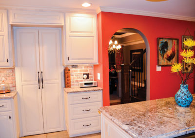
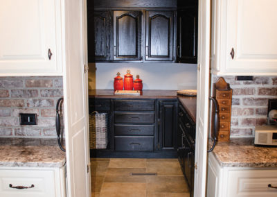
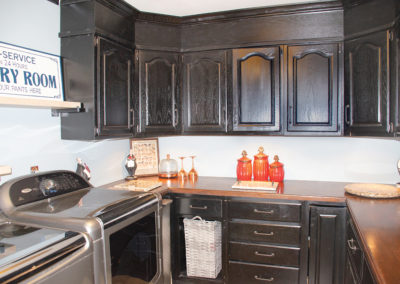
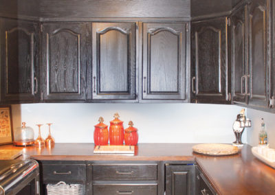
The doors to the laundry room and the stairway to the basement were awkwardly located in the dining room. Relocating the basement access to align with the stairs to the upper level allowed the homeowners to re-think the space and create a convenient butler’s pantry/laundry, which they now use all the time! They also moved the pantry door into the kitchen. These simple changes made a huge difference in how the rooms flow.
The kitchen and casual eating space were a great size, but definitely straight out of the 80s. And, there was a single door that led outside to the covered patio, limiting the opportunity for the inside to flow outside for larger gatherings. In the master suite, there was an abundance of space, but the bathroom suffered from 80s-itis as well! They knew all of these problems could be fixed and began to formulate a plan for their vision.
Fortunately, the front entry had an existing two-story ceiling height. They added a display niche above the front door and had the walls finished with a metallic paint treatment that glistens when the light is just right. It’s a beautiful subtle effect that creates a nice element of surprise when guests enter the home. She chose durable neutral tiles to flow from the entry straight through into the kitchen.
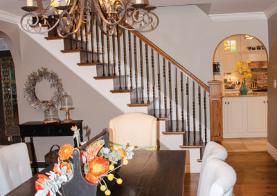
Finally, the room at the top of the steps was closed off from the lower level, and by removing a wall, they were able to create a functional office space. The open balcony brings natural light and architectural interest to the foyer. The new railings with wrought iron spindles, topped with rich wood hand rails are another design detail that adds to the home. What once was a walkway to the bedrooms on the upper level is now usable footage.
After exploring the space upstairs, they found the answer to their 8-foot ceiling challenges. Above the dining room, living room and master bedroom suite was enough unfinished space to raise the ceiling heights.
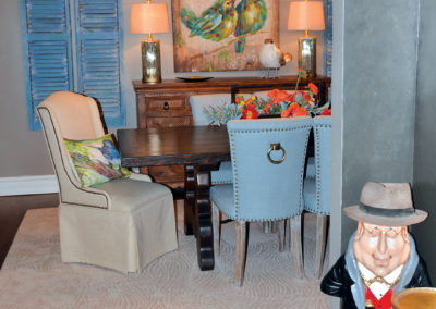
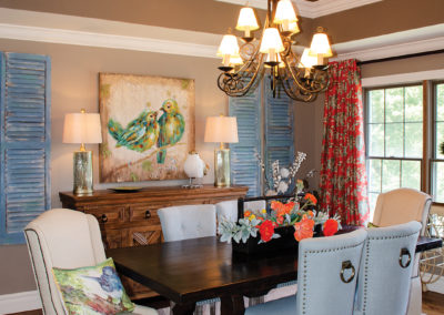
In the dining room, their carpenter Henry Veltrop opened up the ceiling to reveal a nice surprise! The potential to create a dramatic double vaulted ceiling treatment revealed itself. At the end of the day, Henry had framed in the structure and it couldn’t have been better if it would’ve been a part of the original house. In order to make the new ceiling even more special, they repeated the metallic paint treatment from the foyer and found a large chandelier perfect for the room. They kept the existing pine floors the previous owners had installed and stained red. They chose to have them sanded down to the bare wood and replace the red stain with a medium toned wood color. They turned out beautifully. Furnishings and accessories were chosen so everyone would feel relaxed and stay a while. The homeowner found the old shutters and dry brushed on a layer of blue paint. The artwork and accessories are reflective of her love of light and bright happy colors and interesting patterns.
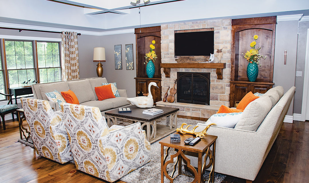
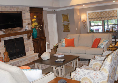
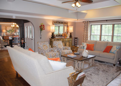
The spacious living room underwent a dramatic transformation by removing the fireplace which previously overpowered the room. It’s hard to describe how much better the room felt when all that brick was removed! A window was installed to let in the light and provide a view to the beautiful back yard. The focal point of the room is now where it needs to be. They installed a gas fireplace with a stone surround and wood mantel that is flanked by rich wood built-ins. Now when everyone is in the living room, they have plenty of seating with matching sofas and a pair of swivel chairs. She chose a large-scale coffee table to anchor the space. The room is so large that she was able to place accent furnishings around the perimeter which have become a curated mix of traditional and relaxed items.
Overhead, the new room height is accented by a box beam architectural feature. A ceiling medallion is used to add an embellishment to the ceiling fan. What a difference the additional two-feet has made in this exciting new space. The lighting he added in every room makes the home feel much bigger and brighter. And, she teases him about the benefits of living with an electrician…she can change out lighting like she would her jewelry.
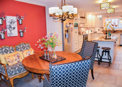
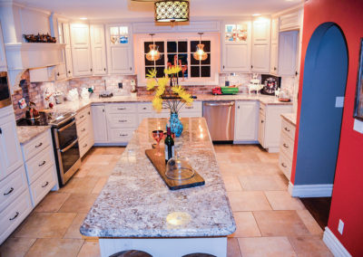
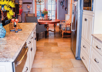
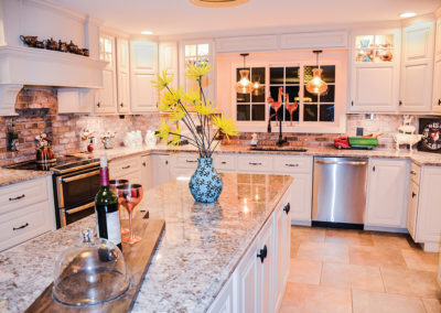
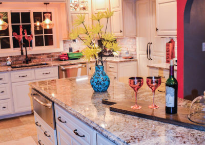
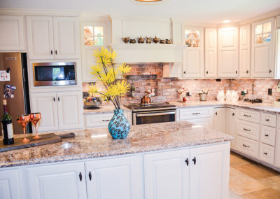
The kitchen is their favorite room in the home. The painted white cabinets are the perfect canvas to design a French country family-friendly space. Glass cabinet inserts display treasured items and the curved stove hood complements the beautiful lines of the custom cabinetry. Stainless steel appliances enhance the design and contrast with the natural rustic feel of the brick backsplash he installed. The space has a sophisticated air about it, but it is definitely not overdone. In lieu of the original u-shaped kitchen with a peninsula, they chose to use an island. The stunning granite countertops are perfect to stand up to daily use. The island provides more than enough space to serve everyone’s favorites. When their family gets together, the large island is the perfect place to create an appetizing display that would rival any upscale buffet!
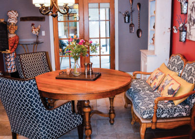
In the seating area, a playful mix of artwork is hung against the perfect color red. The scale and texture of the fabrics chosen to reupholster vintage seating reinforce the French county style. The antique dining table is the perfect size and is a comfortable place to begin your day, or to come back together to share the day’s experiences. It’s a balance of vintage antiques, designer fabrics and color that celebrates the relaxed look they’re most comfortable with.
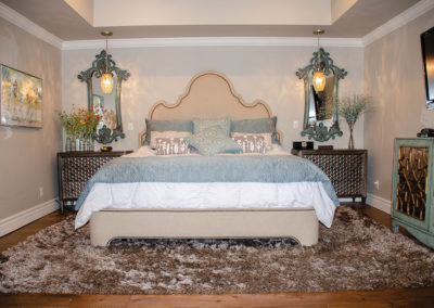
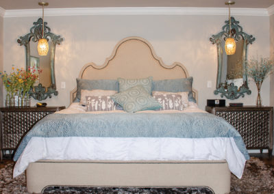
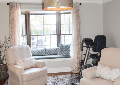
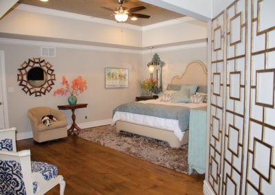
A soothing grey and textural layers are used in the master bedroom to create a truly relaxing retreat. The large master suite was one of the original spaces that drew them to this home. They have a large space for their lush upholstered king-sized bed, and once again they capitalized on the opportunity to raise the ceiling. In the adjacent room, they have a sitting area with space leftover for exercise equipment. The pine floor continues throughout these rooms and they’ve softened the feel with soft area rugs. A window seat is an opportunity for their dogs to sit and guard their backyard.
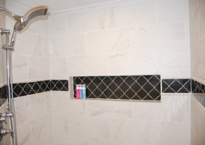
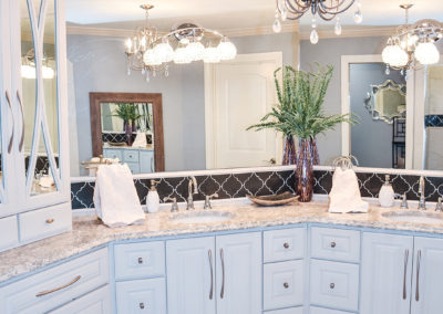
The master bath is a soft and soothing composition of classic cabinetry, quartz counters, glistening light fixtures and simple and clean marble look tile accented by smoky grey arabesque glass tiles. No detail was overlooked. From the graceful curved accents on the mirrored storage cabinet doors to just the right cabinet pulls, everything came together perfectly.
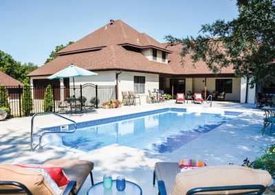
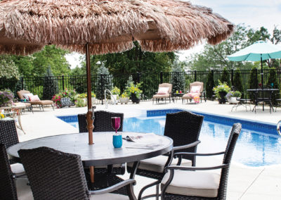
The existing outdoor space consisted of a covered patio and a great deal of lawn space. You could tell the previous owners rarely spent any time outdoors past the patio. The great thing about this property is how much space they had to create the pool area they really wanted. It was important for him to give her the pool area he knew she wanted. Now, their new pool is surrounded by a generous amount of concrete in order to hold several seating options for everyone. This homeowner is known to be somewhat obsessed with beautiful outdoor seating and it wouldn’t be surprising if she hasn’t already added more to the space.
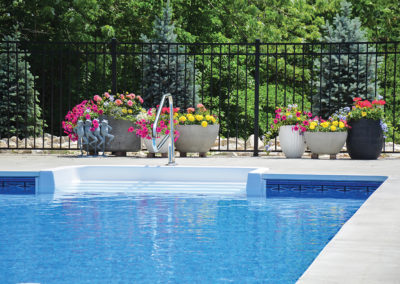
In order to have a non-slip surface surrounding the pool, he chose a light broom finished concrete and had it scored on the diagonal. This created a subtle design element that didn’t add to the budget. The pool is all one level making it easy for all ages to enjoy.
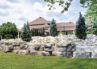
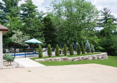
Because of the natural slope of the yard, they needed a retaining wall. After considering how to achieve the most natural look, they chose a product that features large stones that resemble naturally occurring outcroppings. Plantings of blue spruce and arborvitaes will grow into a natural screen and provide a beautiful backdrop for years to come. He surrounded the area with black aluminum fencing to keep the area secure.
When you have a property with this much potential, you may never really be done, but these homeowners have earned an opportunity to take a break and enjoy everything they’ve accomplished. She brought a design perspective to the entire project, driven by an artistic eye for color, scale and detail. And, he was able to put his electrical and construction experience to work and be a major part of the remodel. Since he was able to take a 2-month leave in order to oversee the massive project, it gave this homeowner peace of mind and true pride in the result.
They recognized the good bones of the home, and were committed to reviving it in order to create a home that fits their needs. She enjoyed the collaboration with family and friends, as well as the wonderfully positive craftsmen they worked with to create a home that speaks to what they love. Now, all they have to do is enjoy the home they’ve created… Until she finds their next project!
SUPPLIER LIST
Henry Veltrop
JC Mattress and Furniture Showrooms
Nathan Voss
Green Horizons
Brady’s Glass and Paint
DeBuhr Electric
JP Property Solutions
Mike McDonald Pools
Woodman Engineering
Forshaw
Mid Missouri Surfaces
Scruggs Lumber
Frank Schrimpf Plumbing
Mid City Lumber
Martellaro Granite
Stockman Stoneworks
JCL Hardwoods
Sommers Interiors
United Landscaping
Premium Interiors
Howell’s Carpet
Coleman Appliance
Lowe’s Home Improvement
Uniquely Rose

