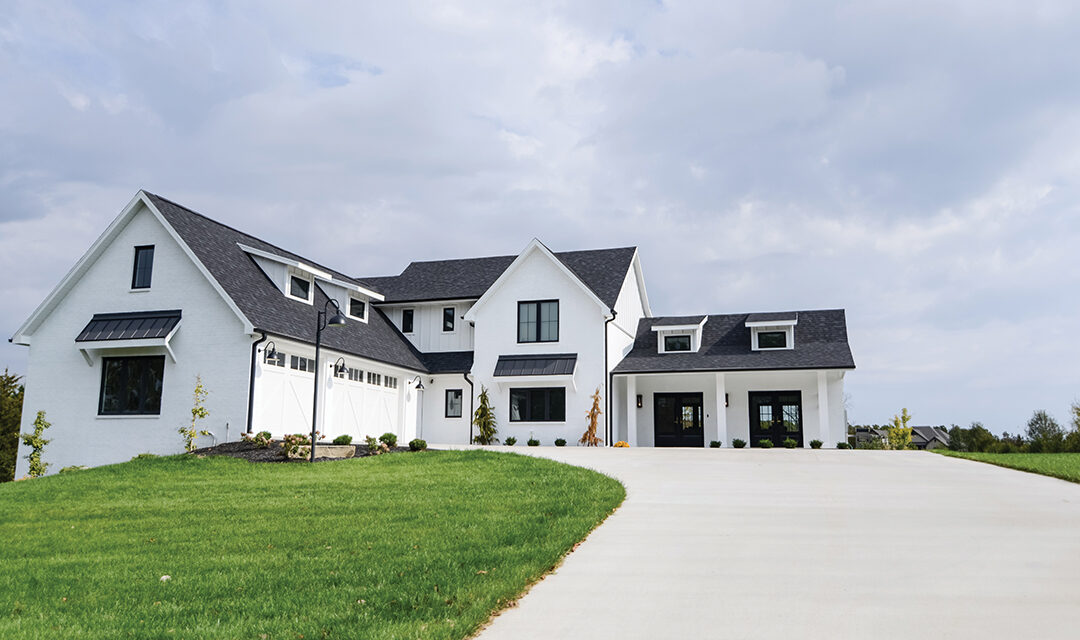
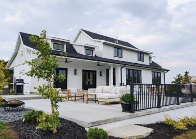
The stark contrast of this black and white home is the first thing that catches the eye. The classic colors are applied in a modern, yet welcoming, manner. The black accents and roofing stand out against white brick and vertical siding. The three-car garage is accessible by two garage doors on one end of the house, while the opposite end features two sets of French doors. Both are capped with a pitched roof and dormer windows. The “shed dormers” add height to the roof of these two portions of the house while the center section towers higher still, with a second floor.
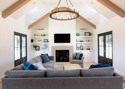
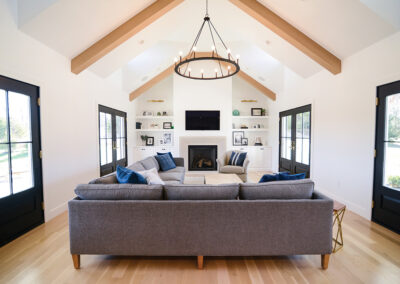
Upon entering the home through one set of the black French doors with four large panes of glass, you see a mirror image across the main living space across the main living space. Four more identical doors are set into the far wall. The living room is flooded with light gleaming through the eight glass-laden doors. The white oak flooring provided brings more warmth to the space. One end of the living room contains built-in shelving and a large fireplace featuring a cast concrete mantle from Oklahoma. As the eye is drawn up, the round chandelier and solid wood beams bring attention back to the sloped ceiling. The many angles of the roof presented unique obstacles but with attention to detail and fastidious planning, they join together beautifully.
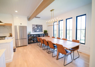
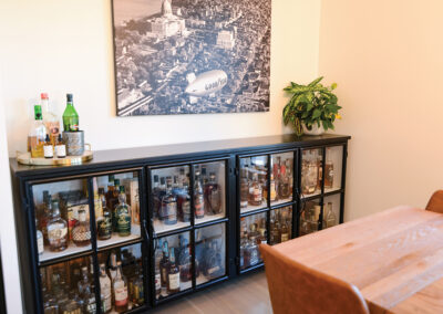
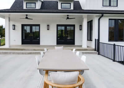
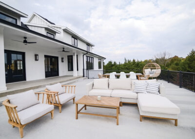
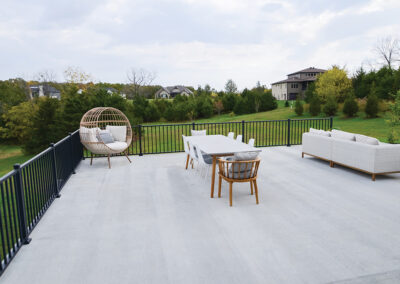
The kitchen and dining room are located at the other end of this wing. A large dining room table seats ten and is accented with a unique light fixture that gives the illusion of candles suspended overhead. Against the wall are black framed, windowed cabinets, used for the owners’ bourbon collection. The art above is a large black and white photo of Jefferson City. The two sets of doors at the back of the house grant access a spacious back patio with an outdoor dining set and sitting area, perfect for larger gatherings. A rounded chair provides comfortable seating on the other side of the patio with a unique style.
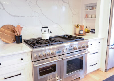
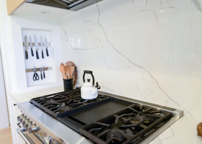
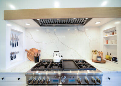
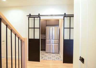
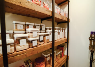
The expertly assembled chef’s kitchen contains a double oven gas range and is placed in front of a solid sheet of white quartz with light veins of grey. The same quartz is used on the double islands, offering ample space for meal prep with the family. The cabinetry was thoughtfully designed and meticulously installed throughout. Set into the wall are some shelves on one side and magnetic strips on the other. These features keep the frequently used items, like kitchen knives and spices, close at hand while cooking. The islands provide an abundance of storage and counter space with white pendant lights illuminating the center of the room. A set of sliding reclaimed 1890s elevator doors from New York, restored locally, opens to the pantry. It is furnished with reclaimed wood shelving and has a patterned tile floor.
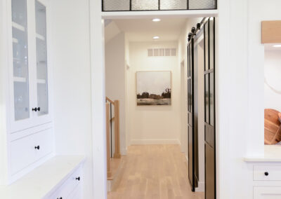
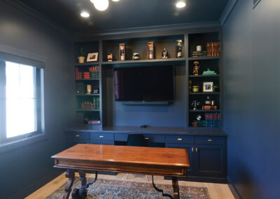
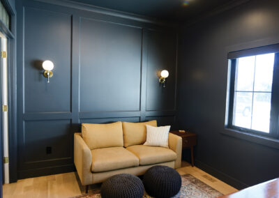
A nearby door, complete with a custom transom, displaying refurbished 1890s glass from New York, opens to reveal a navy-blue office with a styled seating area that includes a couch with a fitted look and a pair of padded stools on a multicolored rug that compliments the wall color. The vintage-inspired, round wall sconces add to the sophisticated style along with the box paneling wall treatment. The tasteful dark, high-gloss desk is framed by built-in bookshelves and provides a great deal of space for the homeowner to work.
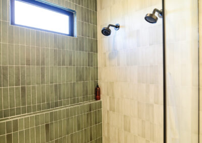
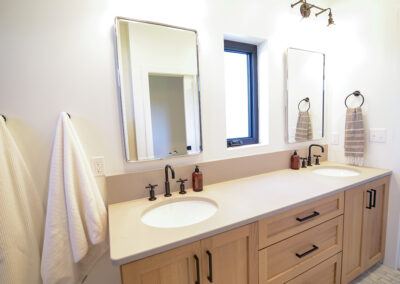
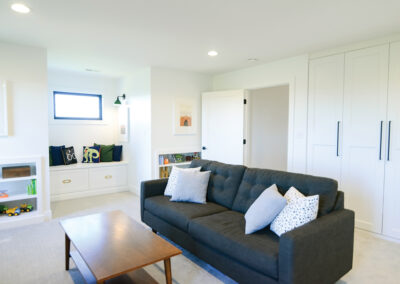
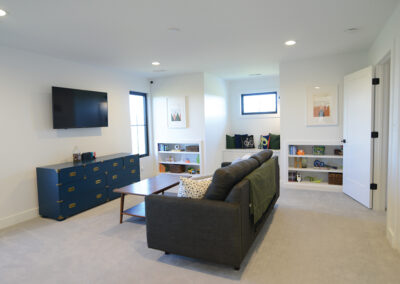
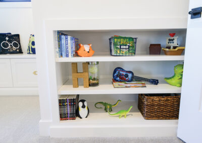
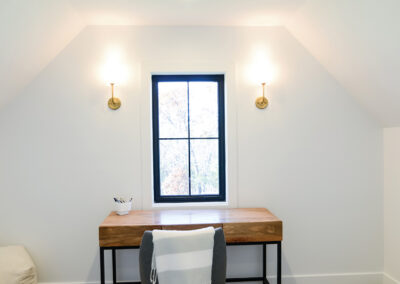
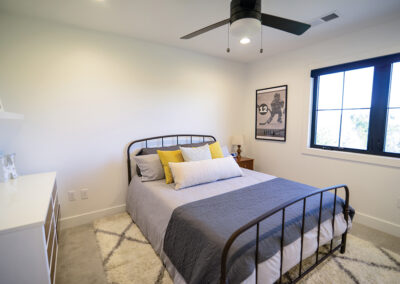
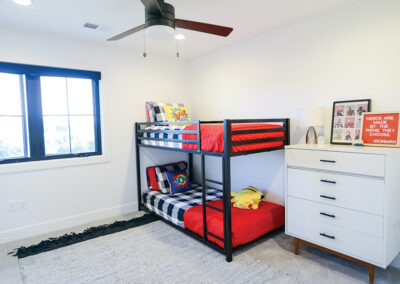
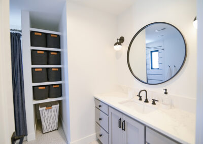
Past the stairs is a laundry room and a bathroom with double sinks. The vertical tile on the shower walls is grey toned on two walls and shades of dark green on the back wall. The most exciting room for the owners’ three sons is, of course, the playroom. This large space offers more built-in shelving and floor-to-ceiling closet storage for all the kids’ things. A roomy window bench contains drawers for additional stowing space. Best of all, mom is close at hand with an office space on one side of the room. The two older boys have bedrooms nearby with a Jack and Jill bathroom between them. The sweet little one’s nursery is across the hall.
The homeowners came in with a detailed plan for the home that they wanted. Having remodeled a house shortly before breaking ground on this home gave them some experience. The prior remodel helped them when deciding what features they wanted and how to communicate what they were looking for. The plans were drawn up before finding the right builder to make their dreams come to life. They chose Kent Bentlage from Bentlage Homes because he gave them the freedom to make the home exactly how they wanted. They were very cognizant of the details and fixtures they wanted, carefully selecting light fixtures to the correct scale of each room. While the details are important to make the house look beautiful and feel cohesive, the most important thing is that the space works for the family. In the words of the homeowner, “Pretty is important but function is more important.”
SUPPLIER LIST
Bentlage Homes
Paulette Designs
Brady’s Jefferson City’s Glass Co
Capital Installers
CFCC, LLC
Chad Winge Masonry
Cole County Industries
David Veith Plumbing
Delongs
Don Eskens Drywall
Forshaw
Jeff Lute Electric
Jerry Luebbert Flooring
Lewis Landscaing
Mid America Truss
Mid City Lumber
Mid Missouri Surfaces
Midwest Block and Brick
Nate’s Concrete Pumping
Nawkaw
Petals and Paper
Phil Thoenen & Sons Cabinet Inc.
Pro Powder Coating
Quaker Windows
Schwartz Roofing
Spradlin Insulation
Squared Nails Architectural Salvage
Stieferman Heating and Cooling
Superior Exteriors
Temmen Excavation
The Entertainer
Tim Kirk
Turpins Waterproofing
Veltrop Construction

