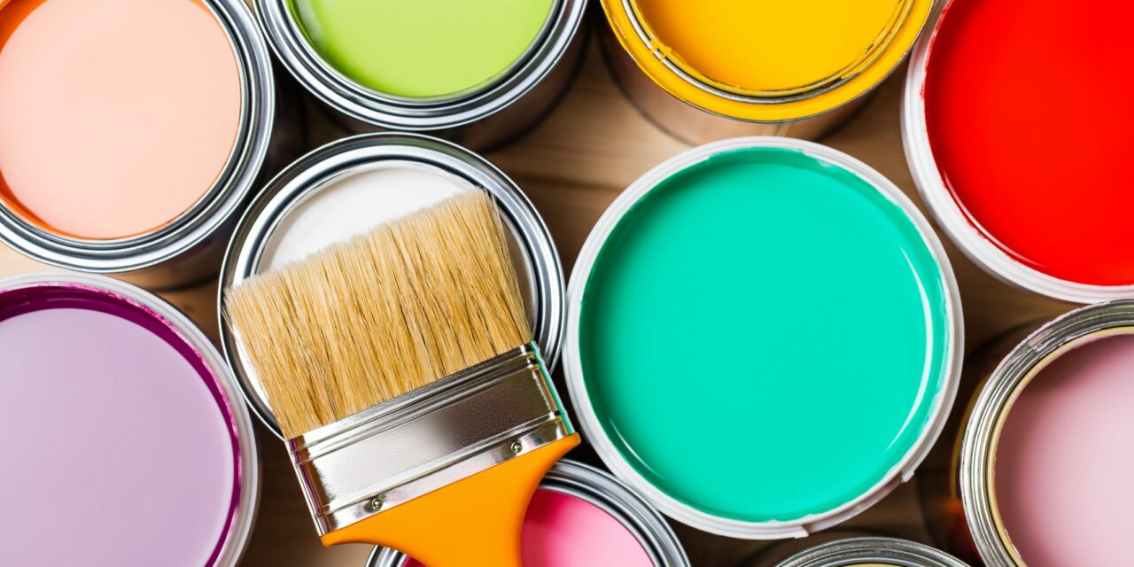
In the ever-evolving world of home decor and building, the annual unveiling of the Colors of the Year is a momentous occasion. These carefully curated palettes set the tone for design trends, influencing everything from wall colors to architectural choices. Let’s embark on a colorful journey as we explore the hues that promise to define the aesthetic landscape in 2024.
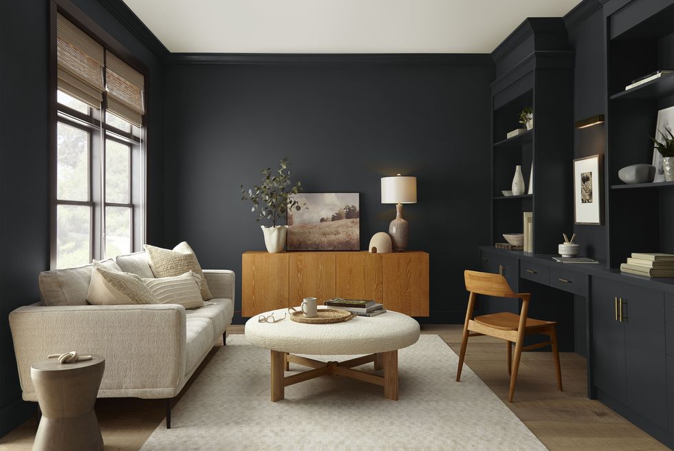
Behr Paint Company – Cracked Pepper
Behr Paint Company’s choice for the Color of the Year, Cracked Pepper, is a sophisticated and timeless shade that adds depth and versatility to any space. This deep, charcoal hue serves as a strong foundation for creating bold contrasts or elegant monochromatic designs, making it an ideal choice for both modern and traditional interiors.
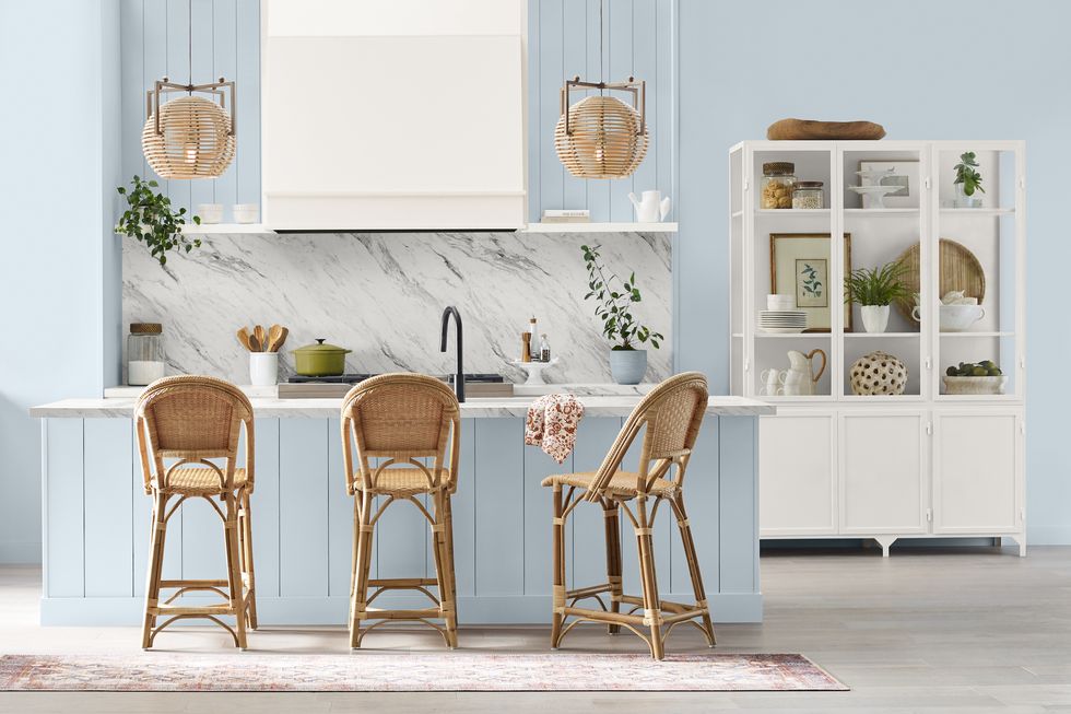
Sherwin-Williams – SW 6239 Upward
Sherwin-Williams presents Upward, a serene blue that captures the essence of endless skies and tranquil waters. This color promotes a sense of calm and introspection, making it an excellent choice for bedrooms, bathrooms, or spaces where relaxation is key. Upward pairs seamlessly with both neutral and bold accent colors, offering endless possibilities for creative expression.
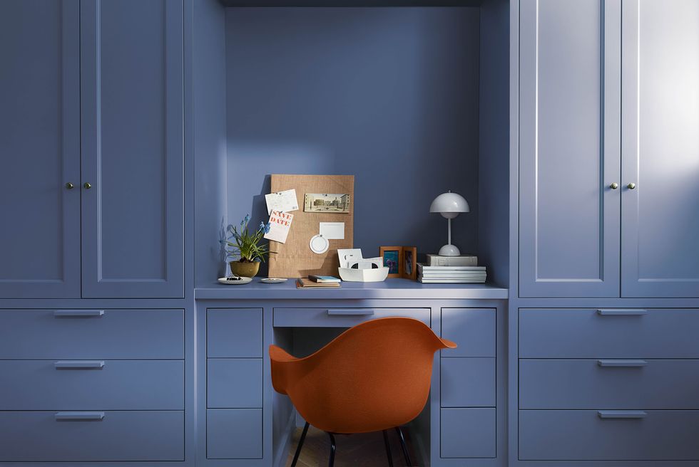
Benjamin Moore – Blue Nova
Blue Nova from Benjamin Moore is a bold and expressive hue that brings a modern edge to interior spaces. This deep blue evokes a sense of mystery and sophistication, making it an excellent choice for statement walls or as an accent color in furniture and decor. Blue Nova pairs well with metallic accents, adding a touch of glamour to the overall design.
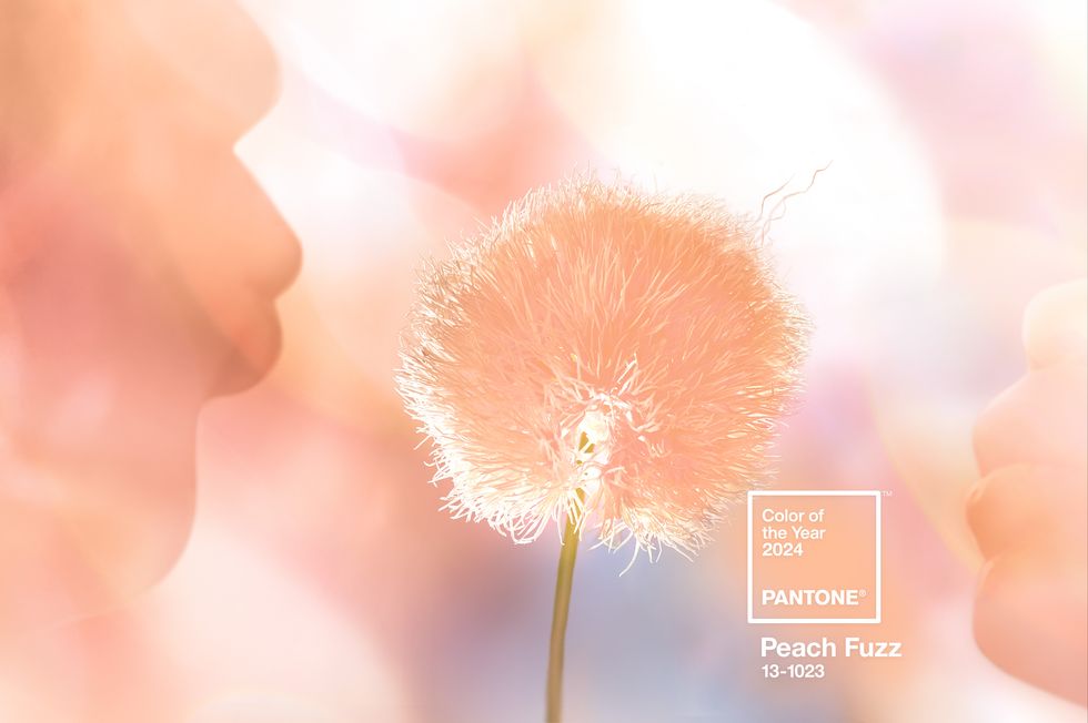
Pantone – Peach Fuzz
Pantone’s choice for the Color of the Year, Peach Fuzz, brings warmth and optimism to the forefront. This soft and inviting peachy hue is perfect for creating welcoming living spaces. Use Peach Fuzz as a wall color, in textiles, or as an accent in furniture to infuse energy and positivity into your home.
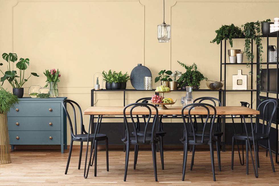
Glidden – Limitless
Limitless, Glidden’s Color of the Year, is anything but yellow, presenting a bold departure from traditional color trends. This vibrant and invigorating hue symbolizes boundless possibilities and creative freedom. Incorporate Limitless into your decor to add a pop of color that sparks inspiration and creativity.
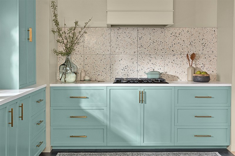
Valspar – Renew Blue
Renew Blue by Valspar is a calming and refreshing color that brings a sense of renewal and serenity to interior spaces. This versatile blue works well in various design styles, from coastal to contemporary. Use Renew Blue on walls, furniture, or as an accent color to create a soothing and timeless ambiance.
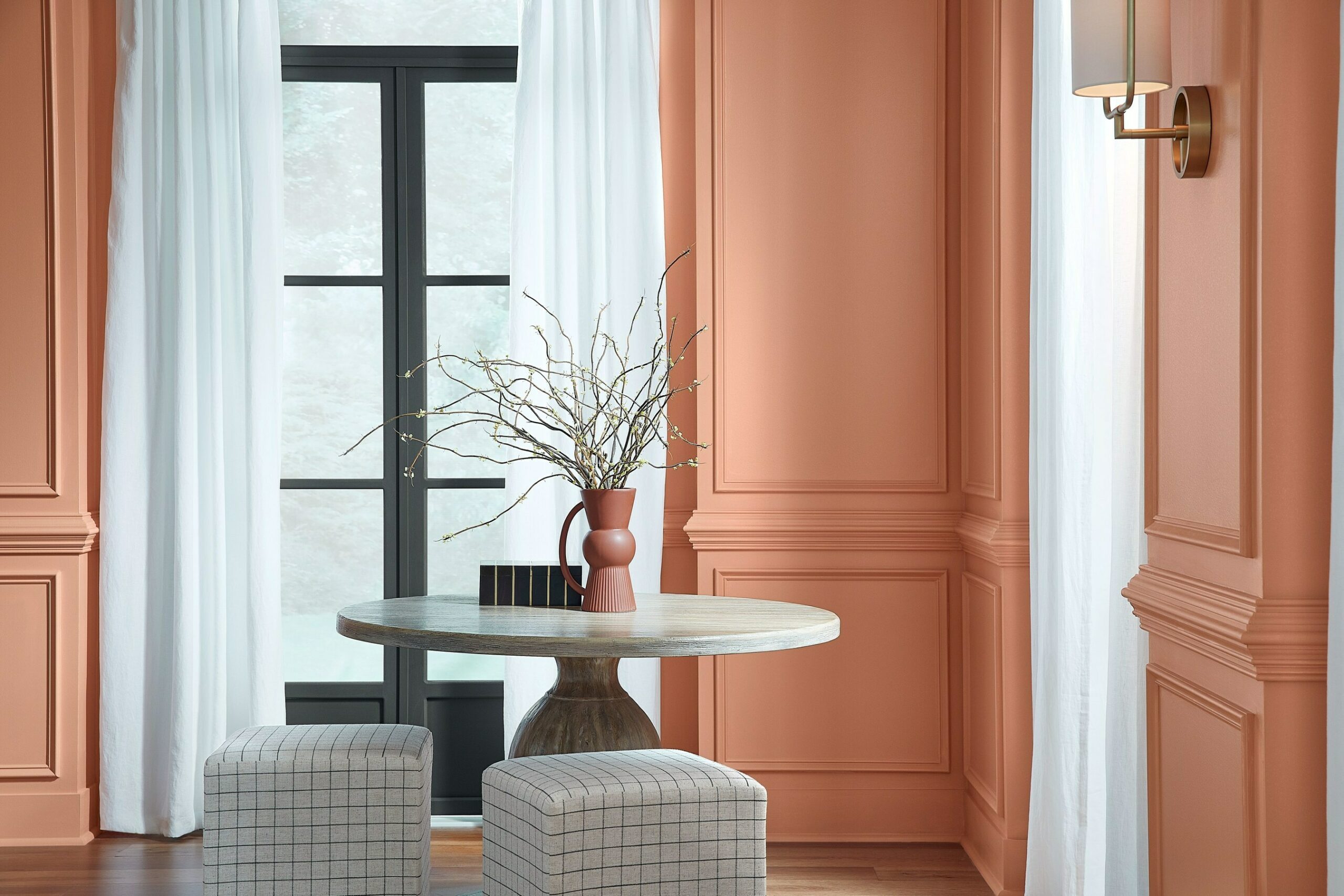
HGTV Home by Sherwin-Williams – Persimmon
Persimmon, HGTV Home by Sherwin-Williams’ Color of the Year, is a bold and lively hue that injects warmth and personality into any room. This vibrant shade works well in both modern and traditional settings, creating a lively and inviting atmosphere. Consider using Persimmon in accent pieces, such as throw pillows or decor accessories, for a playful touch.
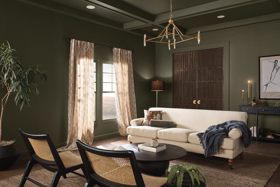
Dutch Boy Paints – Ironside
Dutch Boy Paints introduces Ironside as the Color of the Year, a sophisticated and grounding hue that exudes strength and stability. This deep gray-brown can be used as a neutral backdrop or as a statement color in furniture and decor. Ironside complements a variety of color palettes, making it a versatile choice for any design scheme.
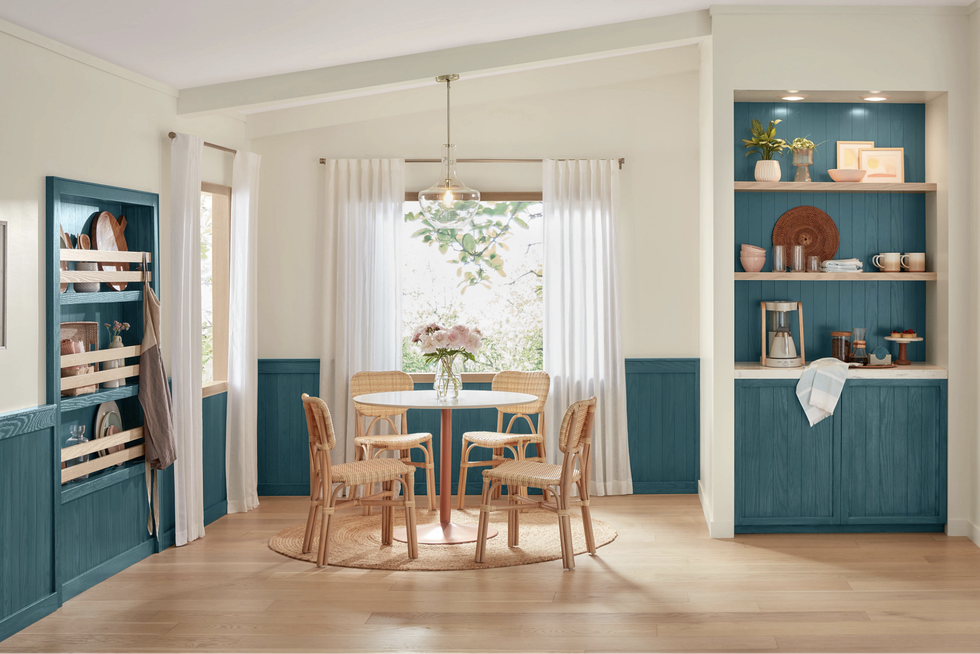
Minwax – Bay Blue
Minwax’s Color of the Year, Bay Blue, transcends traditional expectations by bringing a rich and modern hue to wood finishes. This classic yet contemporary color adds a touch of elegance to furniture and woodwork, infusing spaces with timeless charm. Bay Blue pairs well with a range of design styles, making it a versatile choice for both traditional and modern interiors.
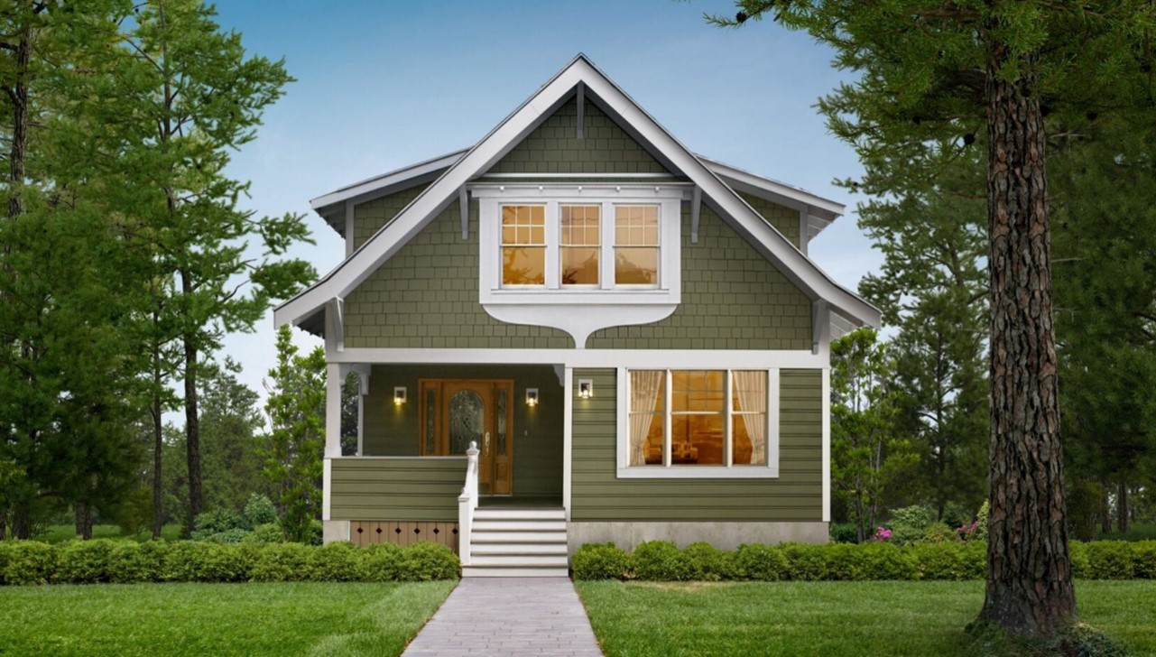
James Hardie – Mountain Sage
James Hardie’s inaugural Exterior Color of the Year, Mountain Sage, revolutionizes curb appeal with its sophisticated and nature-inspired hue. This muted green-gray shade complements a variety of architectural styles, providing a timeless and harmonious look to exterior spaces. Mountain Sage is a versatile choice for siding, trim, and accent details, creating a cohesive and inviting exterior.
How to Incorporate the Colors into Your Home
Now that we’ve explored the Colors of the Year for 2024, let’s discuss how to seamlessly integrate these palettes into your home decor and building projects.
-
Accent Walls: Create a focal point in your room by painting an accent wall in the chosen color palette. This not only adds visual interest but also allows you to experiment with bolder hues without overwhelming the entire space.
-
Furniture and Upholstery: Introduce the Colors of the Year through furniture and upholstery. Consider statement pieces such as sofas, chairs, or bed frames in these hues to anchor the room and set the tone for the overall design.
-
Accessories and Decor: Infuse the chosen colors into your home through accessories and decor items. Think throw pillows, rugs, vases, and artwork that complement the selected palette, adding layers of color and texture to your living spaces.
-
Architectural Elements: For building projects, consider incorporating the Colors of the Year into architectural elements such as cabinetry, doors, or trim. These subtle touches can make a significant impact on the overall design and feel of a space.
The Colors of the Year for 2024 present a diverse and inspiring palette that caters to a range of design preferences. From bold and expressive to calming and timeless, these hues offer endless possibilities for creating spaces that reflect individuality and style. Whether you’re renovating your home or embarking on a new building project, consider incorporating these captivating colors to stay on the cutting edge of design trends in 2024.
