One day while driving down the dusty country roads to check on their cattle, a couple happened upon a house for sale, and they decided to take a chance.
The property had an old 1960s ranch house that they had planned to remodel. However, everyone that they consulted all agreed: this home was just in too poor of condition for a remodel. With all the work that would be needed to bring everything up to code, it would be better to just start over.
Paulette Kreter of Paulette Designs worked closely with the couple to determine exactly what they wanted from the property. With a blank slate, the shouse they originally thought of building turned into a more “traditional” home which would ultimately be a better investment and better fit their vision of a home that would play host to many family gatherings. The couple in collaboration with Paulette drew up the plans for their new home, and Mike Luebbering took on the task of making it a reality.
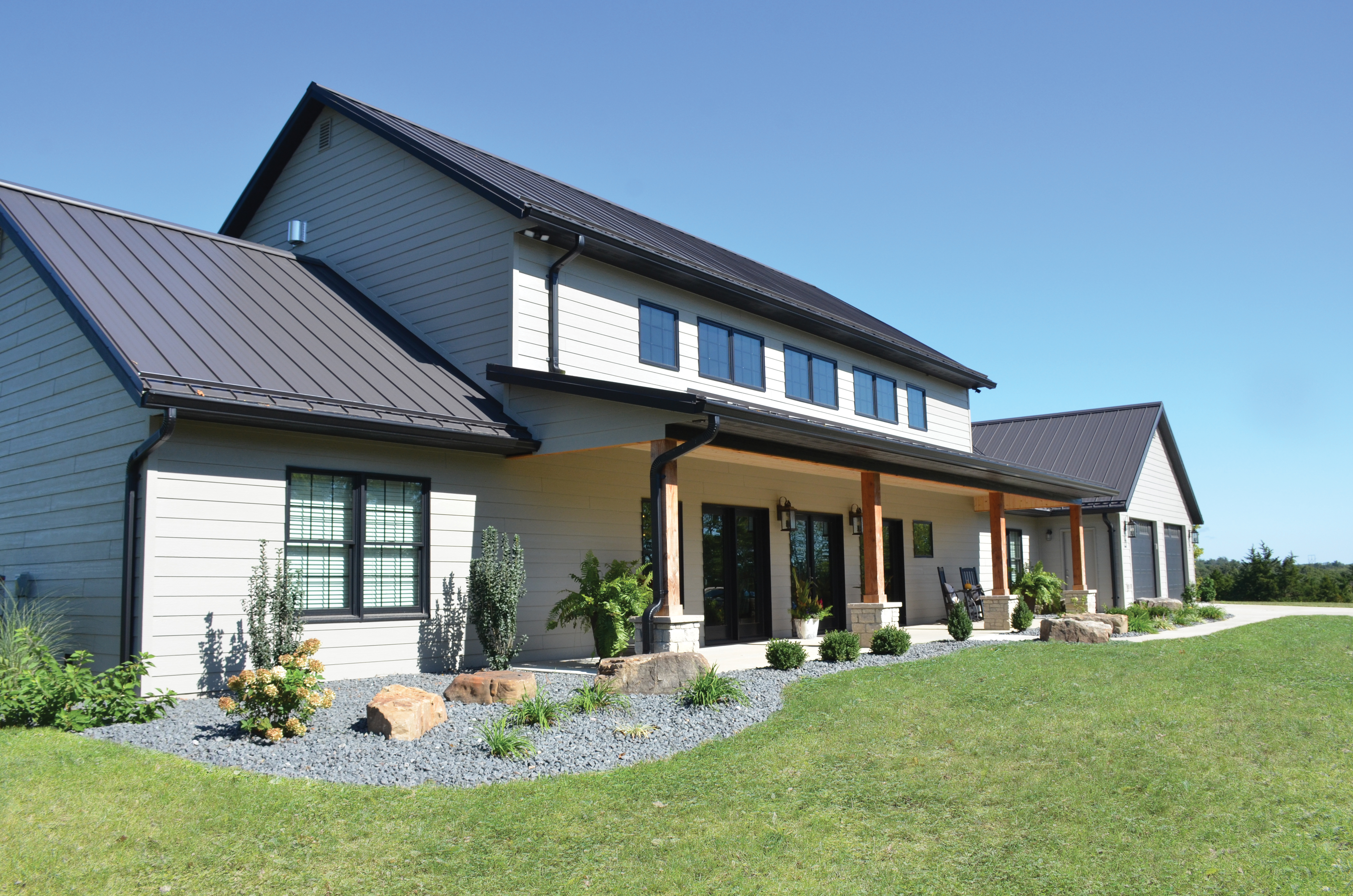
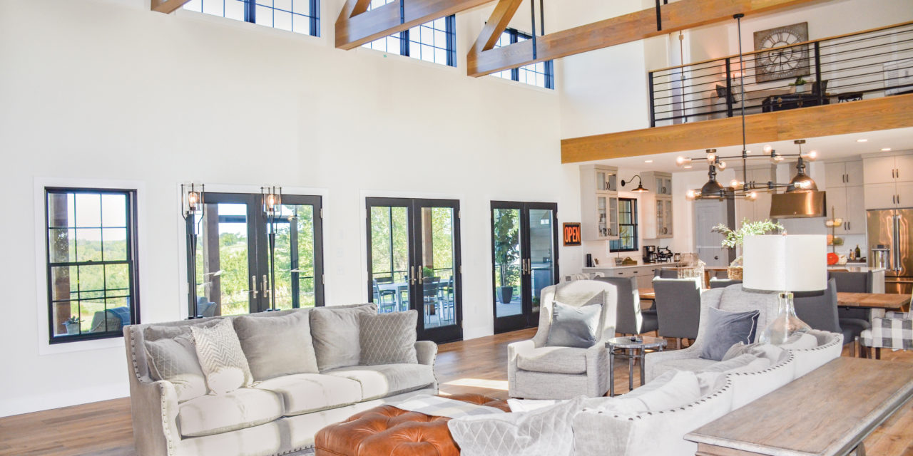
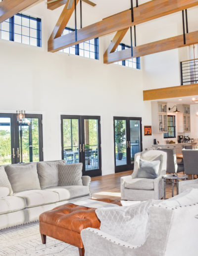
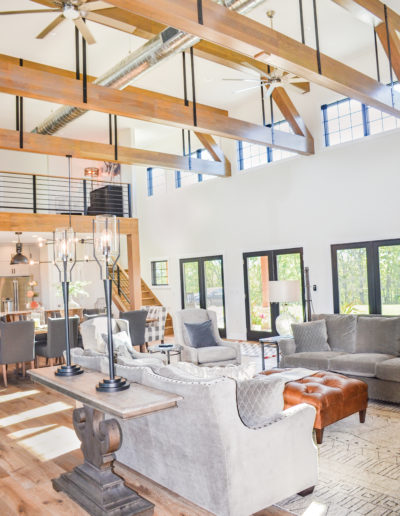
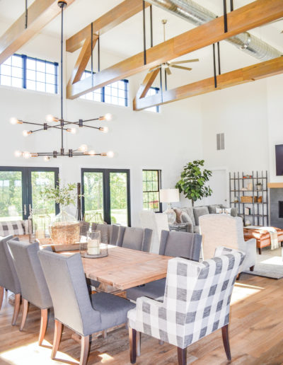
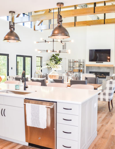
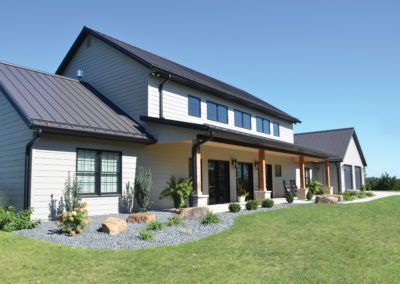
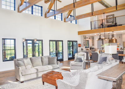
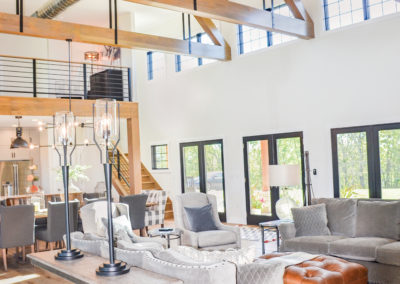
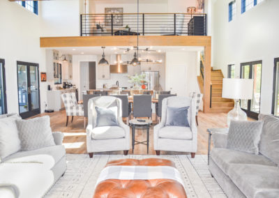
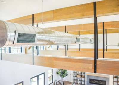
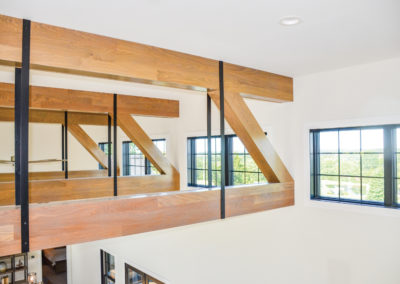
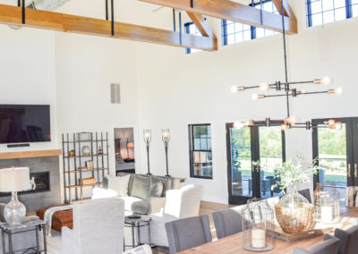
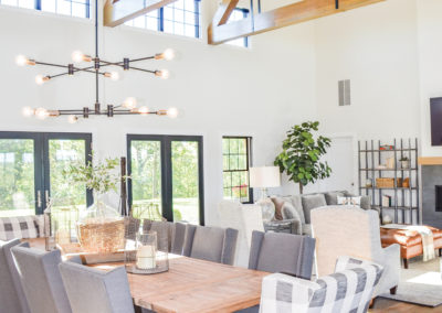
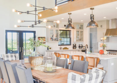
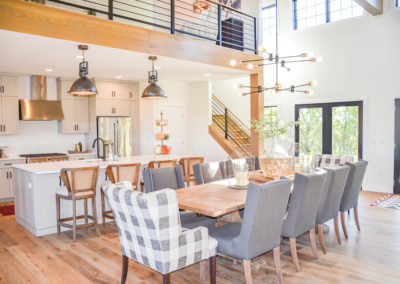
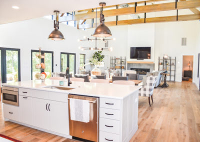
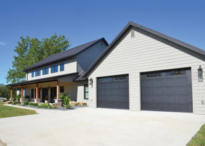
The homeowners really wanted this home to draw the outside inward. The front of the house features three sets of French doors, which perfectly align with identical sets of French doors on the backside of the house. This allows light to flow completely through the house. From outside, the home looks like a two-story. Once you walk into the space, you realize that the entire second story above much of the open concept living area has been left exposed. The openness is accented by Anderson windows and white oak support beams, drawing your eye upwards to the ceiling, across the space, and furthering that light and expansive feeling.
Inside is a truly rustic, industrial retreat. Old meets new. Traditional meets modern. Natural meets man-made. Built on a slab foundation, the first floor of the home features engineered hardwood floors that have the feeling of real wood but was easily installed directly over the concrete. Metal accents contrast against the light woods and cream-colored walls. All the windows and doors have been framed with black trim, echoing the metal strapping on the beams. An exposed duct running across the ceiling even further enhances the industrial style.
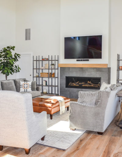
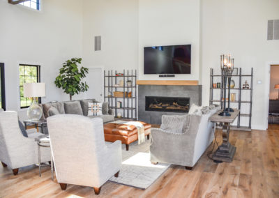
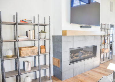
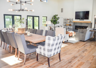
With the homeowners’ strong vision for their space, Rachel and Tina of JC Mattress and Furniture Showrooms helped them finish off the design and find the perfect furnishings, lighting and area rugs. In the living room area, they have made great use of symmetry in the layout. A gas fireplace, surrounded by grey tile and topped with a wooden mantle that matches the flooring, stands as the focal point. Two wood and metallic bookcases flank it on either side. In front of the fireplace, the space is softened with plush grey sofas featuring nailhead accent trim, each with a matching table framing their back to offer the final impact on the symmetrical design. A pair of grey armchairs sit at the head of the arrangement. A light-colored, geometric patterned rug anchors the furniture arrangement with a warm tufted leather ottoman at its center.
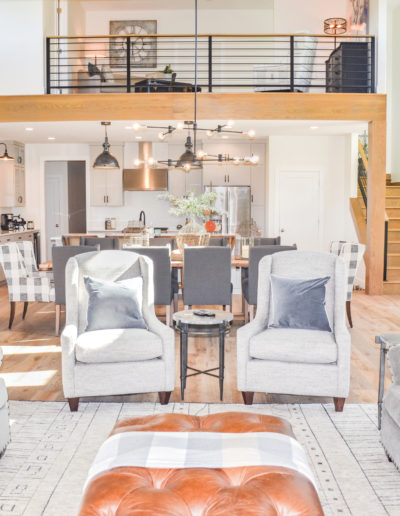
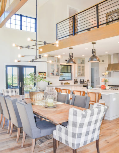
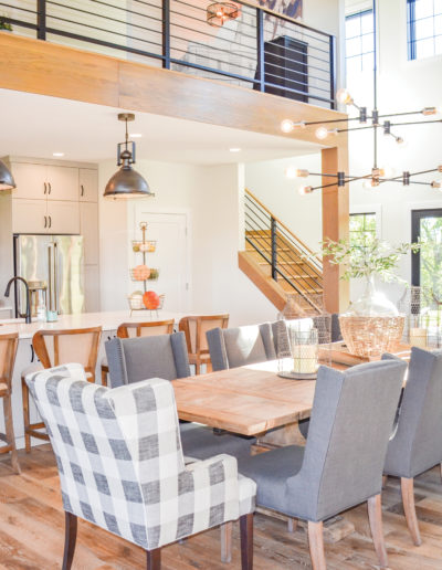
Beside the living space, a large, light wood farmhouse style table awaits the next family gathering. Overhead, an eye-catching chandelier made of metal with round exposed bulbs takes on a sputnik-inspired silhouette for an artful appearance. Ready for the next dinner party, comfortable seating for ten surrounds the table. The upholstered dining chairs complement the sofa design with nailhead trim and grey textiles.
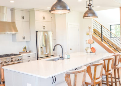
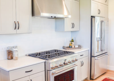
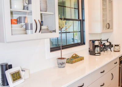
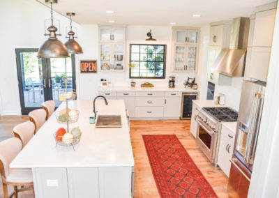
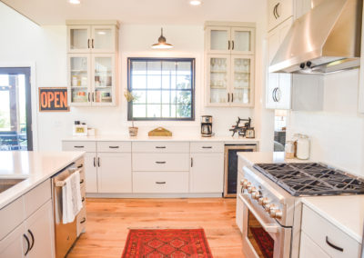
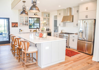
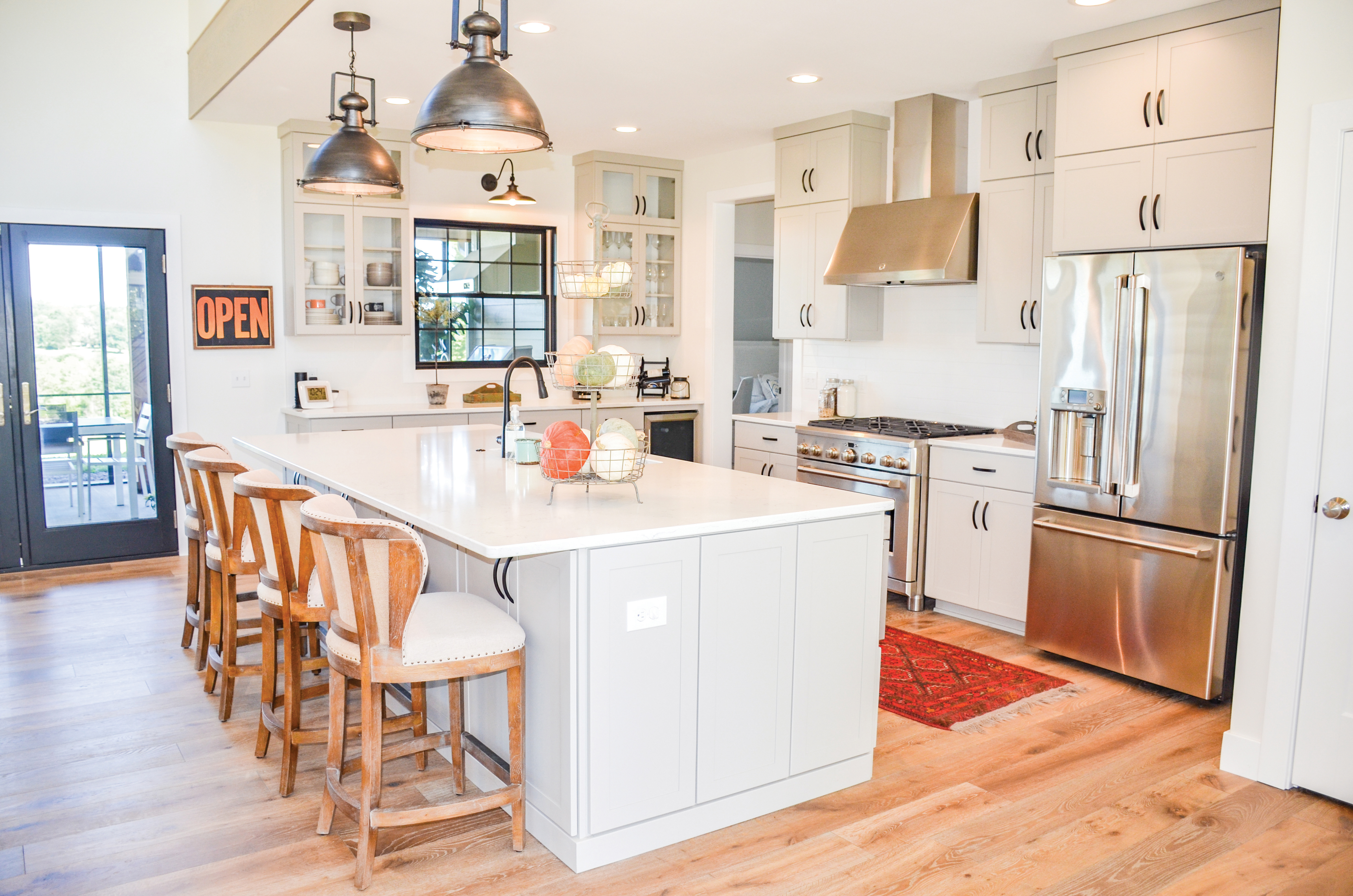
The room then flows right into the kitchen, which is kept just as light and airy as the rest of the space by using light grey cabinetry with gleaming white quartz countertops. Sitting at the large island are distressed wood barstools that feature deconstructed backs that expose a light toffee burlap while the rest of the chair is covered in a neutral cream-colored fabric. Over the island hang a pair of bushed metal industrial-style pendants. Their dark metallic color is repeated in the iron cabinet pulls and dark faucet. Meanwhile light bounces back into the space off the gleaming stainless steel six-burner gas range and appliances. The space is fitted with all the essentials for entertaining, including a wine fridge. Underfoot, a bright red rug gives the kitchen a pop of unexpected color.
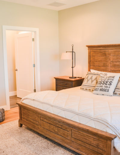
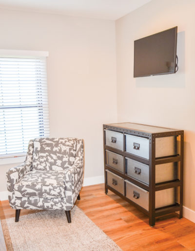
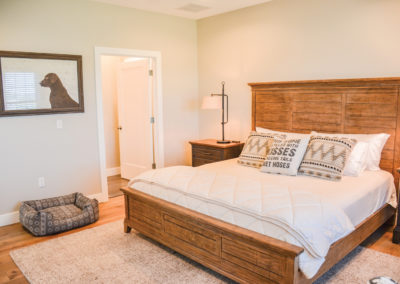
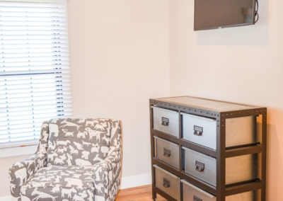
The master bedroom sits just off the main living area and continues many of its design aesthetics. The barn wood master bed matches the dark wood nightstands topped with industrial metal pipe table lamps. The crisp white bedding proclaims who truly runs this home—the family dog—a theme that is echoed in the corner armchair, covered in a grey, illustrated dog print fabric. Industrial elements reappear in the two-tone metal dresser drawers with riveted details.
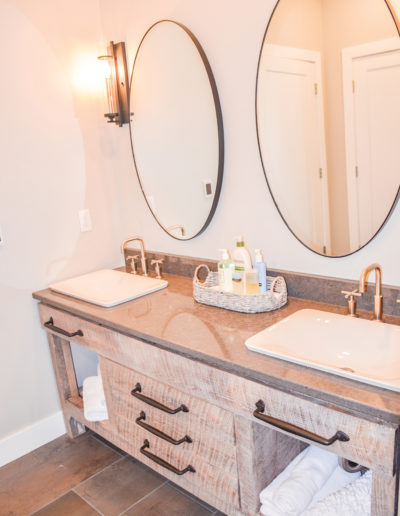
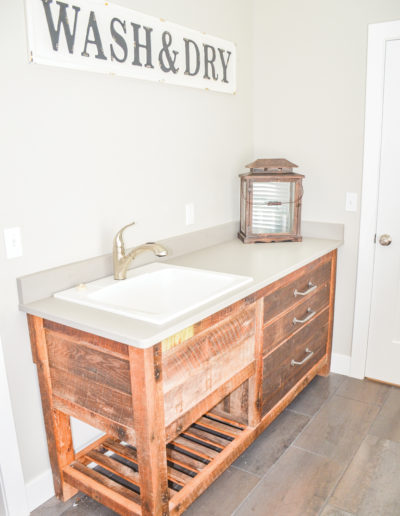
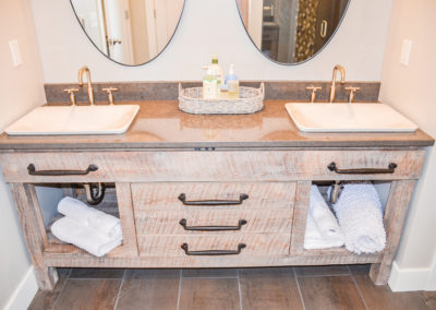
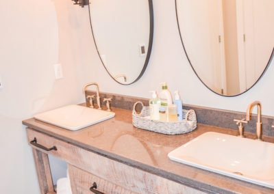
The master bath houses one of the treasures honoring the original property. During the demolition of the existing structures, the homeowners had to tear down a machine shed. Columbia craftsman Matt Mehmert was able to reclaim the best of this lumber and utilize it to build the new construction’s bathroom vanities. Each vanity is unique in its construction. The master vanity features light-colored solid oak boards, planed to showcase the wood’s original saw marks. As you run your hand across the wood, you can feel the texture, but such care in craftsmanship has been taken that you’d never get a splinter. Iron handles, quartz counters and double sinks top off this one-of-a-kind showstopper.
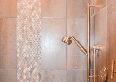
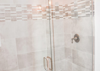
The rest of the master bath features neutral tones. A vertically stacked large grey tile with a stripe of diamond mosaic surrounds the shower. Multiple showerheads complete this well-appointed master retreat. A mix of metallic finishes gives the room that industrial contrast.
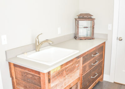
The nearby laundry room features another vanity created from the machine shed’s reclaimed lumber.
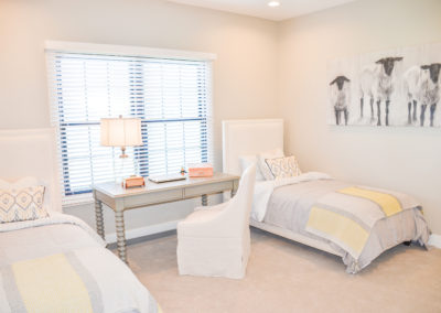
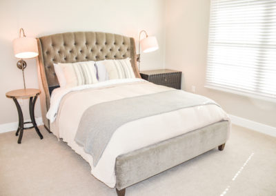
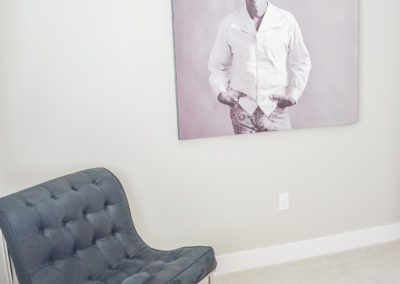
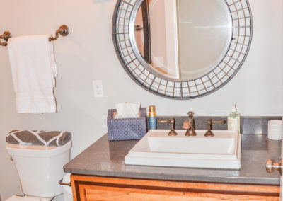
Two guest rooms are ready for when family wants to sleep over. While one room has twin beds, another, which has been dubbed “The Eastwood Room,” contains a large grey upholstered bed. The spaces are light and airy, continuing the grey and cream tones on the walls, bedding and accessories.In the guest bathroom, you’ll spot another unique reclaimed wood vanity, this one containing dark accents of Brazilian cherry. Again, adorned with iron handles and a grey quartz counter, this sink is topped with a round mirror with caged metal framing, hanging from a rope and giving it a very rustic industrial feeling.
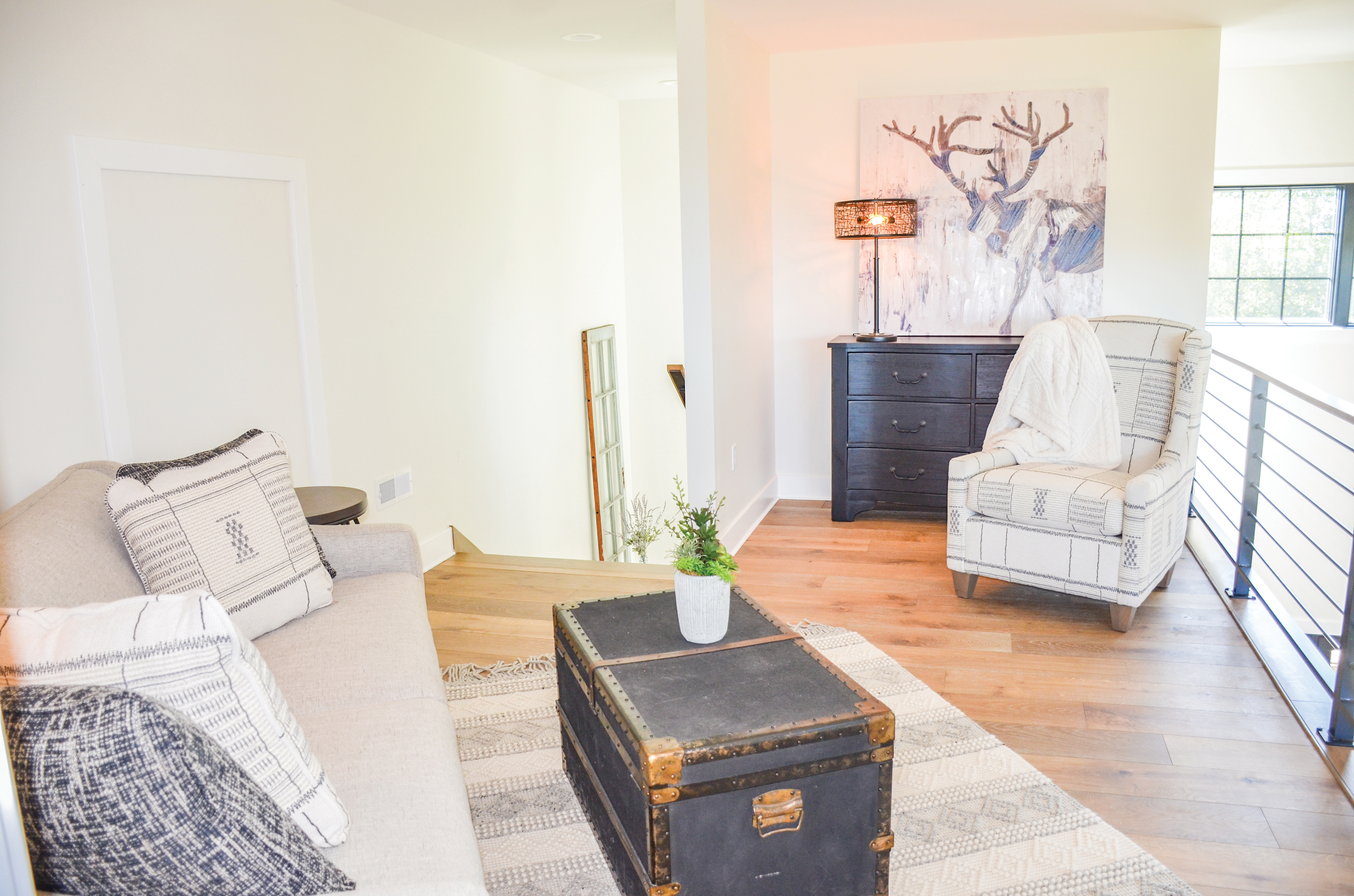
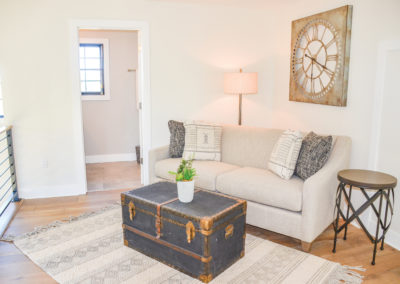
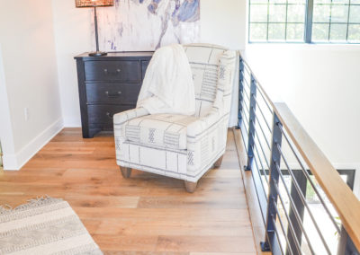
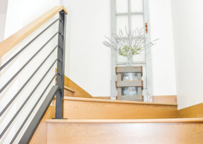
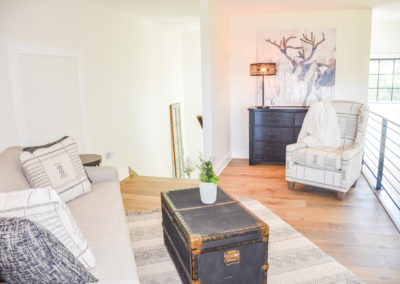
Meanwhile, tucked to the side of the main living area is a staircase that leads to a lofted area above the kitchen. Lined with a horizontal metal railing that furthers the industrial style, it opens to an additional seating area that can also convert to a sleeper. Utilizing a trunk as the coffee table, layered with pillows and textiles, this area has a cozy, softer style. From this height, you can look down over the entire living area below, giving you a bird’s eye view of all the activities that may be happening in the house. From this level, the second-story windows are aligned perfectly so that you can see quite a distance outside to the horizon. Obscured during the spring and summer, once the trees lose their leaves, the homeowners shared that from this vantage point you can see all the way to the river bottoms.
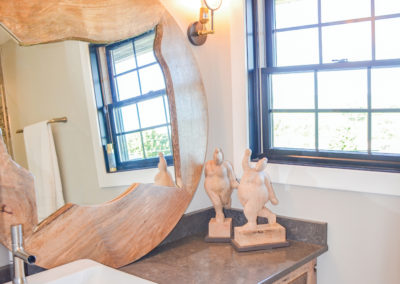
Just to the side of the lofted sitting room, you’ll find the bathroom with a reclaimed sycamore and oak vanity. This one is styled with a round, live edge framed mirror and wooden figurine accents, giving it a more rustic style than the rest.
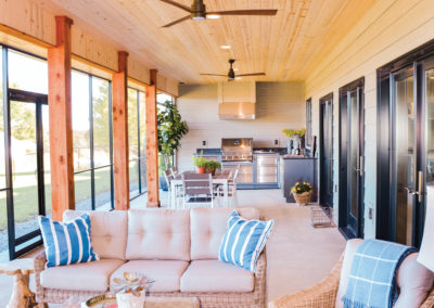
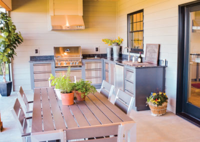
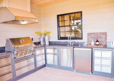
Back downstairs, if you follow the French doors to the back of the property, the homeowners extended the concrete pad in order to create an additional living space and an outdoor kitchen. The entire outdoor space is screened in to more comfortably enjoy the outdoors. Accented with rough sawn cedar posts and Smart siding, like the front of the home, this continues the couple’s goals of creating a home where the inside and outside flow together.
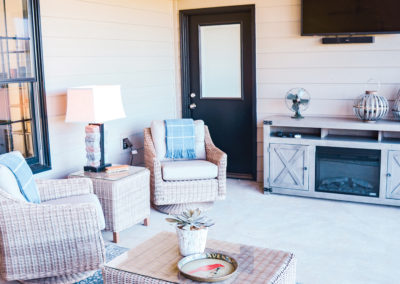
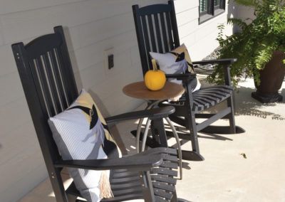
Overhead is pine shiplap that has been treated with a white glaze and sleek, modern black ceiling fans that tie in with the black window and door trim. The seating area features an electric fireplace furniture piece. They’ve kept the furnishings outside light and natural, while the outdoor kitchen is grey-clad with stainless steel drawers and grill. Since it needed to hold up to the elements, they utilized a dark granite for the outdoor countertop.
During the building process, it can certainly be hard to determine the exact size and scale of everything. At one point, the homeowners stood on the concrete slab that would become their home and voiced their concerns that perhaps it wasn’t big enough. To this, their builder Mike Luebbering reassured them it was. They are glad that they trusted him. Now, from the loft, looking down over their expansive three-bedroom, three-bath, 2,300 square foot home, they can rest easy knowing they made the right decisions.

