John and Kathy Hunt are transplants from the Kansas City area, where their spacious home was full of over-scaled furnishings and décor that defines the Johnson County aesthetic. The move to Jefferson City was a chance for them to start over with a fresh eye as to what would be most important to them. Their house hunt led them to a 2-story home in an intimate neighborhood tucked conveniently in the heart of Jefferson City. The home spoke to her immediately, and she knew they could make it their own.
As things fell into place and she had a vision for their home, Kathy visited Scruggs Lumber and met Regina Green, one of their designers. Sometimes you just know that things happen for a reason. It turns out that John and Kathy’s new home was built by Regina’s husband and was the first home they built together in 1999. An instant connection was formed.
Even though the designer and her husband originally built the home, she saw the vision that Kathy had to make it her own. Together, they took a space in need of updating and gave it a modern reinterpretation.
Large and Open
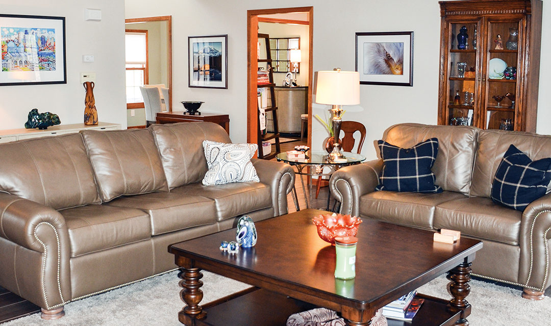
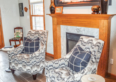
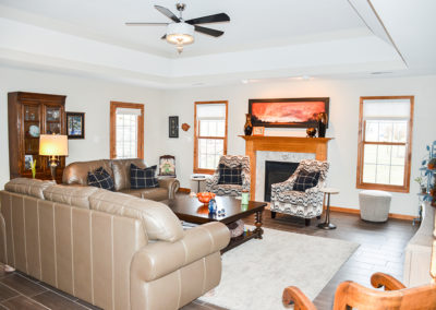
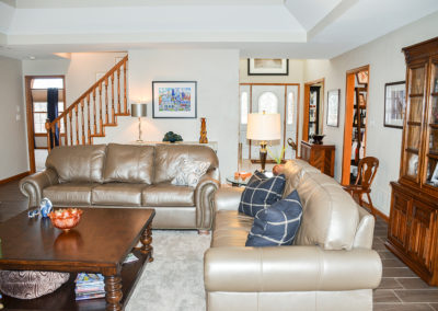
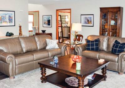
To kick off the transformation, every finish in the home was updated. Starting in the entry, they chose wood-look ceramic tile which flows through the main living areas. Paint is another common thread. Accessible beige is the perfect neutral color used to create a warm and cohesive backdrop throughout. Comfortable leather sofas pair with flame print armchairs which flank the fireplace. The living room is a relaxing retreat for just the two of them, and it is ready for large gatherings of family and friends.
Open concept doesn’t work for everyone and every house. She didn’t try to take down walls in order to achieve a completely open concept. She celebrated the good bones of the original floorplan which naturally flows through large openings in the common spaces making the rooms feel large and open.
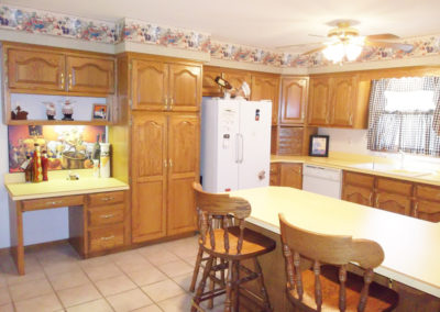
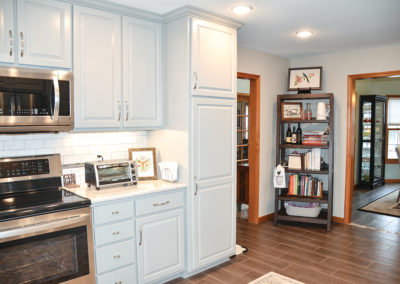
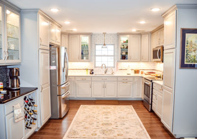
The most transformative change in the kitchen was the removal of a peninsula that jutted into the walkway. She then worked within the existing footprint to keep the efficient work triangle. She chose not to introduce an island to the kitchen in order to keep the space open. Kathy loves to cook and entertain, so naturally she was concerned that this was the right decision. After their first gathering, she knew she had made the right choice. There was ample room for everyone to congregate…which is what always happens in a great kitchen.
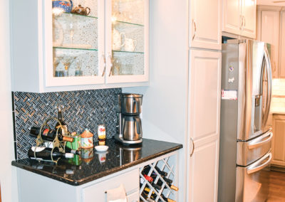
She can’t say enough good things about her cabinet maker. He considered how Kathy uses her kitchen and what specific storage needs she had. They planned built-in convenience features to house kitchen gadgets and small appliances, as well as adding a wine rack and much-needed storage.
Color & up-to-date materials
Kathy worked with Regina and her team of craftsmen to source new finishes for virtually every other area in the kitchen, including floor tile, cabinets, hardware, appliances, countertops, backsplashes, lighting and paint.
The once lackluster kitchen was successfully transformed into a chic modern space—hardly recognizable from its previous state! The change from “before” to after’ is dramatic, and the homeowners together with well-chosen craftsmen pulled it off without any major challenges.
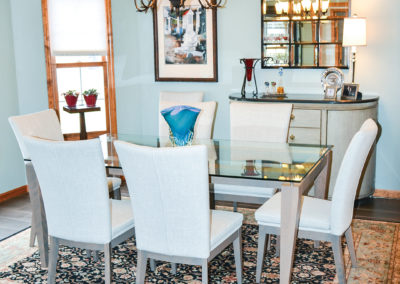
The dining room and kitchen are open to each other making it super easy to entertain. Modern dining room furnishings were chosen for a fresh uncluttered look.
They found the original hemmed-in kitchen space too confining, so they used color and current materials to give it an expansive perspective. With the existing outdated wallpaper, laminate countertops, fading cabinets, and inadequate overhead lighting, this kitchen was in desperate need of an overhaul to meet the modern-day needs of the homeowners.
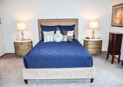
The master suite became the private retreat for the Hunt’s to enjoy. In the bedroom, she chose French Grey for the backdrop of this soothing transformation. Kathy aimed for simplicity in design and choose modern furnishings with simple lines. The navy bedding which contrasts against the warm grey upholstered bed is stunning.
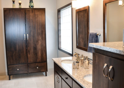
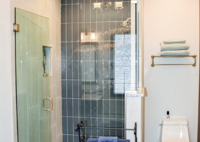
In the master bath, they considered several options to recreate the space. By removing a half bath, corner jetted tub and doors which closed off the space, they were able to work with a blank canvas and imagine the true potential. Ultimately, they decided to keep the original plumbing layout, but they transformed every surface! New modern cabinetry, countertops, and fixtures were chosen to create a beautifully restful retreat. The shower is a study of how to create a striking design just by using a combination of tiles and installing them in an imaginative way. The contrast of the large ceramic tile with the glass subway tiles is a perfect example of how to get a big impact without breaking the bank!
Ample room to relax & entertain
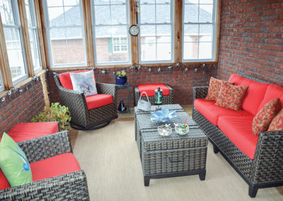
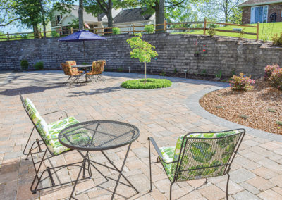
Outdoor living spaces are important to Kathy and John. They immediately fell in love with the existing three-seasons room and use it often. When they saw the level, backyard defined by a large curved retaining wall, they immediately saw its potential. They added a spacious curved paver patio designed with an accent border to tie into the retaining wall material. Beautiful landscaping was added to soften the hard edges. The family now has ample space to relax and entertain outdoors.
The end of every building project naturally comes with a sigh of relief. The sense of satisfaction you receive knowing you’ve realized your original vision evokes a variety of emotions, like knowing that you’ve been given a new opportunity to start fresh, and make new memories sharing a beautiful new beginning with family and friends.
SUPPLIER LIST
Paulette Designs Inc
Mid Missouri Surfaces
Johnston Paint & Decorating
Scruggs Lumber
Tile Layer
Custom Cabinets & Woodworking
Schaefer Electric
Chiles Electric
Leon Muenks Insulation
Superior Heating& AC Vents
Winsupply
George’s Plumbing
DKB
Eldon Furniture
Restoration Hardware
Home Depot
Lowe’s
Bright City Lights
Container Store
Mark’s Mobile Glass
Bradys Glass and Paint
Dillard’s
JC Penney
Schaefer House
River City Florist
Uniquely Rose

