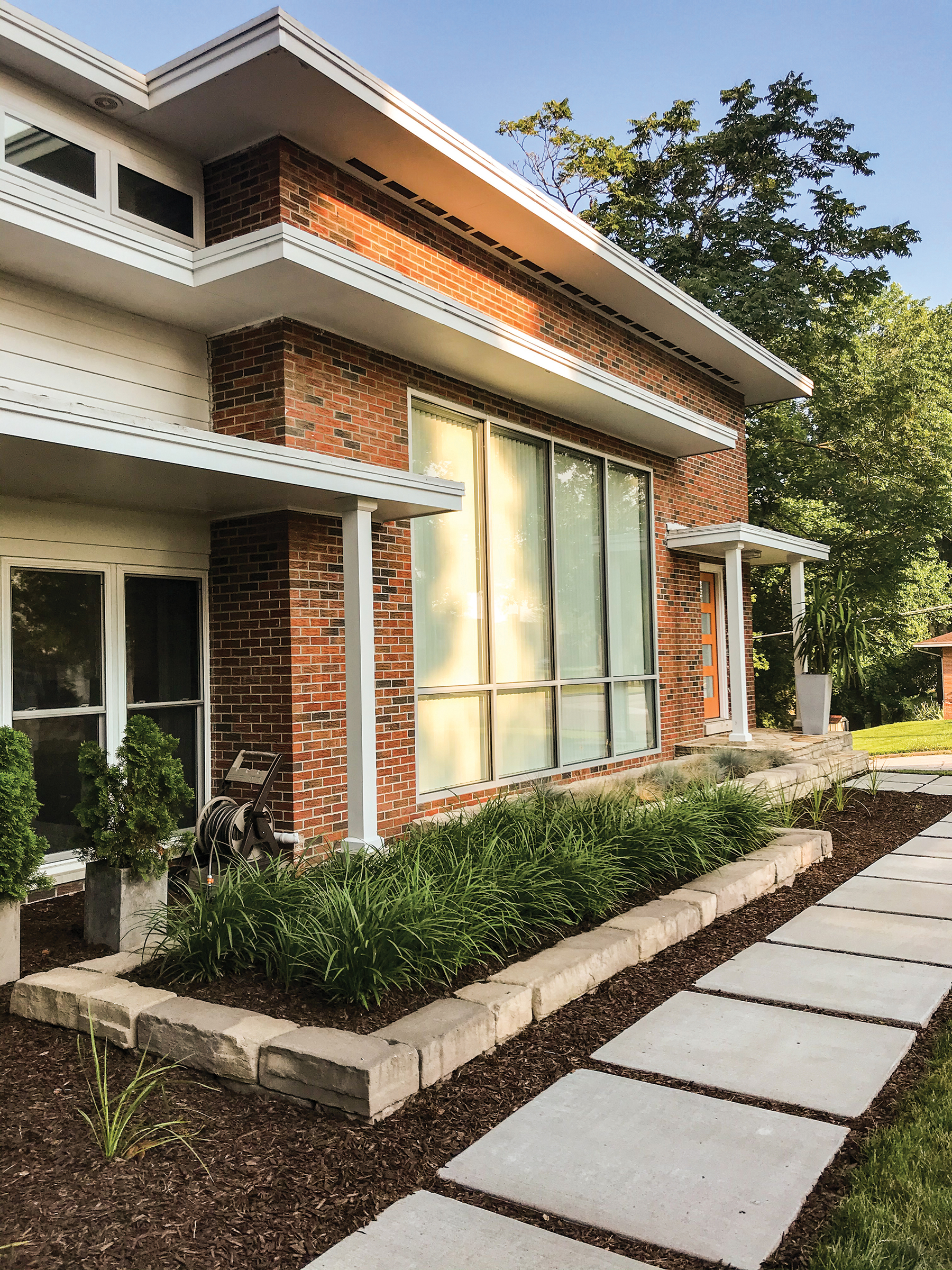
Jonathon and Amanda Prouty met in 2010, married in 2012, and then moved away from Jefferson City for their careers. While away they lived in a condo with a very modern aesthetic. They fell in love with the open and minimal feel of modern architectural elements and home design.
When they came back to Jefferson City, they began searching for their home by driving around town and identifying homes they liked. Even though these homes were not for sale, they wrote letters to the homeowners expressing interest and asking if they would be interested in selling. Out of all the letters they sent out, only one homeowner responded. Fortunately, it was the home at the top of their list… a wonderful midcentury modern marvel.
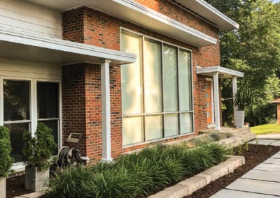
Having survived multiple owners and design choices since it was built in the mid-fifties, the integrity of the original midcentury modern style architecture still stood. Jonathon and Amanda were fortunate to acquire the home after the previous owner had done the first wave of renovations, peeling back layers of flowered wallpaper and old carpet, providing a clean slate of white. They enlisted the help of Markway Construction and Tina Davis to help them put together a plan and complete the project.
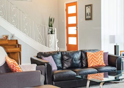
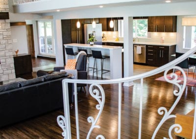
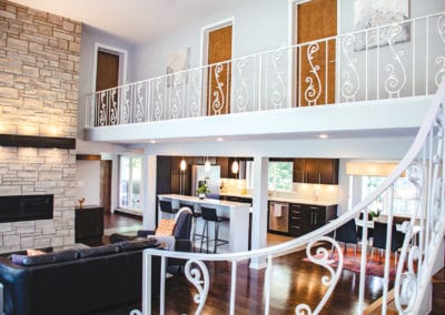
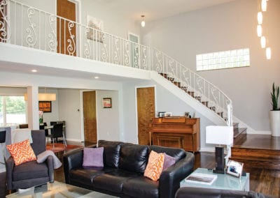
Opening into the living room with spacious 15-foot ceilings, a modern light fixture, glass block window, and contemporary front door illuminates the expansive ceiling height. The extra-wide staircase, an original feature of the home, is a major hallmark of midcentury architecture. The organic curve of the rail and stairs is a stylish undercurrent of form and function so prevalent in the mid-20th century. The home’s original hardwoods, which they refinished in a darker tone, the staircase and railing were in beautiful shape and remain as a nod to the home’s history.
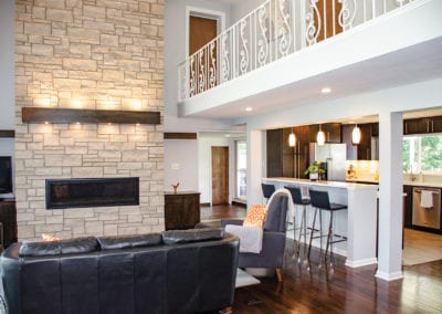
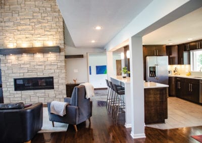
However, they took the opportunity to remodel the fireplace to make it a standout design feature. Once a small-scale fireplace, the new limestone surround reaches from floor to ceiling, balancing out the proportions of the room and emphasizing the room’s height. This fireplace is more contemporary than retro but warms the space with the sleek horizontal gas fire feature. LED lighting in the wood beam casts beautiful shadows and illuminates the space adding dimension to the design.
Flanking each side of the new fireplace is cabinetry which houses their electronics on one side and a bar that is easily accessible when entertaining. The bar is stocked with glassware and all the necessities to keep the cocktail culture of the 1950s and 1960s alive and well.
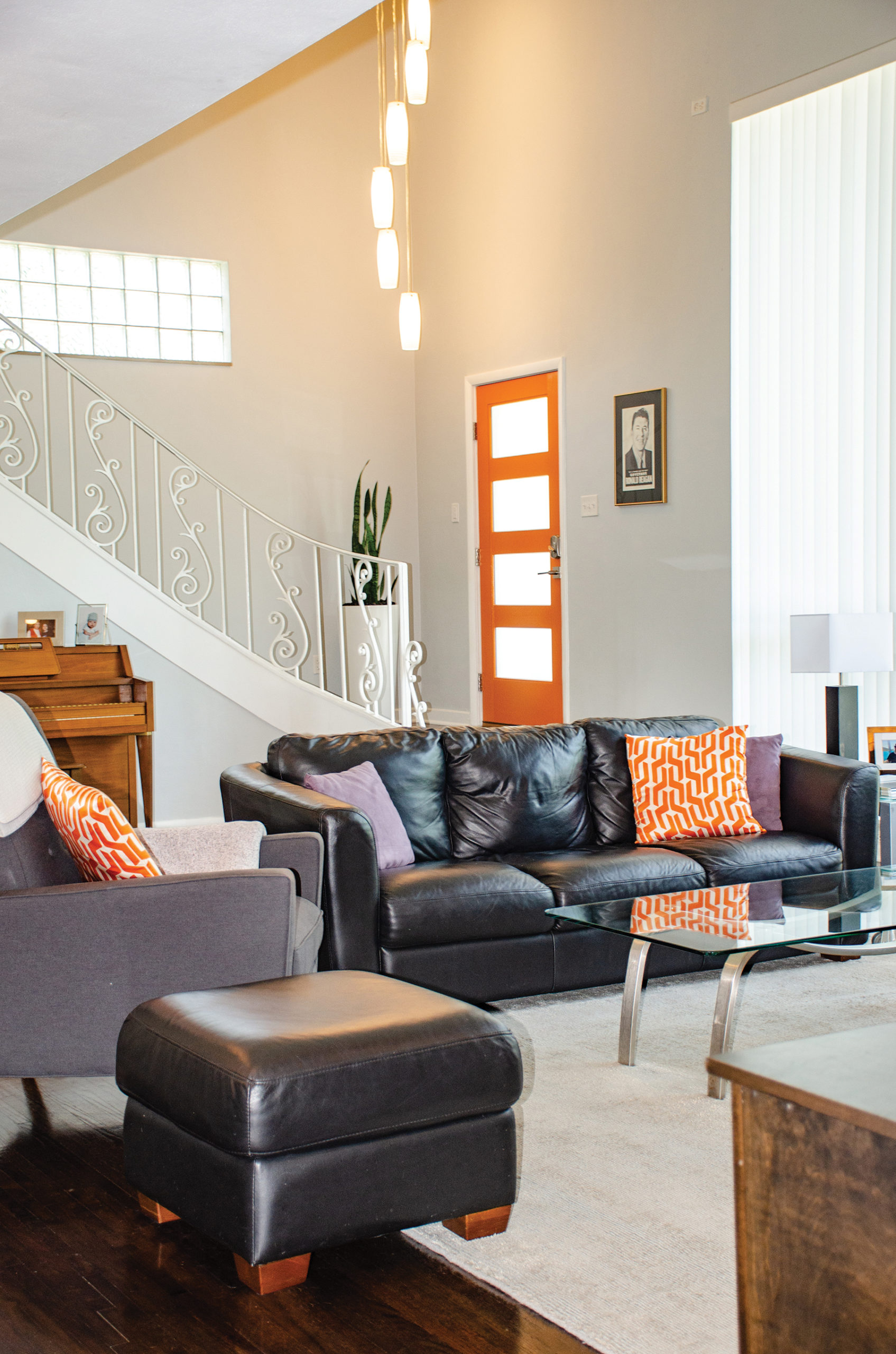

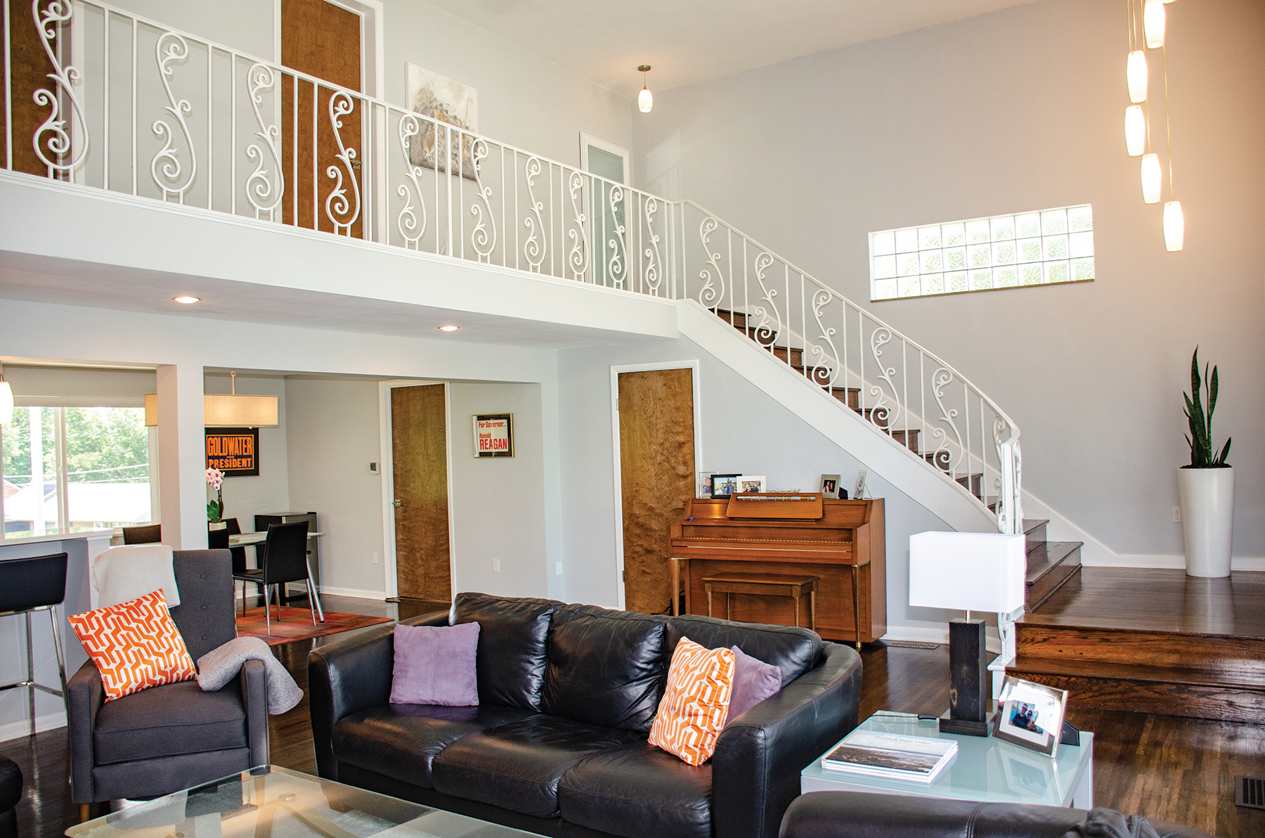
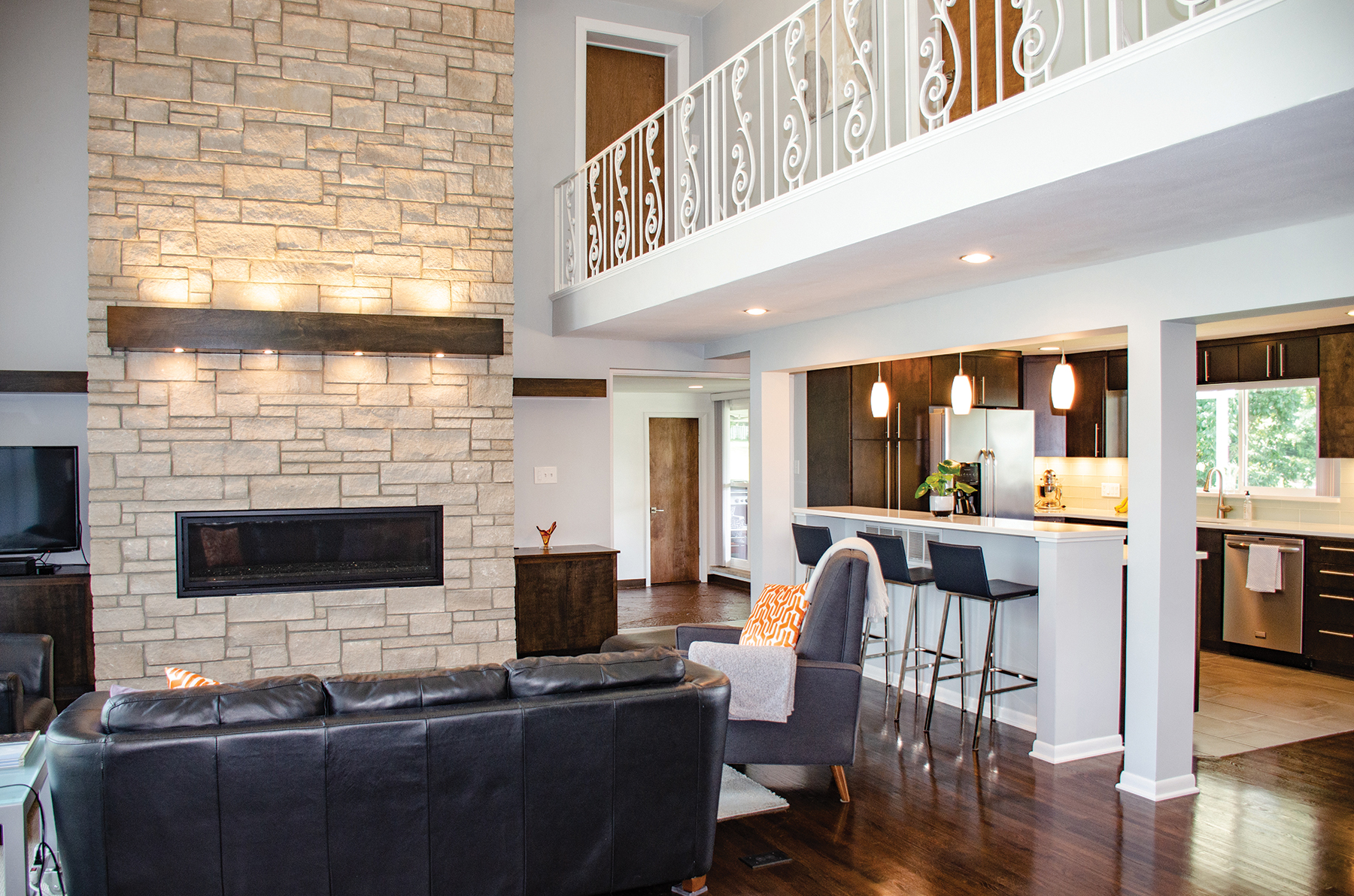
Choosing the right materials is essential to executing a well thought out design, especially when working with the clean modern aesthetic of a midcentury modern home. By keeping the walls grey, they are able to showcase their quality pieces. And the room’s neutral palette allows their artwork and black leather furnishings to stand out. It is important in midcentury design to harmonize shapes, fabrics and finishes, while pairing a few well-chosen materials and organic shapes with sharply framed pieces to give a well pulled together cohesive look.
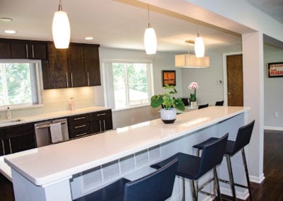
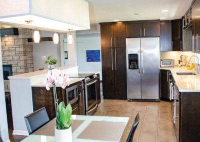
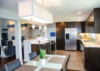
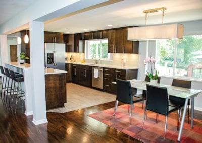
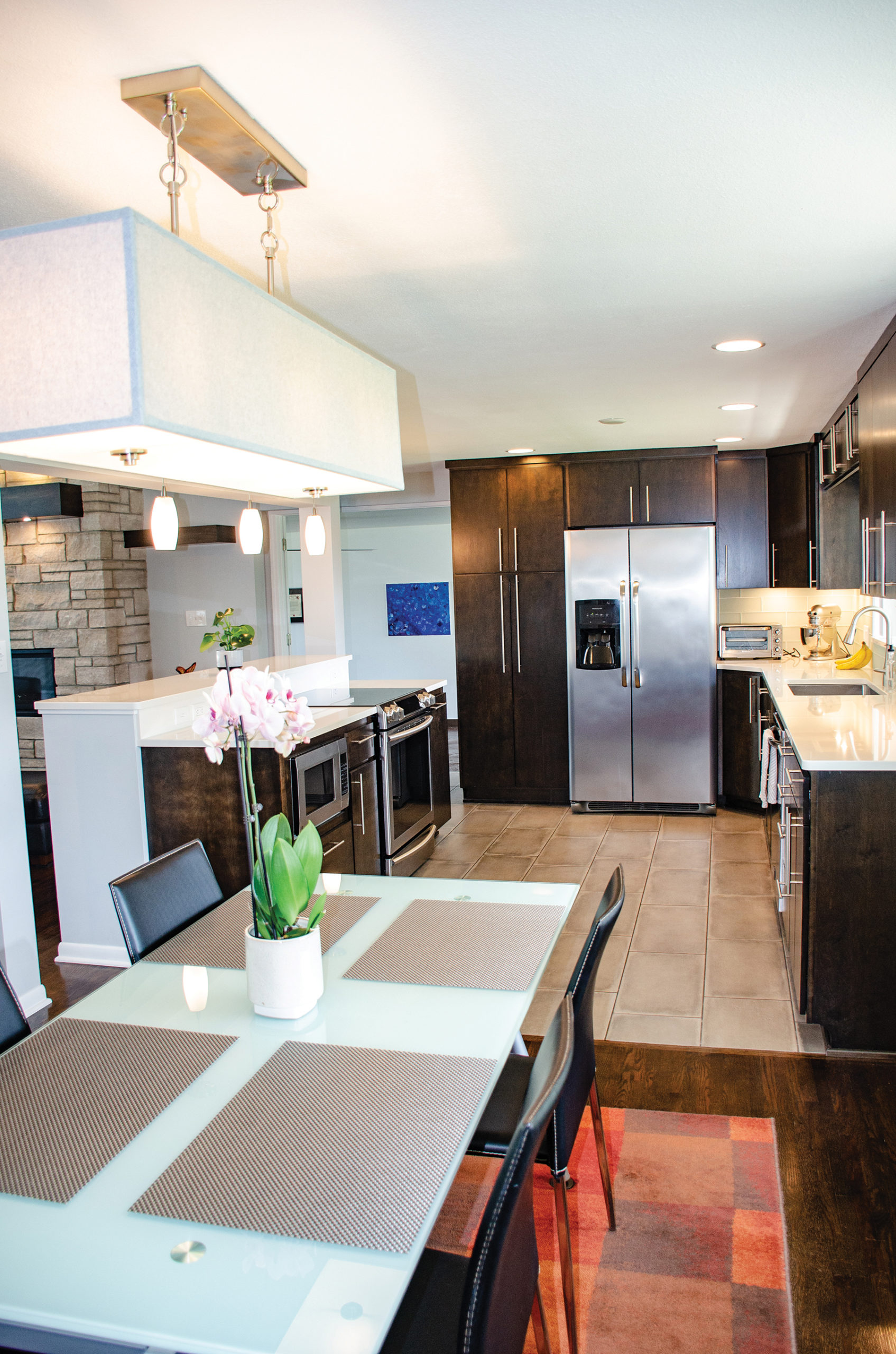
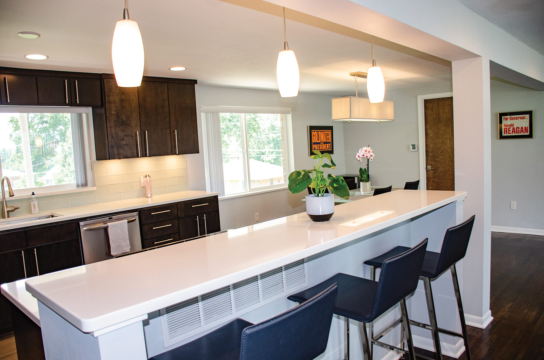
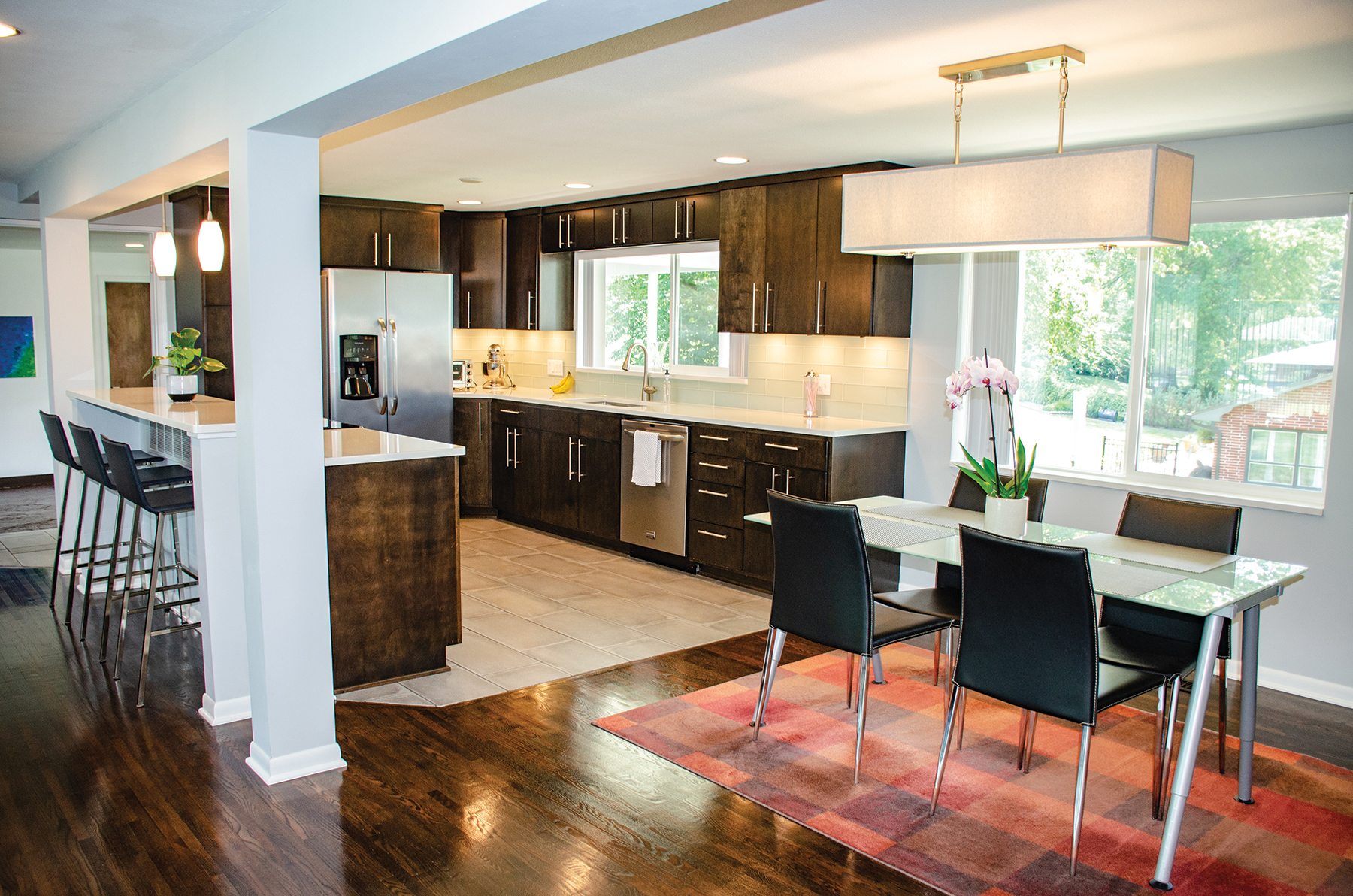
Jonathon and Amanda took the renovation to the next level by eliminating the stairwell to the basement, thereby opening the walls that separated the small galley kitchen from the living room. With such a simple floorplan change, the new kitchen provides much more room for the couple to move around and entertain without being closed off from their guests. The subtlety and thoughtful craftsmanship make this midcentury-style kitchen timeless. The clean lines of the rich wood cabinetry showcase the solid slab doors in a rich wood finish. Modern hardware paired with lighting that could’ve been original to the house look fresh and modern. White Cambria quartz countertops with a barely blue frosted glass subway tile offer a brilliant contrast with the beautiful wood tones.
Jonathon and Amanda spend the majority of their time in the kitchen, dining, and living room, and with a design like this, it’s easy to see why. These spaces are so well done, that they offer the flexibility for when it’s just the two of them, and the flow and function they’ve created is perfect for entertaining family and friends. The now completely open floorplan has a high-style modern midcentury vibe!

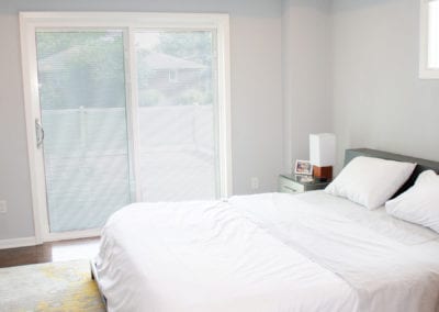
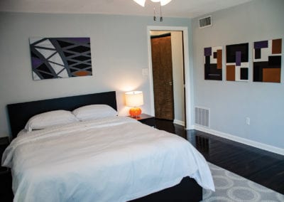
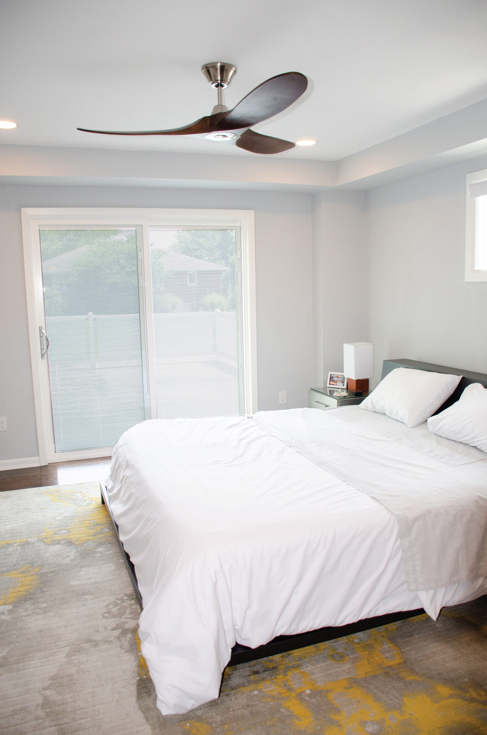
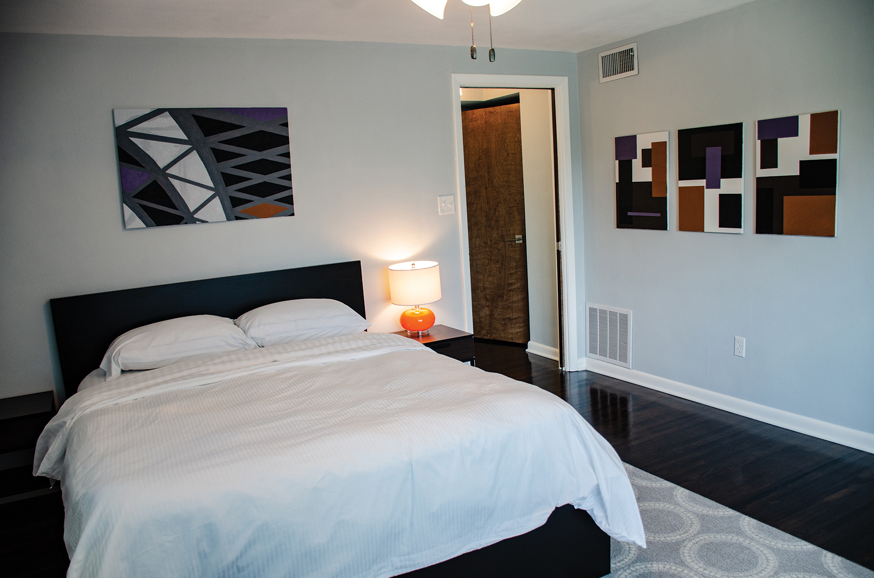
Up the grand staircase are the master suite, two spare bedrooms, and an additional bathroom. The master bedroom is a calming palette of blue-grey and white, bringing a sense of serenity to the space. The master closet was created by borrowing some space from a large adjoining bedroom and using barn door hardware on a contemporary slab, they created a space-saving door. Sliding doors also lead out to the flat roof above the garage. Frosted glass panels combine with metal to create a railing structure which gives a new modern accent to the original architecture of the house.
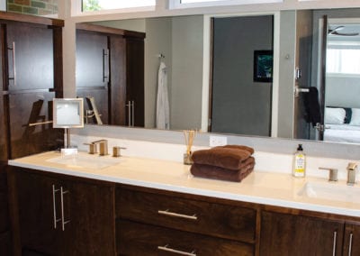
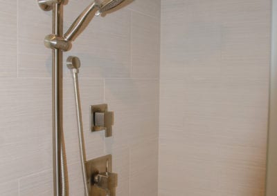
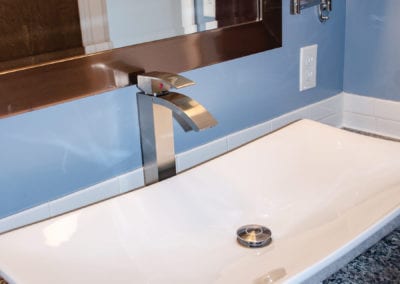
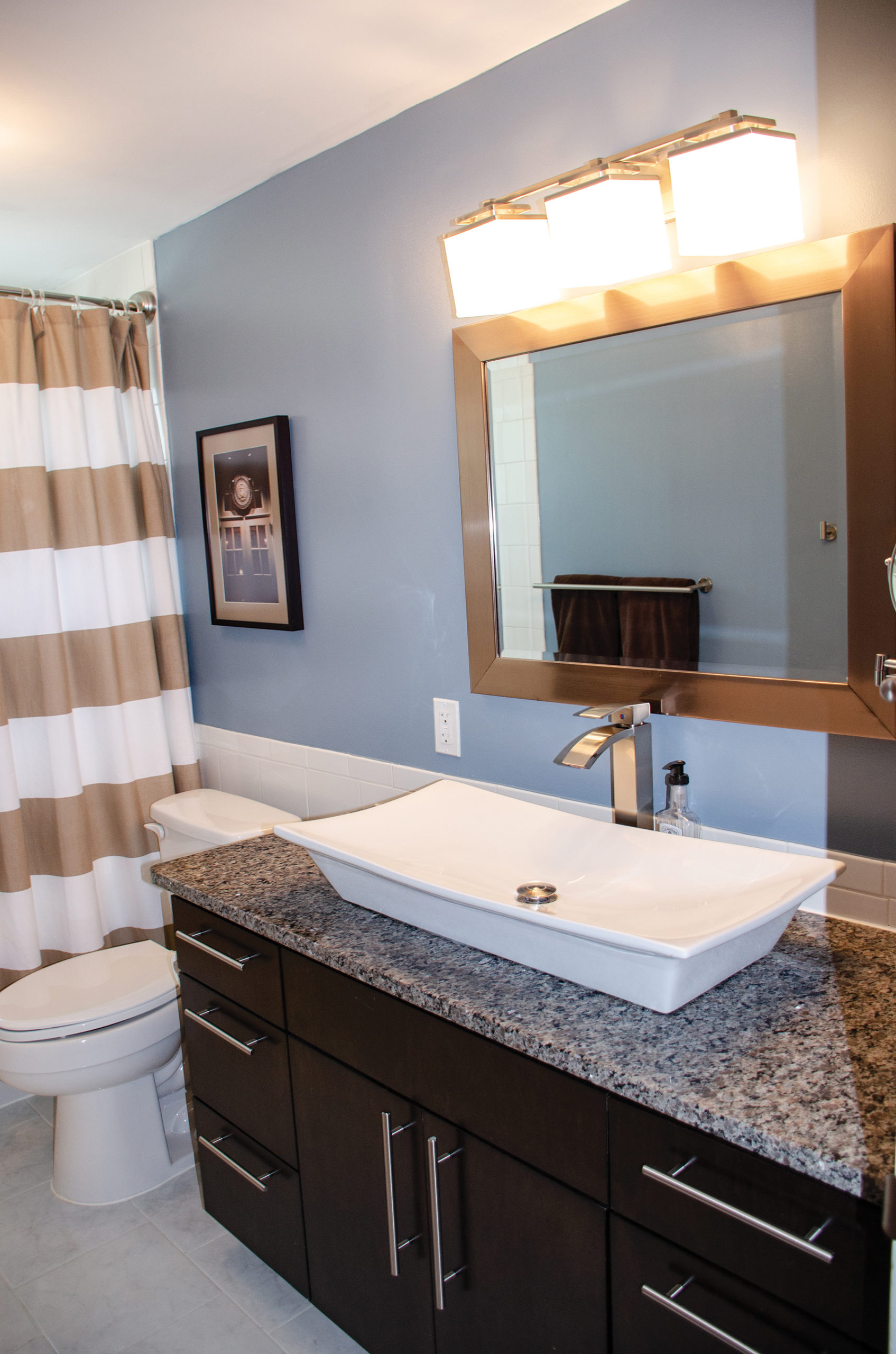
The new master bath has storage, storage, and more storage. Perhaps the best use of space that we’ve seen, they included a generously sized shower, custom cabinetry housing wardrobes with drawers for clothes storage, and dual sink vanity with more drawers for all the necessities. The large mirror combined with the clerestory windows that line the width of the room make this beautiful retreat bright and light.

They enjoy having large bedrooms, and they have a second master for their guests. In this room, as throughout most of the house, the artwork and framed photography were created by Jonathon and Amanda. Jonathon works in politics, and they have collected several framed posters displayed on the main level that are a nod to his profession.
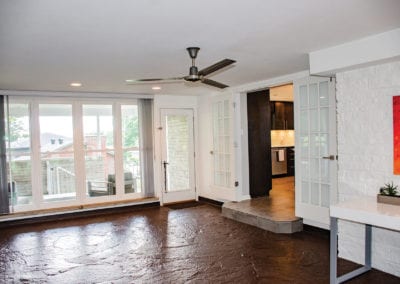
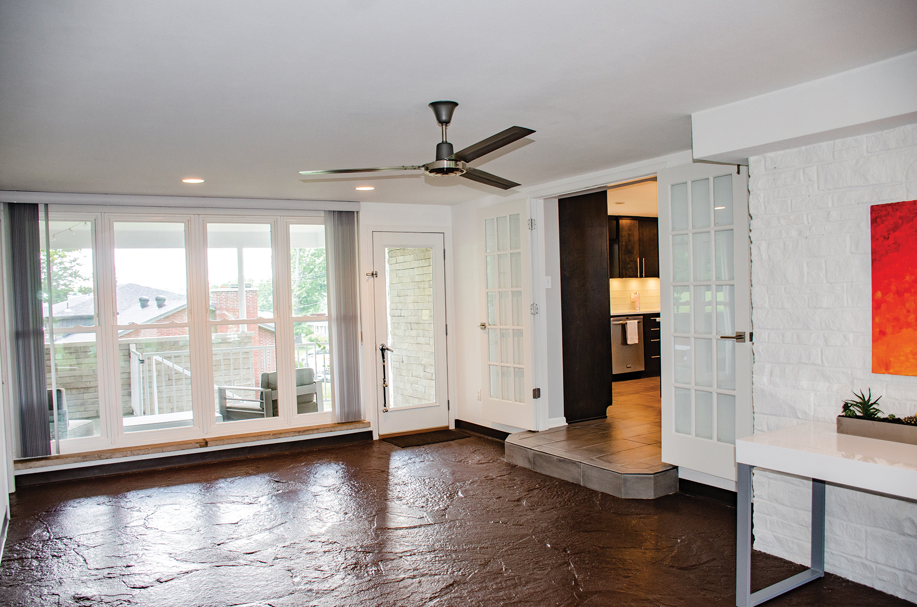
The breezeway leads to the 2-car garage and the outdoor space. The original flagstone floor is painted and there are French doors that can close off this space when not in use. Another throwback feature of the home is the outdoor grill that is vented through the flue. It is in full working order.
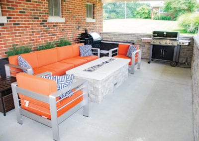
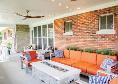
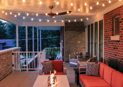
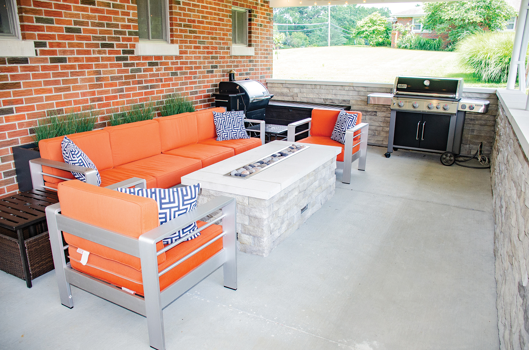
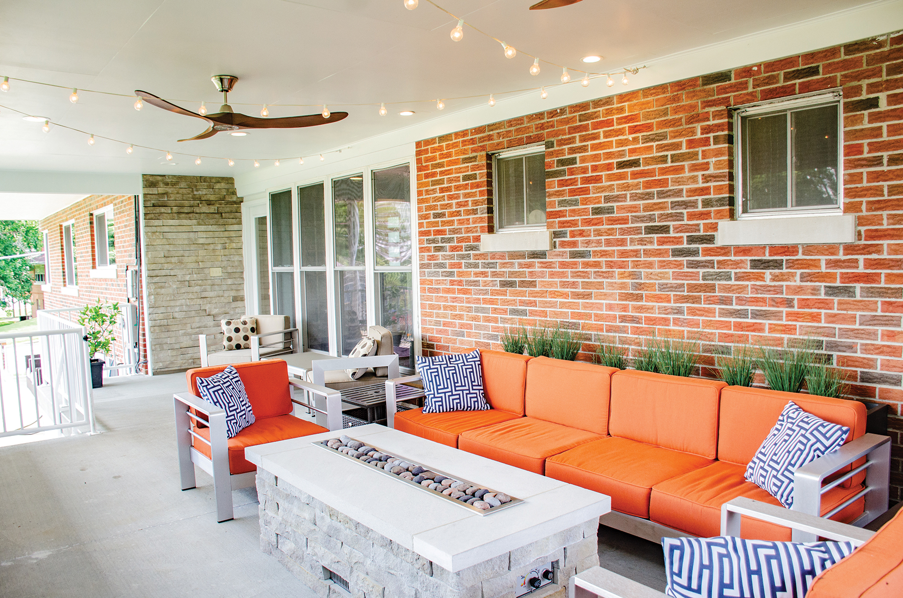
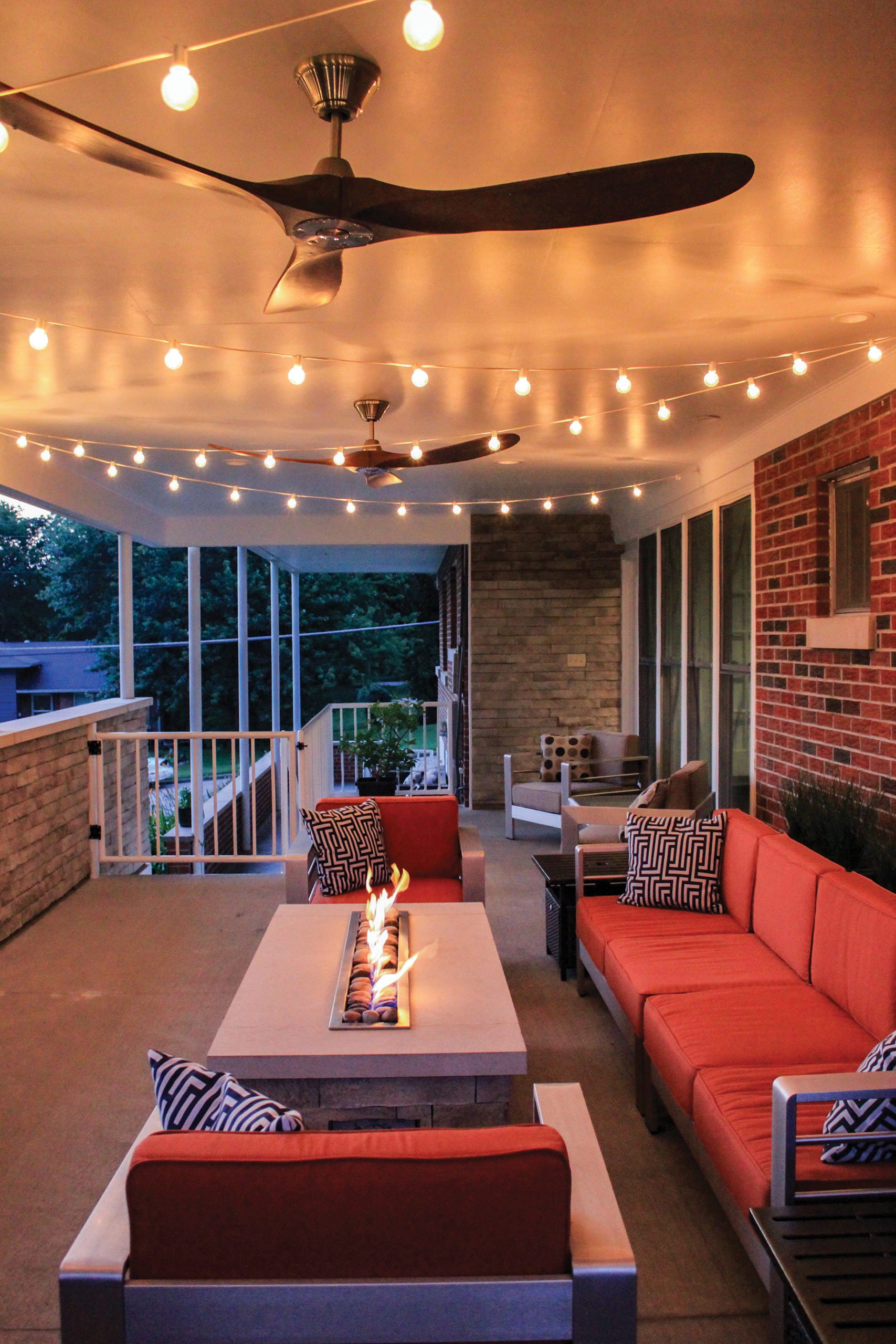
They’ve extended their indoor design aesthetic into their outdoor space. The elongated covered space is beautifully designed with white stacked stone tile lining the two outside walls. A natural finish on the concrete is easy to maintain and has a clean modern appearance. They approached the area in zones. First, they addressed where they would place their grills, and Jonathon chose to put them at the very end of the space where they would be safely tucked against the end wall. Then the seating area anchored by the gas fire pit which is custom-designed to make the best use of the long and narrow space. The clean linear design elements repeated throughout the home honor the original architectural intent. They softened the brick wall behind the sofa with three planters with greenery. They brought the orange accent colors outside on the cushions and coupled them with the sleek design of the brushed stainless-steel furnishings. Adjacent to this they have placed two chairs right outside the door. It is an intimate space, perfect for morning coffee. Best of all, ceiling fans keep everyone cool and party lights set the mood for fun. Down the stairwell, there is more seating on the lower level of the patio. All the spaces are covered so they can be used no matter the weather.
Amanda gives Jonathon credit for his design sense. While they both have original artwork featured throughout their home and clearly have great style, she let him take the lead on the design choices because “I always love what he comes up with.” That is quite a compliment when you stand back and observe the skillful application of midcentury modern décor. He used amazing restraint in not overdoing the vintage design choices. He skillfully mixed in contemporary touches, resulting in clean lines, organic forms, minimal ornamentation, and high function resulting in an undeniable timeless appeal.
SUPPLIER LIST
Jude Markway
Tina Davis
American Drywall
Best Fire Inc.
Bond Painting
Builders Screen
Capital City Home Maintenance
Cole County Industries
DeLongs Inc.
Don Bernskoetter Plumbing
Grey Stone Foundation
JCL Hardwood Floors
Jeremy Peters
K&S Masonry
Lehman Heating
Lewis Irrigation & Landscaping
Mark’s Mobile Glass
Michelle Jansen
Mid Missouri Surfaces
Midwest Block & Brick
Midwest Welding
Pleus Cabinets
Randy’s Insulation
Rusk Home Improvement
S&K Roofing
Sommers Interior
Steve Sandbothe
Thomas Electric

