Neglected, abandoned, and full of possibilities. Having sat vacant for two years, this lake house needed a lot of attention when Brad and Karen Werner came across it. However, while their previous attempt to remodel a lake house ended in a teardown and new construction, the bones of this home were ideal for a remodel, and they were excited by the opportunities this home presented as a vacation home for their family.
Overall, the design and layout of the aging home were good, but they knew it would need additional square footage in order to improve the flow and make room for their ever-growing family. They have a very close family and they wanted to do everything possible to keep their kids coming back to enjoy time together at the lake. To help solve this issue, Karen worked with Paulette Kreter of Paulette Designs and Dave Perry with Turks Construction to help with the layout of the house.
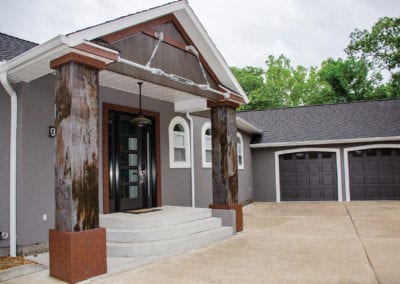
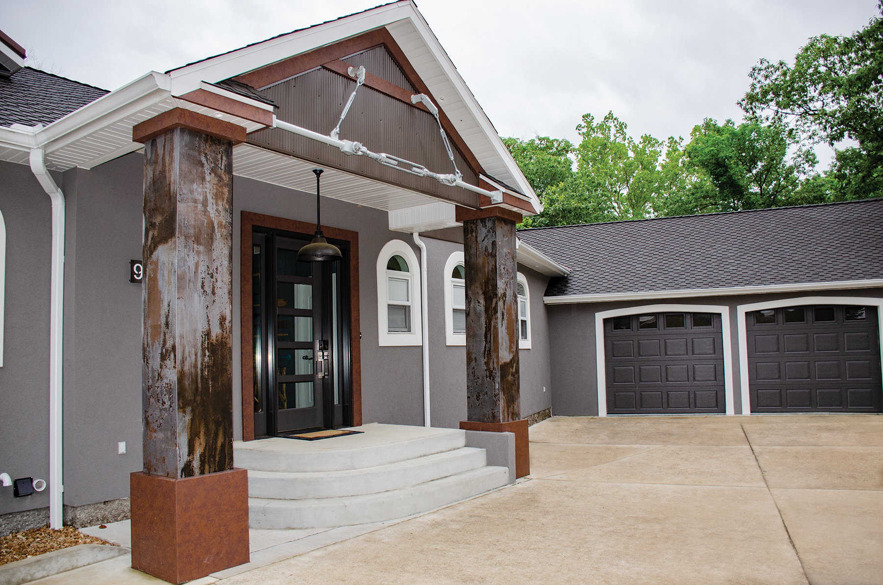
From the moment you drive up to this home, you get the impression that this may not be your typical home. With substantial stone pillars, industrial hardware and a sleek contemporary front door, they set a tone for the unique interior that you are about
to enter.
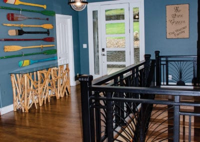
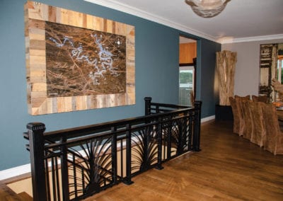
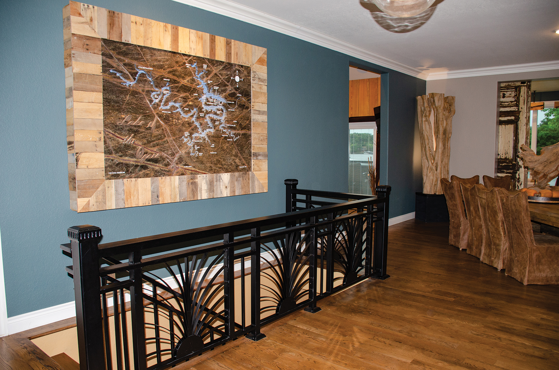
With direct nods to its Lake roots, the entryway walls feature both boat oars and a custom designed map built by Carved in Stone. Truly a showpiece, the map resided in the shop’s showroom during the home’s remodel and is actually a backlit water feature that uses recirculating water to add movement.
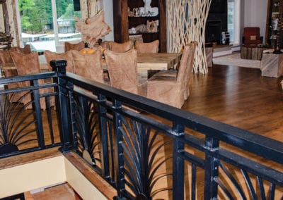
A new sleek black industrial stair railing with a flowing fountain-like motif contrasts with the organic driftwood branch side table on the opposite wall.


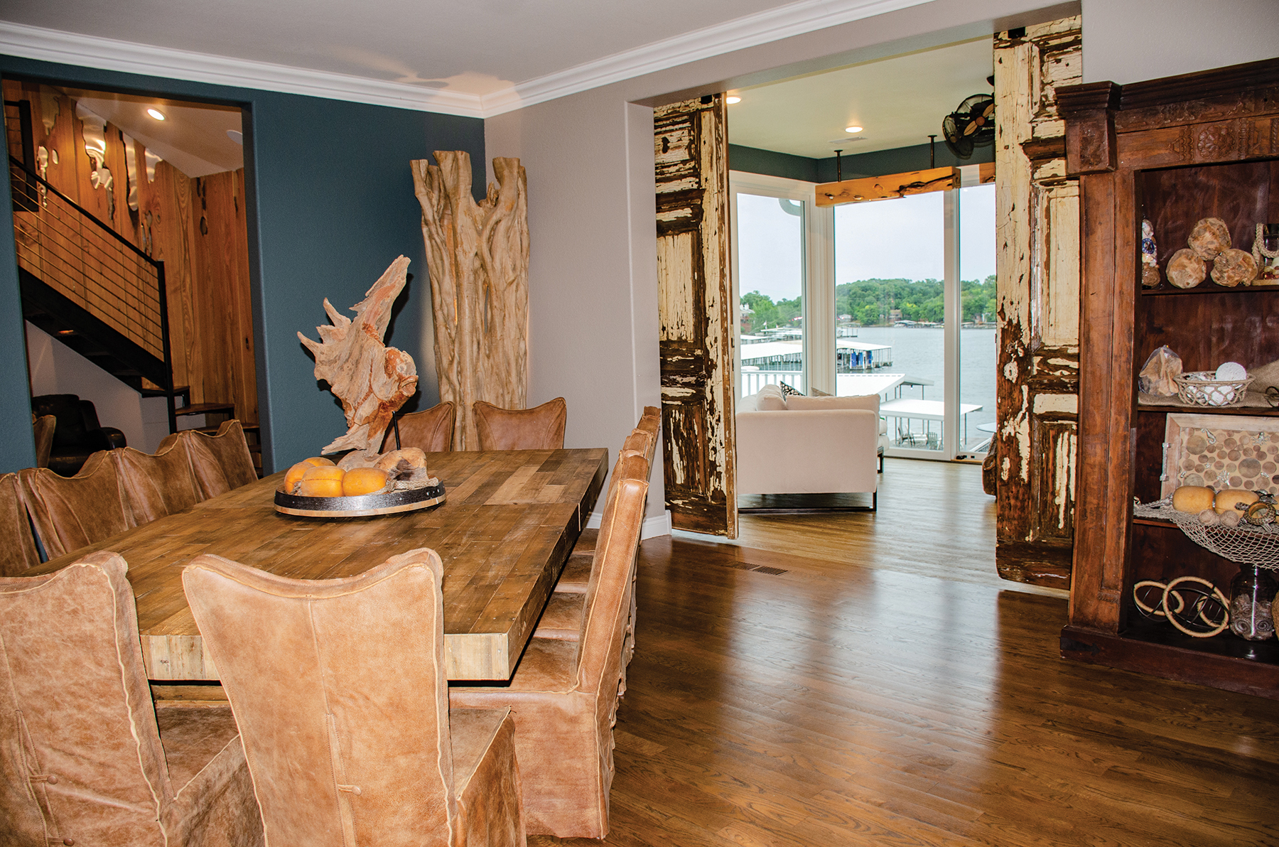
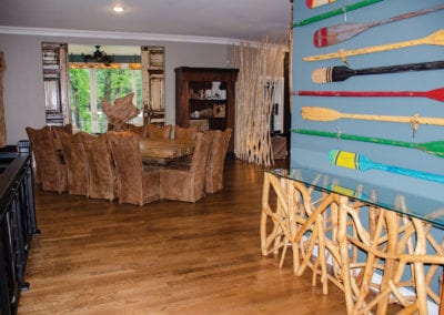
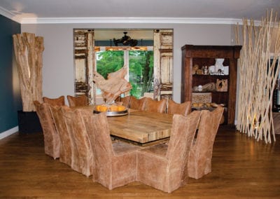
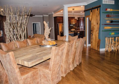
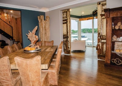
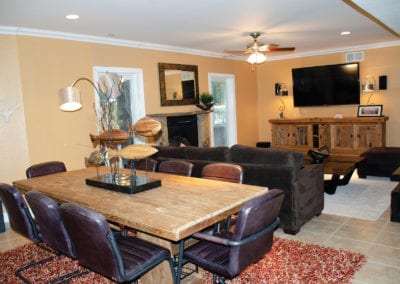
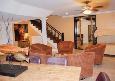
Continuing into the home, the space flows into the dining room, anchored by a sturdy wooden table that seats 14 and is perfect for family gatherings. Warm brown tones stand out against the lake blue and grey walls, creating a backdrop for the wooden features and artwork to pop.
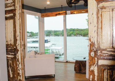
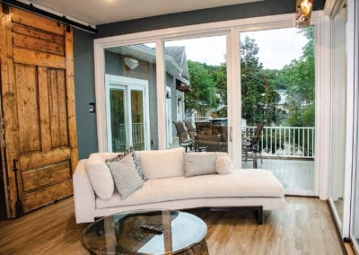
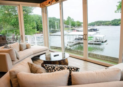
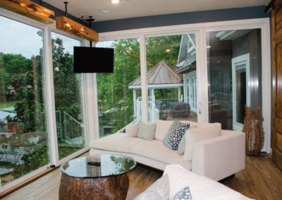
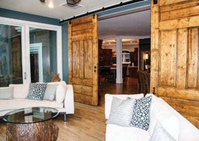
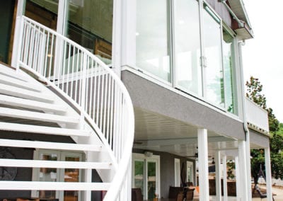
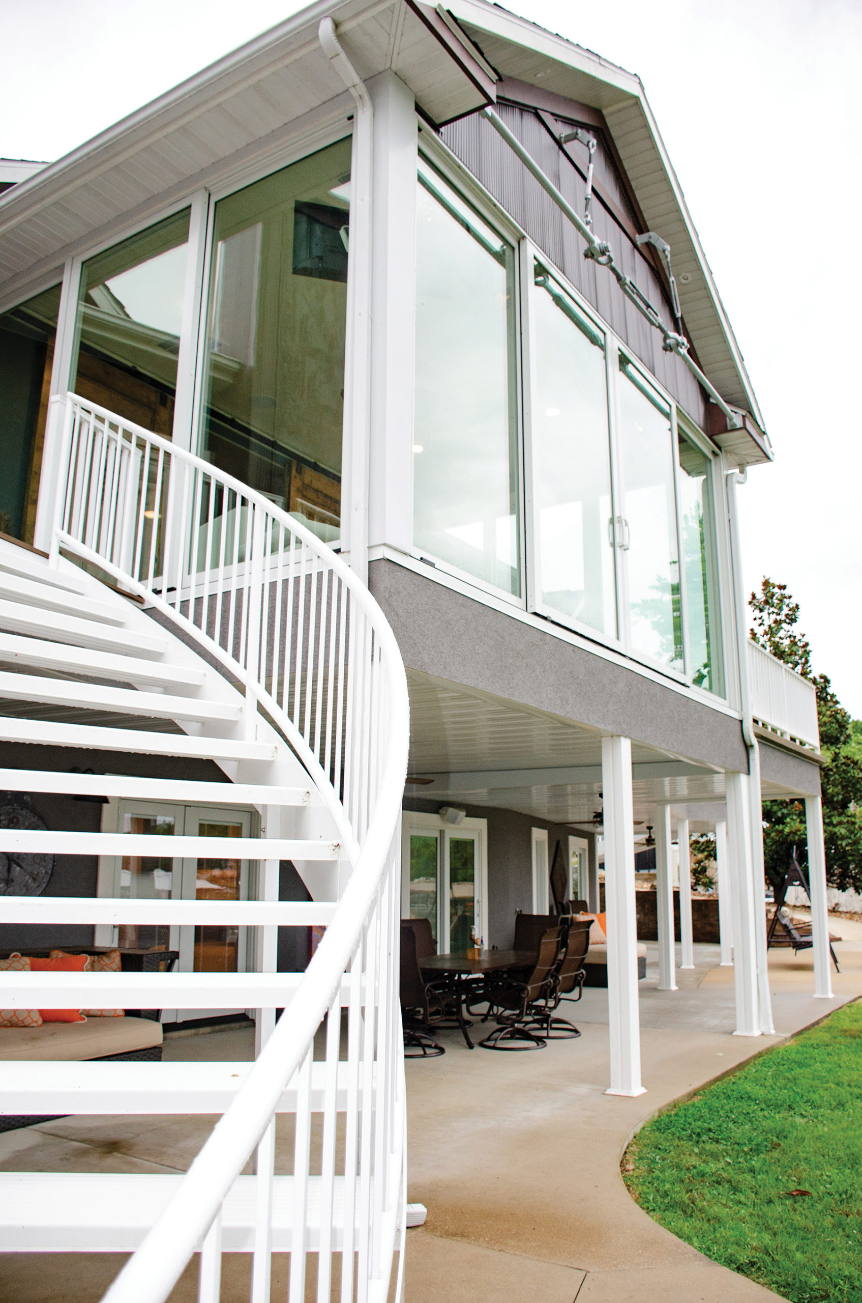
The home’s real showstopper is just a few steps away. Through the massive distressed castle doors—just one of the couple’s interesting architectural finds on a trip to Alabama—is a room that was originally a screened-in porch. But one look at the stunning lake view and the couple knew that they wanted to glass in the space to keep the view as unobstructed as possible. However, as you might imagine, they were looking at huge budget numbers for that amount of glass. Thankfully, a Pella representative was on-site the day they were discussing their ideas for the room and he suggested using Pella’s new 9-foot doors. The modified doors are the perfect, unexpected solution to keep this entire room as open as possible.


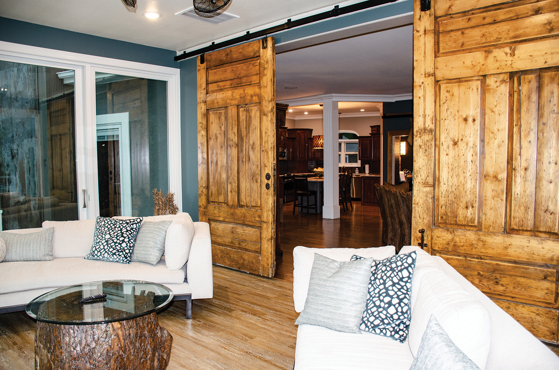

While Brad is a skilled carpenter, builder and all-around talented craftsman in his own right, the Werners also enlisted the help of their old friends, Ed and Kathy Mueller with Up a Creek in Style. This couple who have been involved in the distinctive custom wood features that have become a trademark of their renovations and have been woven into this home’s design. In this sunroom, a unique set of wooden lightboxes take advantage of catalpa wood’s beautiful imperfections to cast a gentle glow over the space.
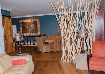
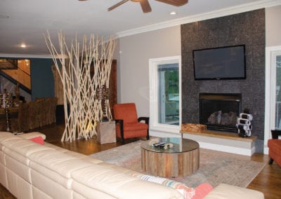
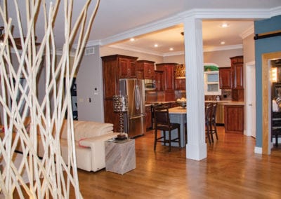
Back in the main space, the dining room, living room and kitchen are open to each other, with the spaces defined by strategically chosen furnishings. Between the dining and living rooms, an organic wood branch creation serves as both part artwork and part
room divider.
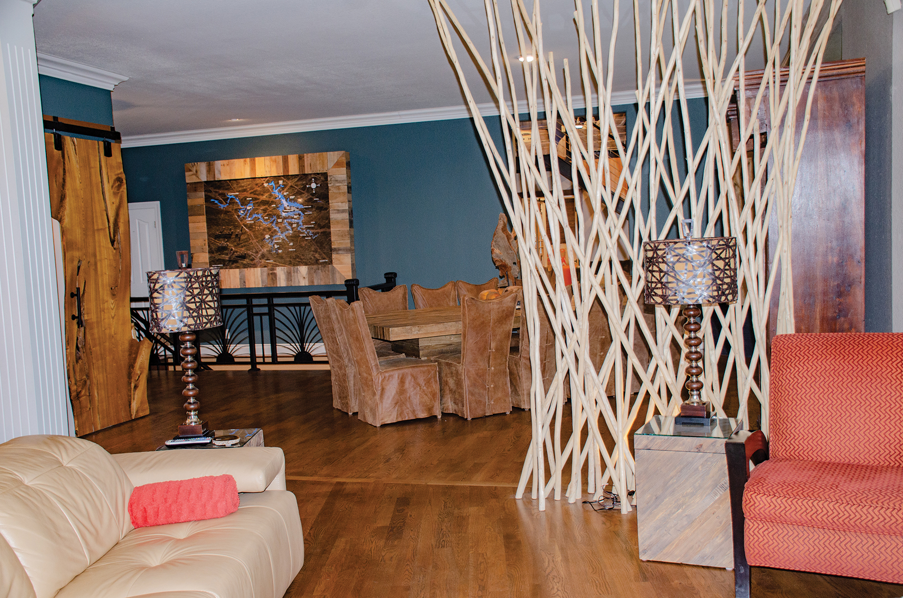
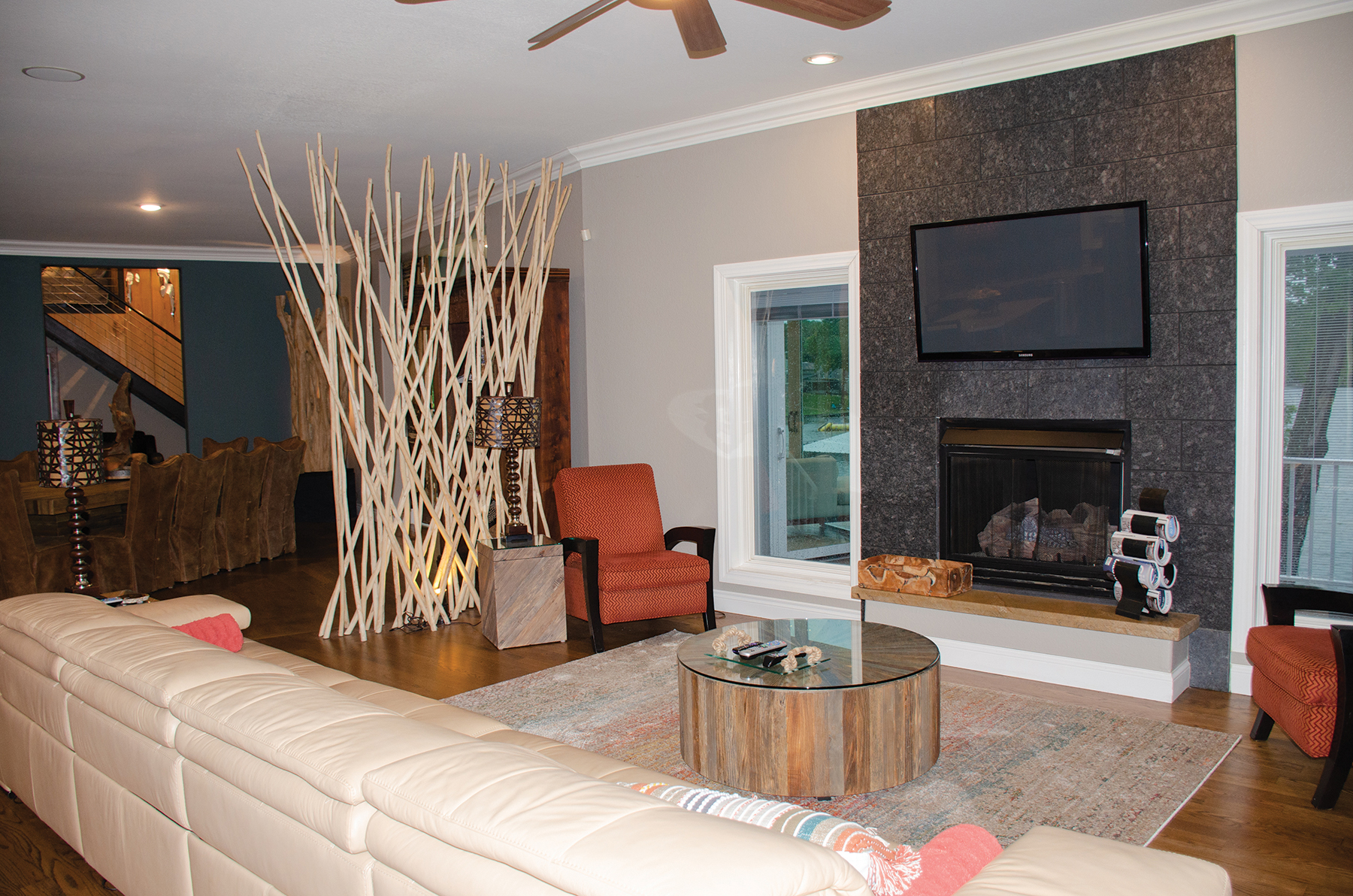
In the living room, comfort is key with the oversized leather sofa and comfortable chairs to gather in. The lamps mimic the crosshatching design of the wooden divider, giving it a dark, modern edge. The dark grey tiled fireplace is a strong focal point in contrast to the light, natural-toned furnishings.
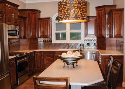
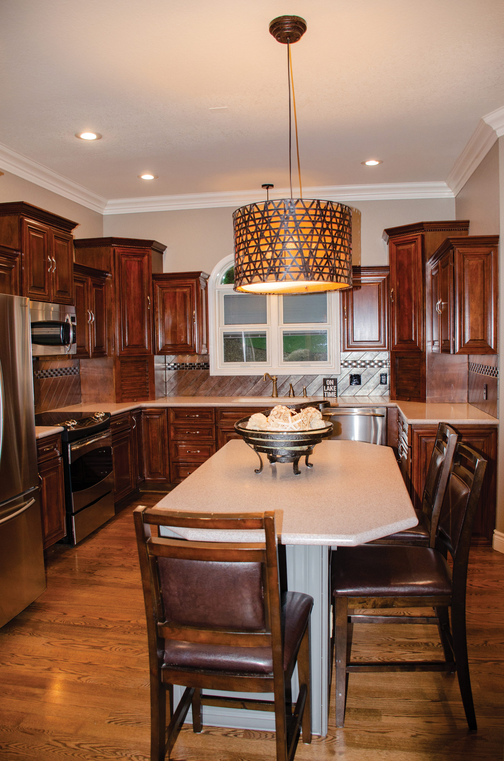
They left most of the original kitchen’s wood finished cabinetry, giving it design enhancements such as a new wood-tile backsplash set on the diagonal and inset with a row of dimensional embellishments. Then they painted the island a soft grey and topped it with a pendant light that matches the shades in the living room.
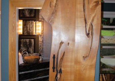
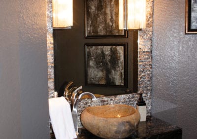
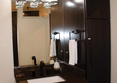
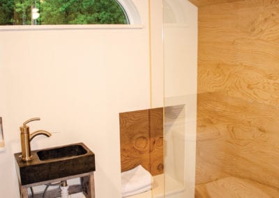
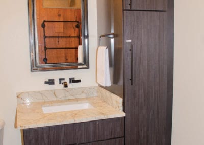
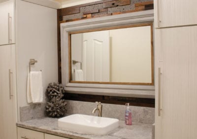
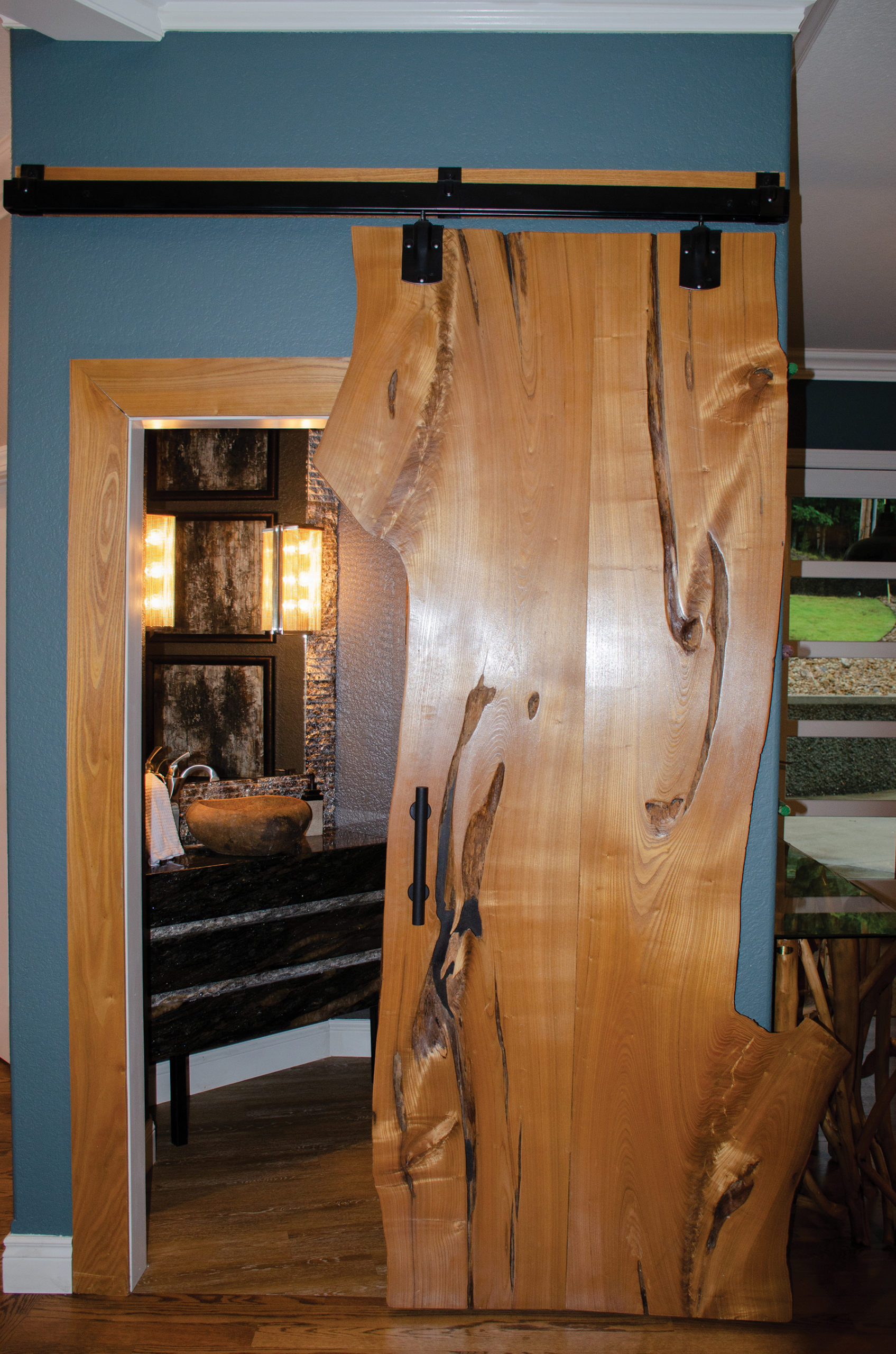
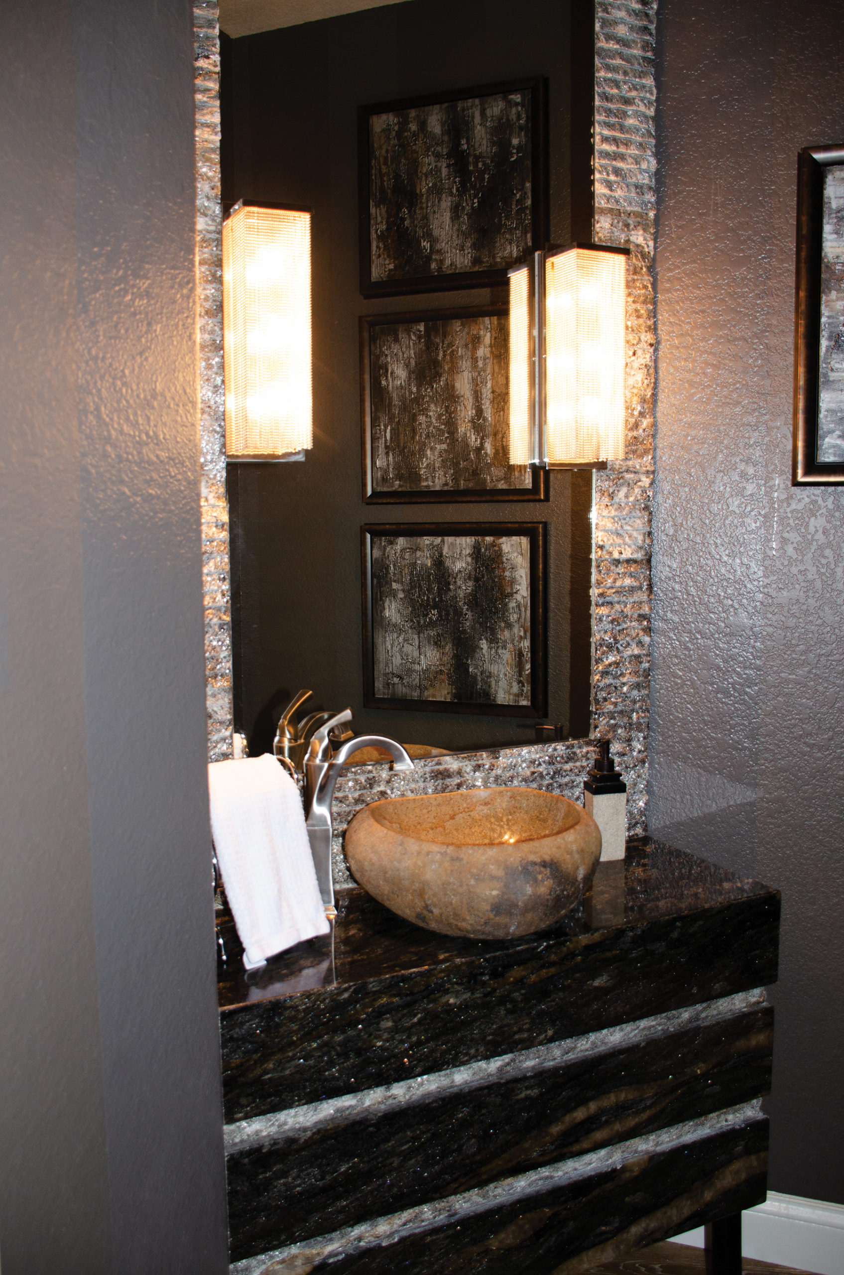
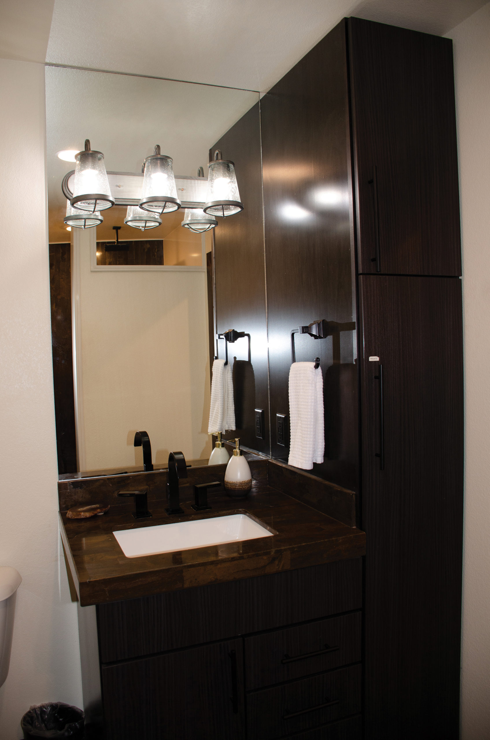
Off the living room, a solid wood slab mounted on barn door hardware conceals a powder bath. Using barn doors throughout the home helped save space, a feature especially important for small areas such as this. A custom vanity made of black granite with brown veining is accented with lighter bands. Surrounding the mirror, additional pieces of granite with chiseled edge detailing have been stacked in horizontal rows, creating a one-of-a-kind wall treatment.
Light from the double sconces bounces onto the charcoal walls giving the small room life. Atop the vanity, a brown-toned vessel sink brings in some of the wood tones unifying the home.
Knowing that each of their children’s families would want to have their own spaces, they created master suites for each family. Karen looked for ways to create a different personality with the design in each of the suites while maintaining a cohesive, completely custom design.
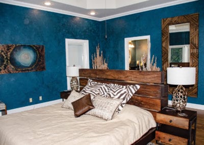
In the first master bedroom, they kept the original footprint but reconfigured the furniture. Now, the bed floats in the middle of the room, facing the lake and taking in the expansive water view. Floating the bed in this way enabled them to create a “wall” with its headboard, anchoring the bed and creating a display space.

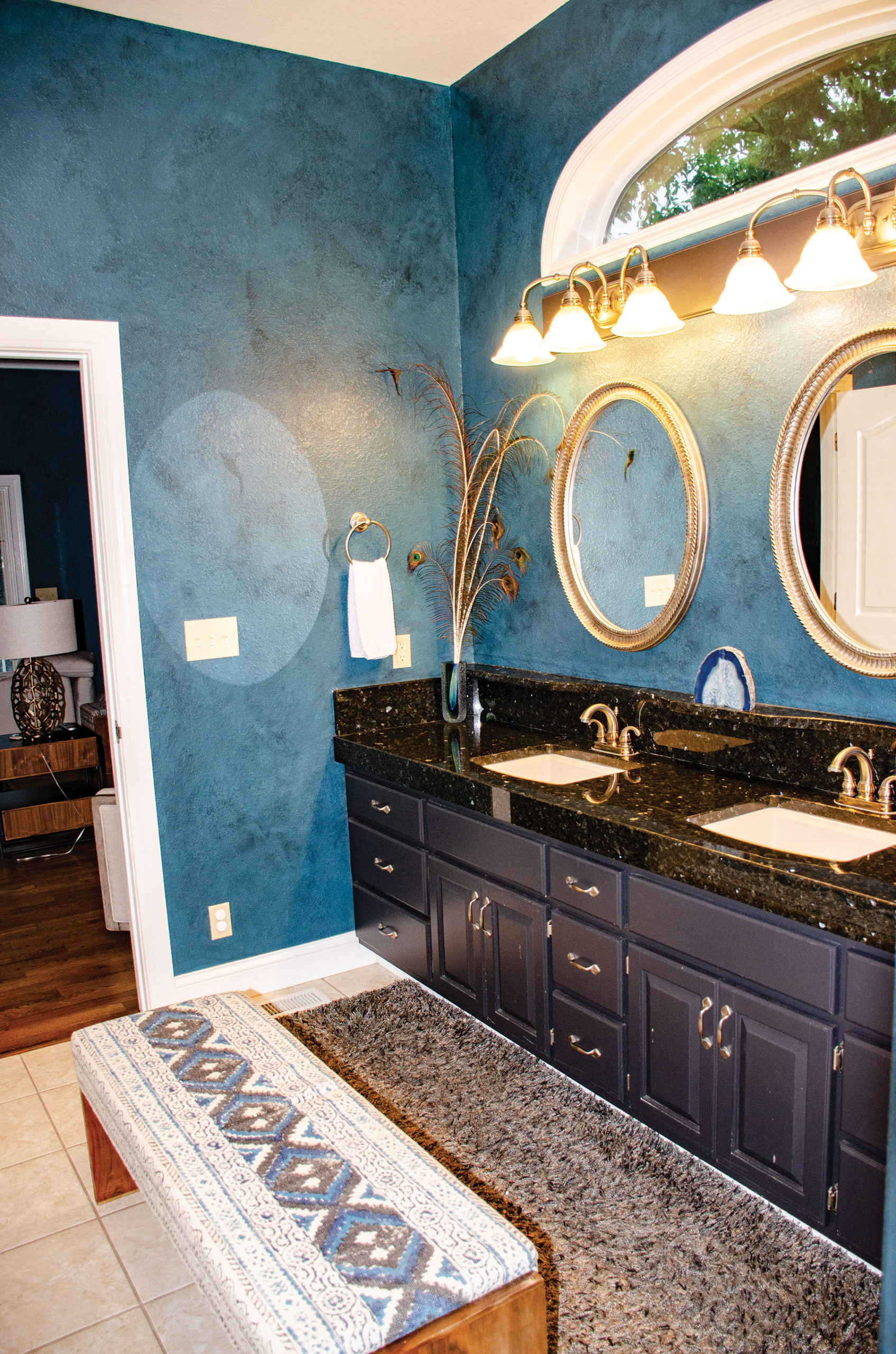
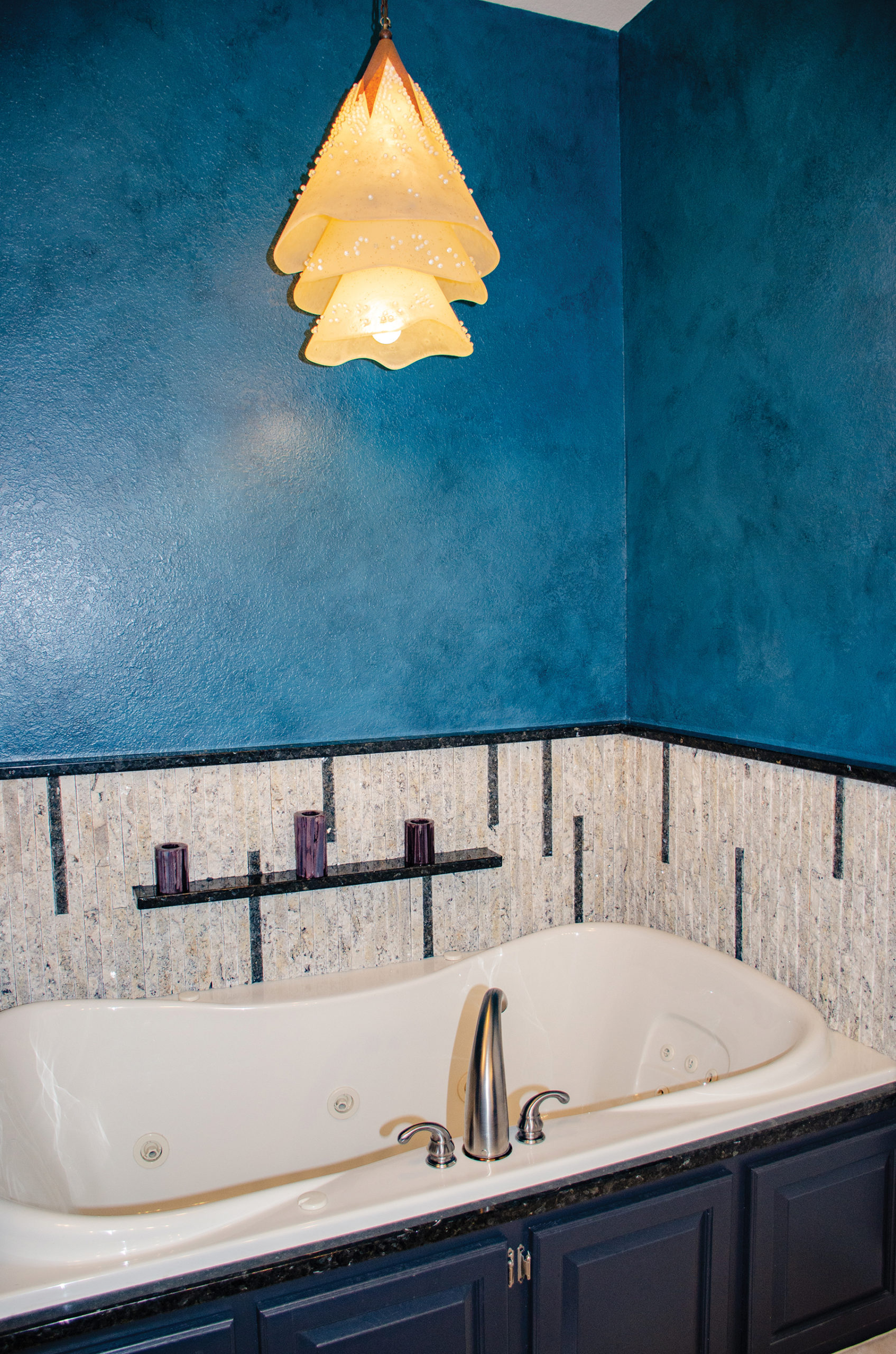
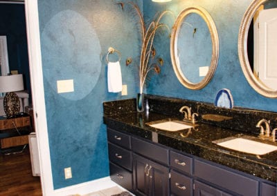
Walls in this master and the attached bath are stained with a blue color wash and lacquer that protects the finish.
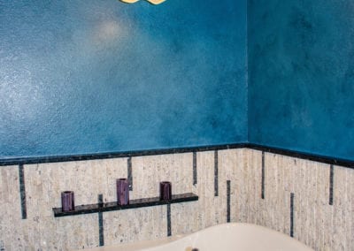
The attached master bath features a dual vanity with circular mirrors popping off the blue walls. Vertical granite tiles surround the jetted tub. Overhead, an ethereal, multi-layered pendant covered with glass pearls continues the nautical style.
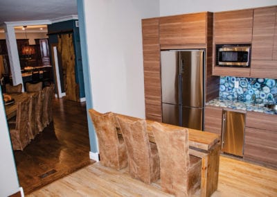
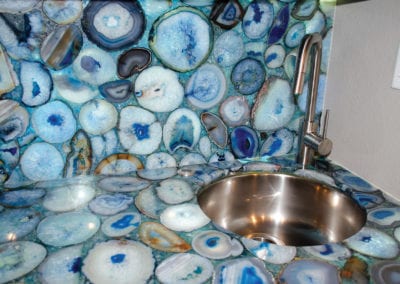
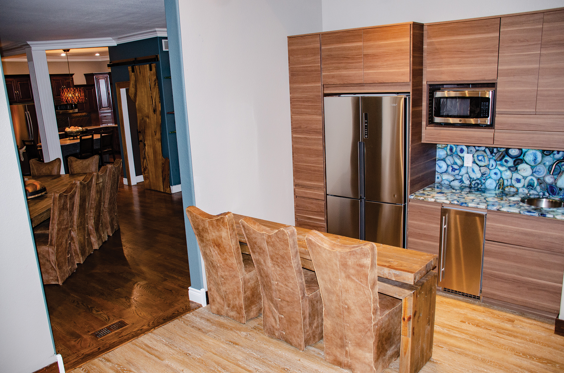
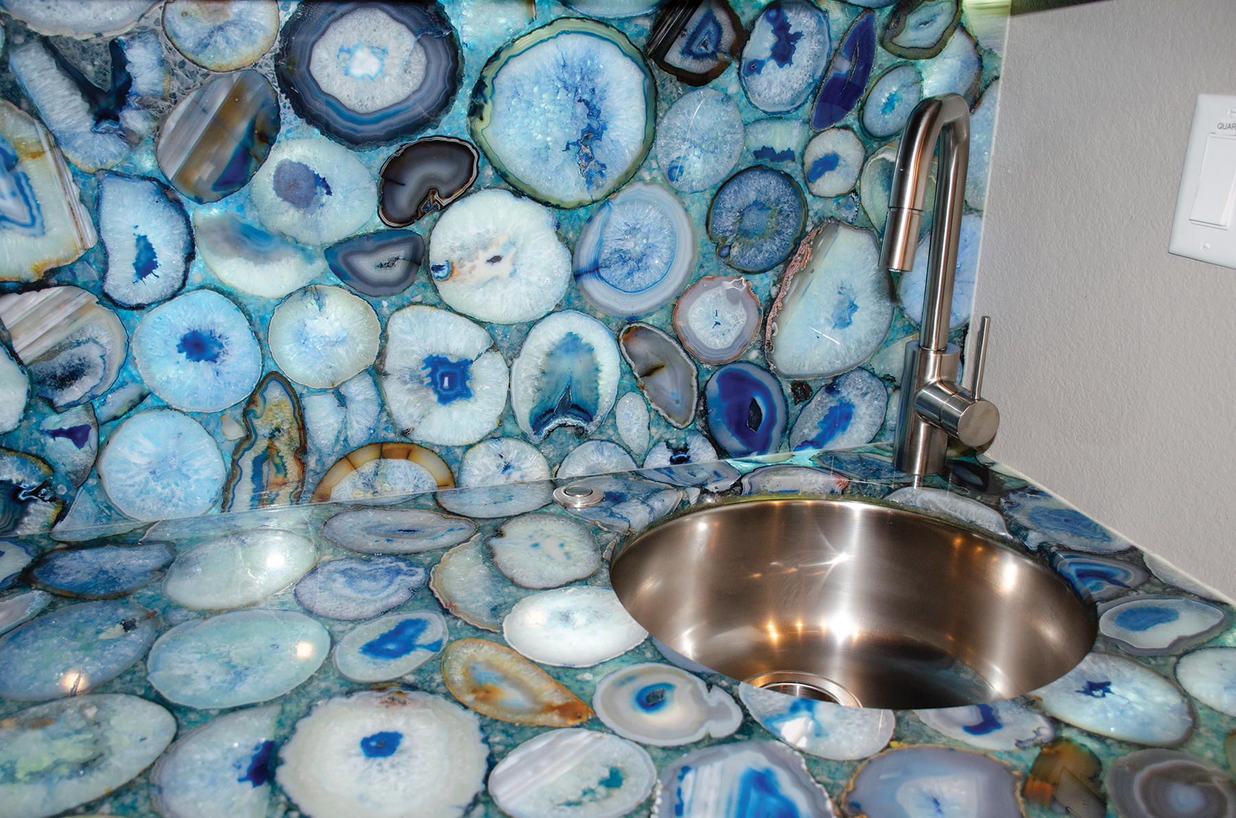
Passing thru the opposite side of the house, to the home’s new addition, is a mini kitchen, keeping food and drinks close at hand near the sleeping quarters. Slices of agate are assembled with a backlight to create the counters and backsplash.
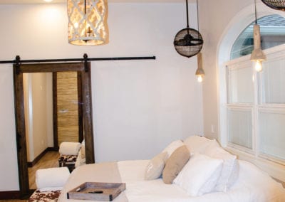
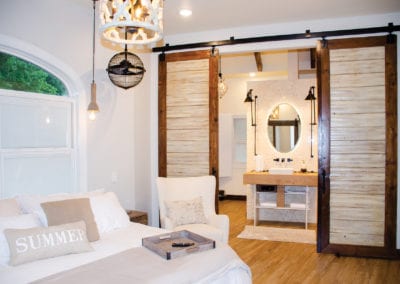
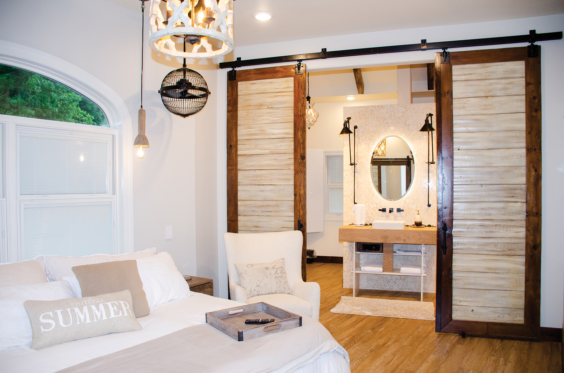
This area leads to a second master suite. With a large double window serving as the headboard, this room has a very airy, spa-like feel. An arabesque designed pendant suspends from the wood-lined vaulted ceiling, while pendant lights and fans hang on either side of the bed.
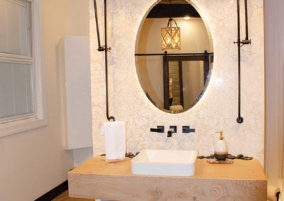
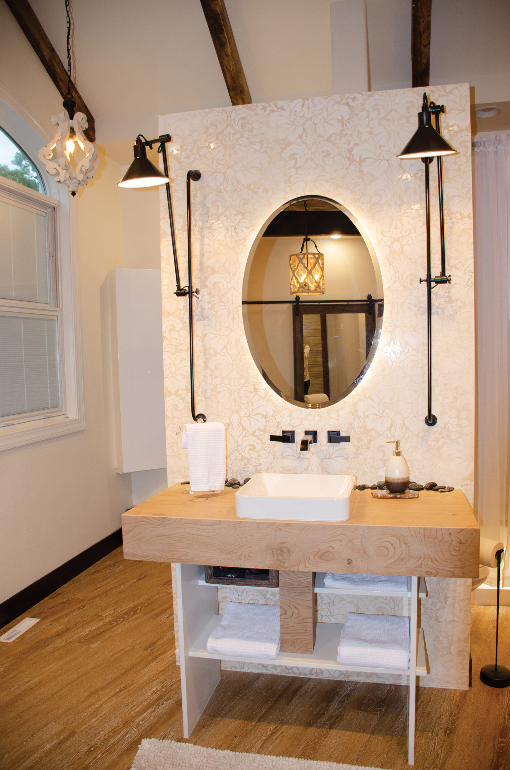
In the adjoining bathroom, a vanity wall made of solid quartz has been etched with a floral brocade pattern. Then to bring out the pattern, the quartz was stained. While the homeowners originally wanted a floating vanity, because of the weight, it was redesigned to support the heavy structure of the countertop. Sleek, adjustable lights attach to poles on either side of the backlit mirror adding a modern and functional design touch.
The unique layout of this bathroom uses the vanity wall to skillfully hide the closet and laundry. On the opposite wall, the shower features a matching, unetched quartz with artfully placed accent lighting to enhance the experience.

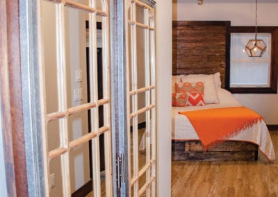
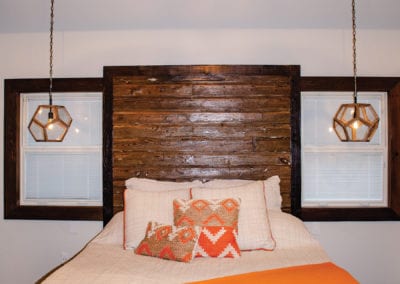
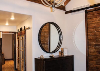
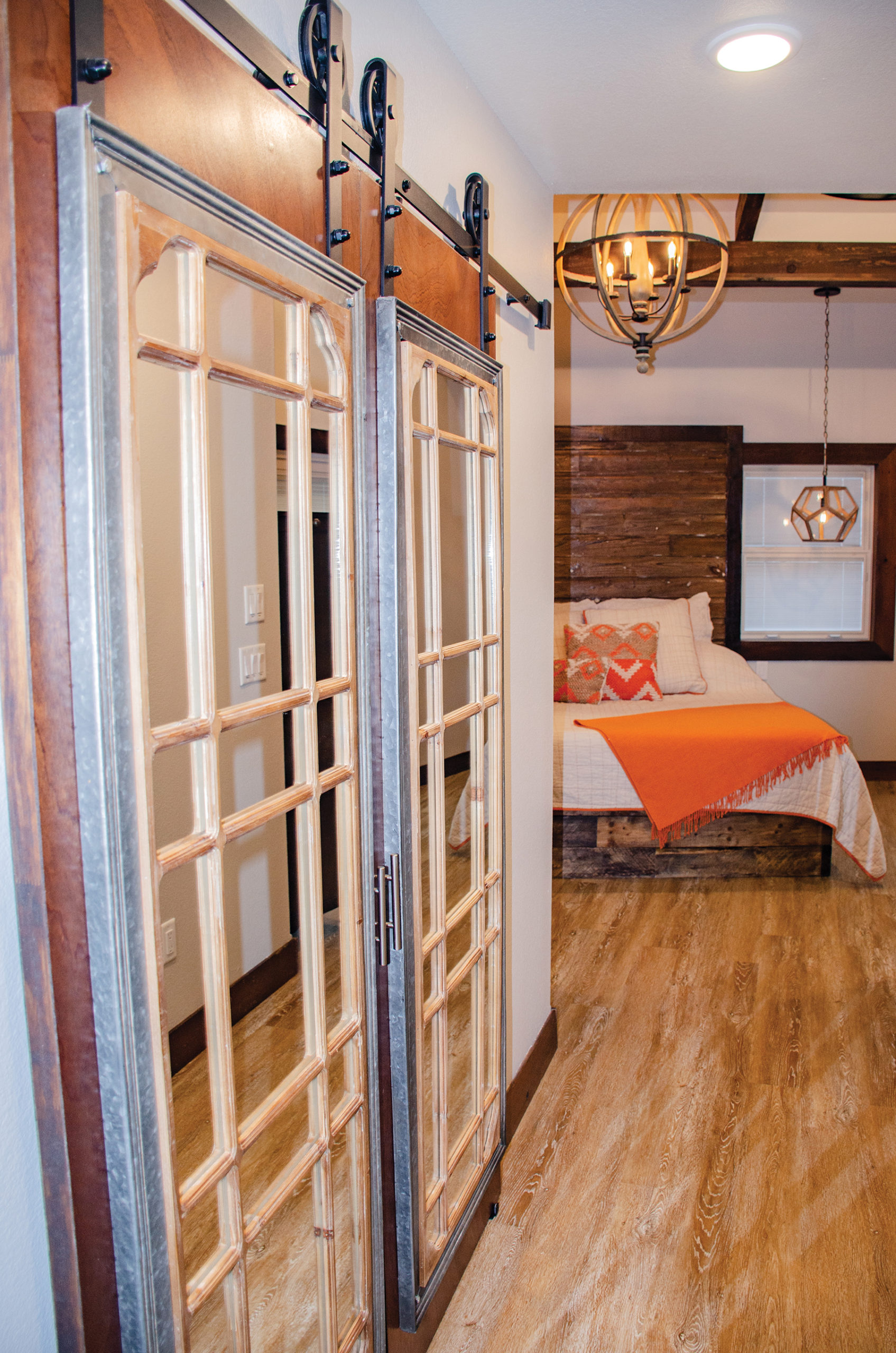
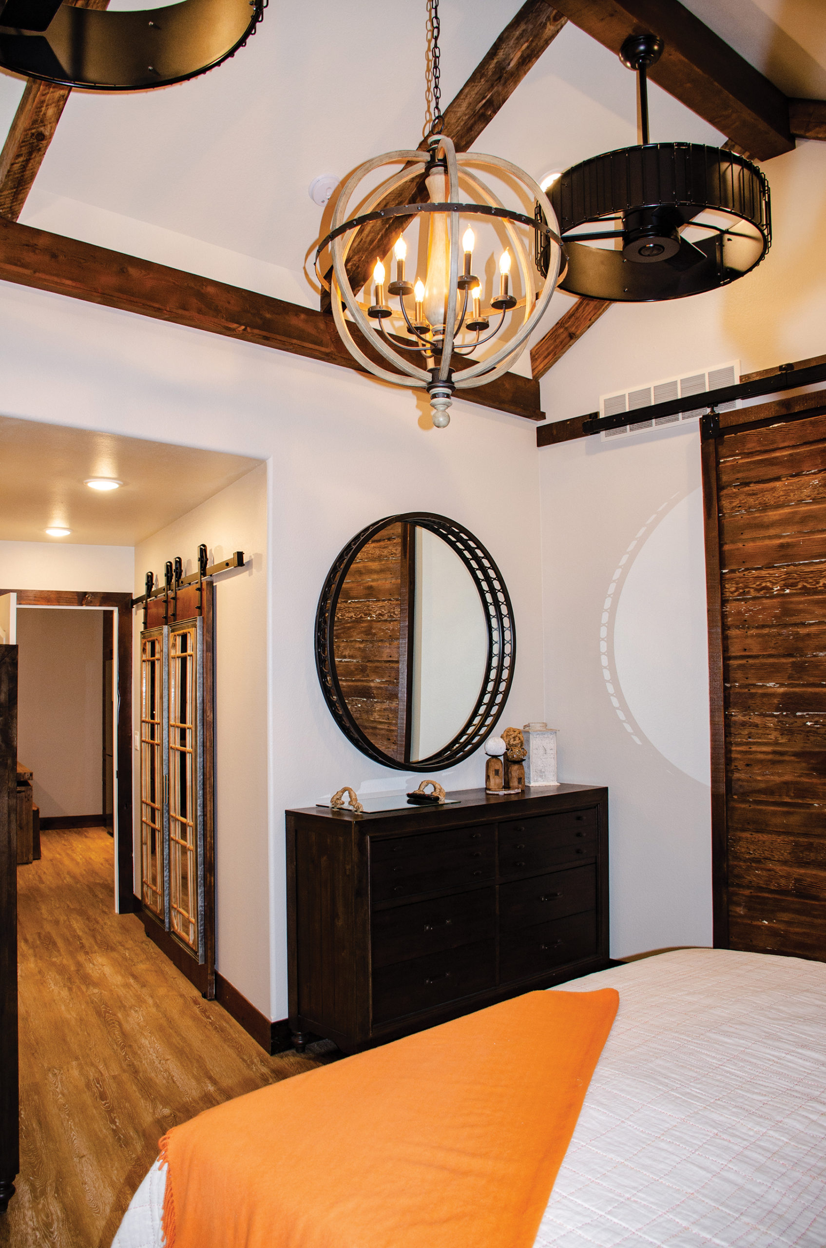
The final master bedroom in this area of the home features a dark stained, wooden, wall-mounted headboard. Beams on the ceiling and huge wood doors were built by Brad to match the headboard. Large fans flank the metal and iron sphere light fixture. The circular motif is also repeated in the metal-rimmed mirror. Pentagonal pendants hang from either side of the bed.
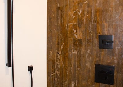
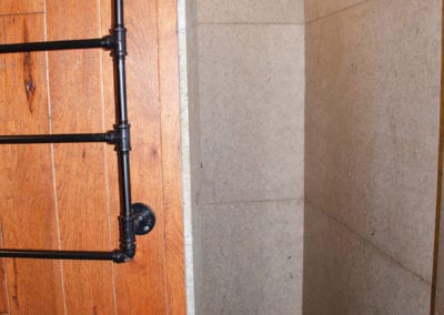
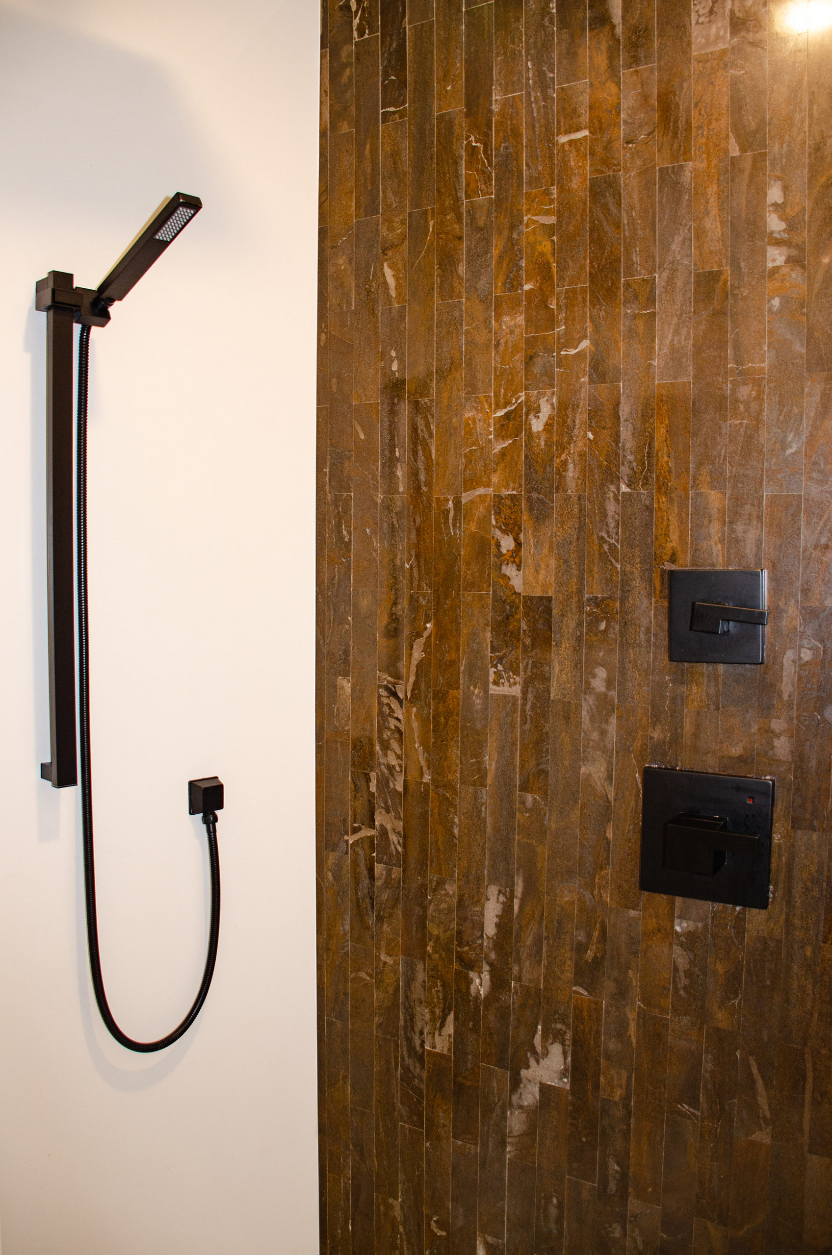
This bath, with its darker brown and black tones, includes granite on the floor, vanity and an accent wall in the shower.

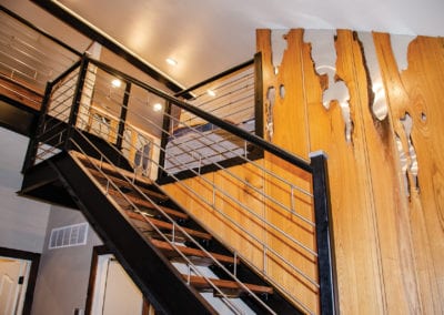
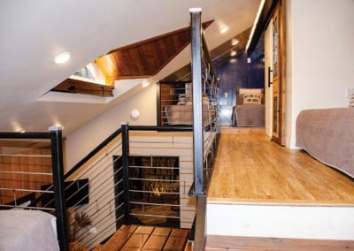
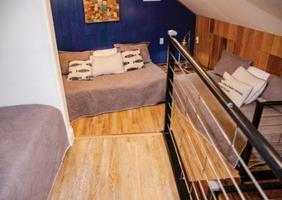
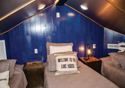
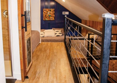
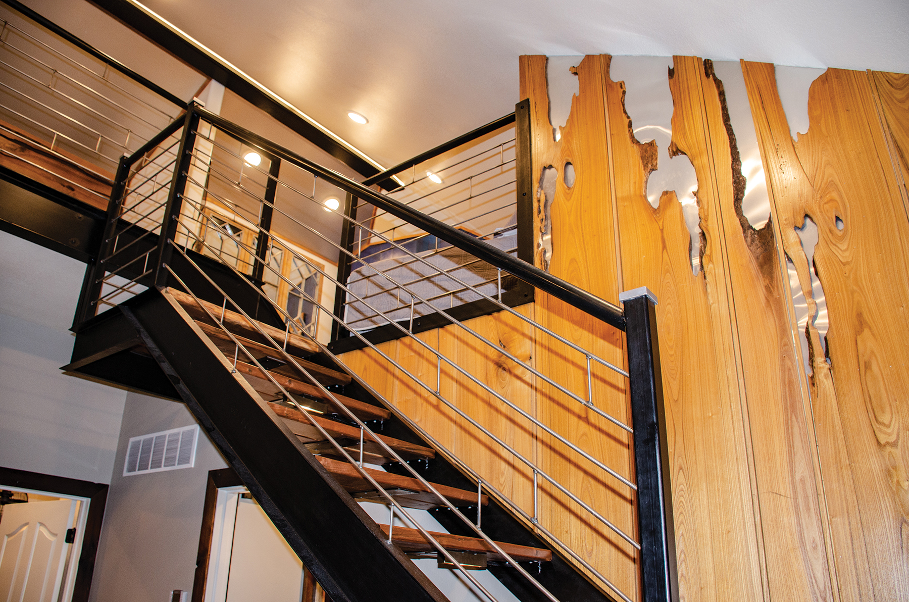
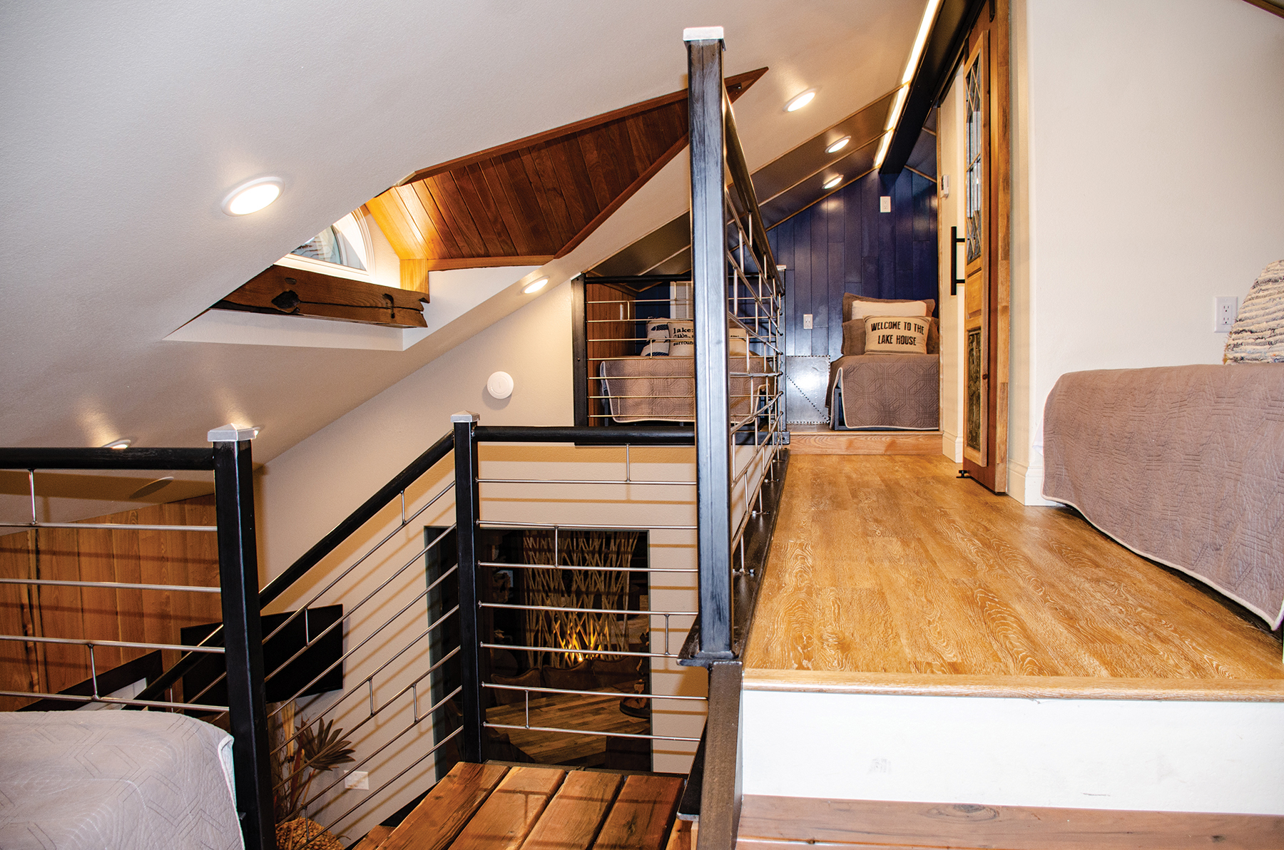
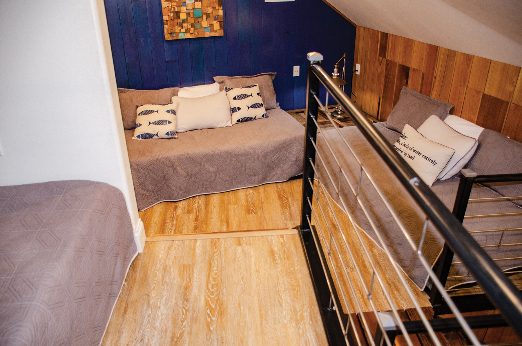
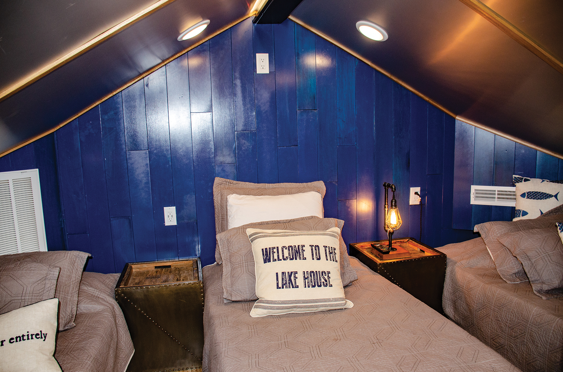
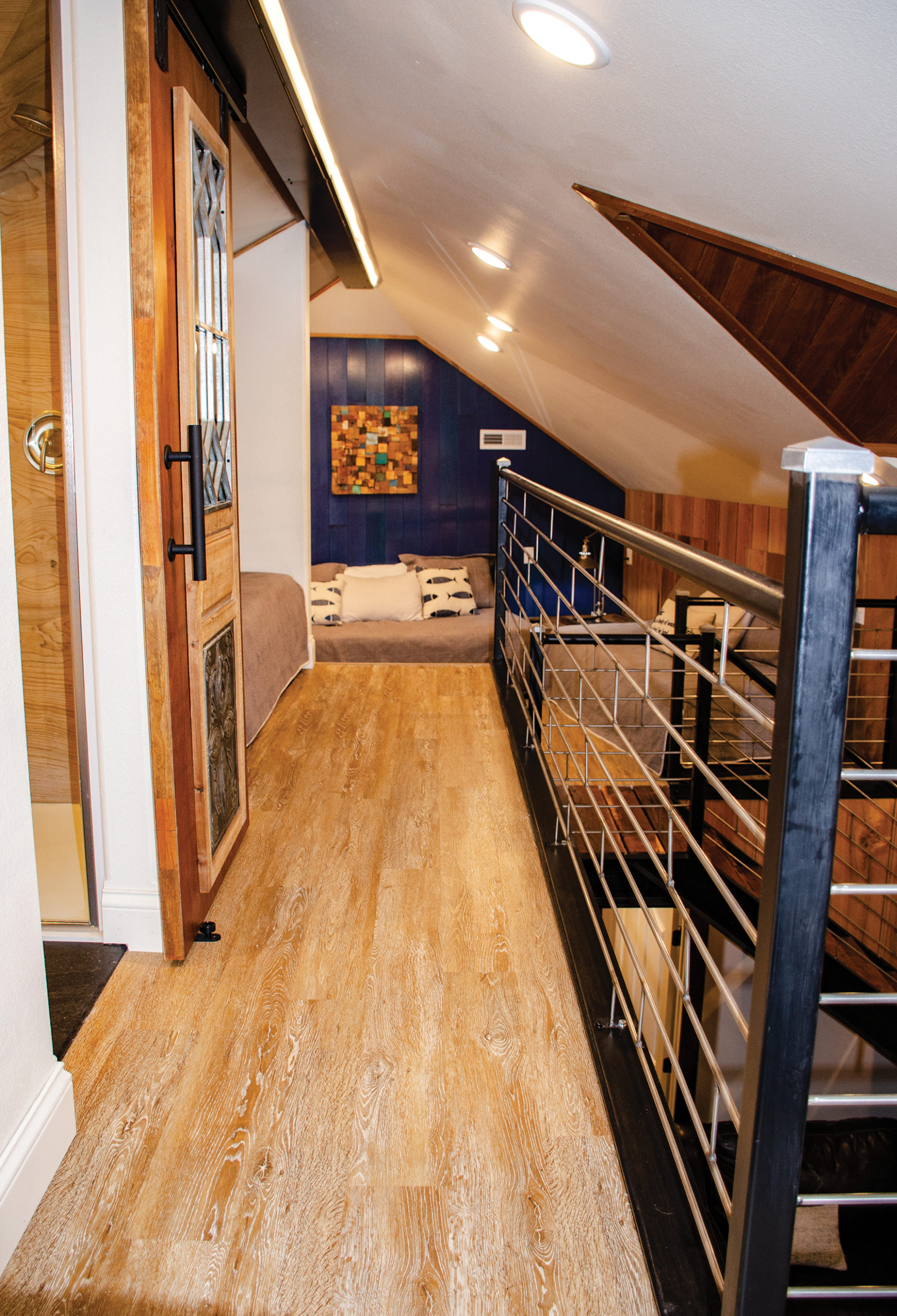
Above these bedrooms, a metal and steel support staircase with walnut treads leads to the loft addition. Creative use of the catalpa wood with metal peeking through its natural holes creates a fun feature wall in what could have been an overlooked space. Once up in the loft, the area sleeps six, and the grandkids have made it their own private space.
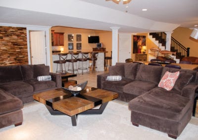
Heading downstairs, the large family room is set up for comfort and interaction. Multiple plush sectionals call for them to stay and relax together before heading to their separate rooms. The huge TV is anchored by a large console featuring carved doors. It is a beautiful piece that also functions as great storage.
Further anchoring the space is the fireplace with a solid, all-natural stone mantle. Proving tricky to install, the wall was cut out and they recessed the mantle stone into the opening to make it structurally sound. Four club chairs offer additional space to kick back and encourage conversation.
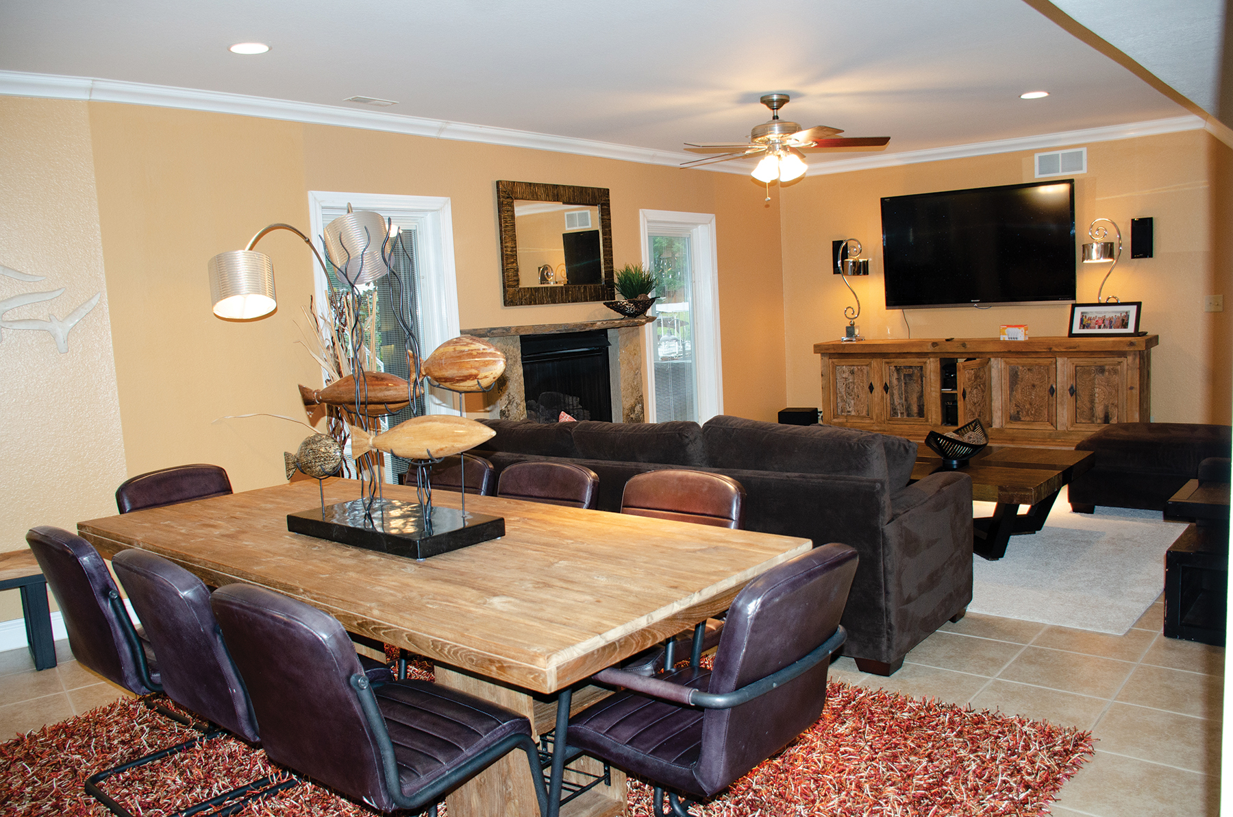
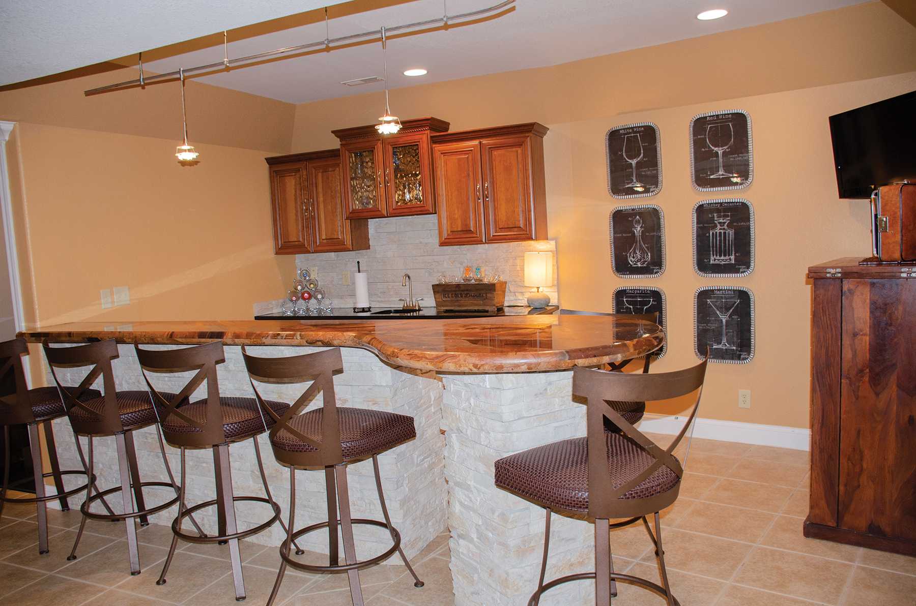
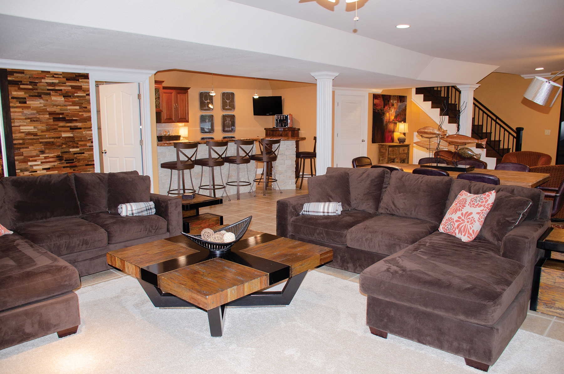
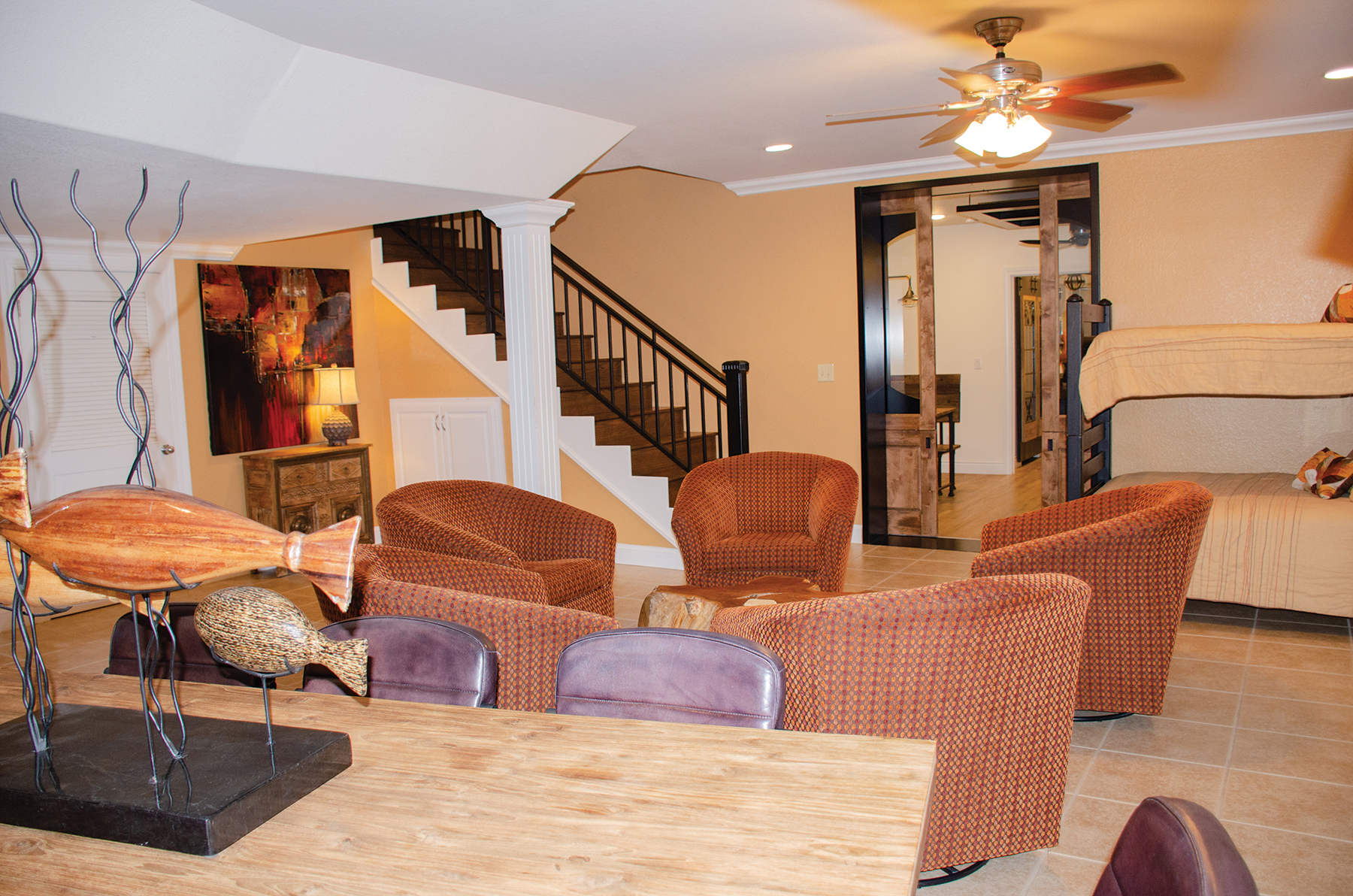
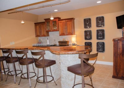
Karen takes every opportunity to add creature comforts for all to enjoy. There’s room to stay and eat or play games at the dining table. The circular-shaped granite bar top creates even more seating and space to entertain. The bar houses under-cabinet refrigerators and ice makers. Accent lights with halogens illuminate the bar and bring the movement in the granite to life.
Turning the home into a full family project, their sons-in-law installed the wood feature wall. After discovering the unique product at Hoods they have a stunning accent. With a family of treasure hunters, it goes to show that you never know where you’ll find just the right building materials.
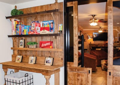
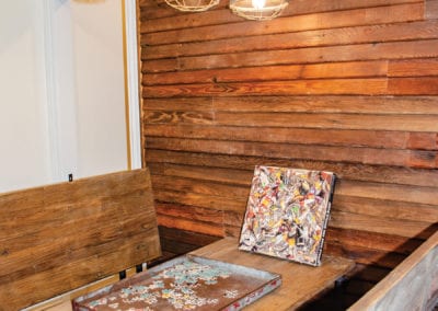
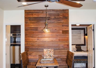
Across the family room, the transition to the new addition is marked by huge double Dutch doors that were created by a retired cabinet maker, Dennis Hilton, that Karen works with. They figured out how to give enough structural support in order to create the double Dutch door while also having them slide back into a pocket. The craftsman enjoyed the challenge this project presented, and they serve as a great transition from the family room space into the new addition. They used old lap siding for an accent wall and have a booth for seating. A small space was used to install convenience features like a microwave, refrigerator and sink… After all, you need to keep snacks close by when you’re at the lake.
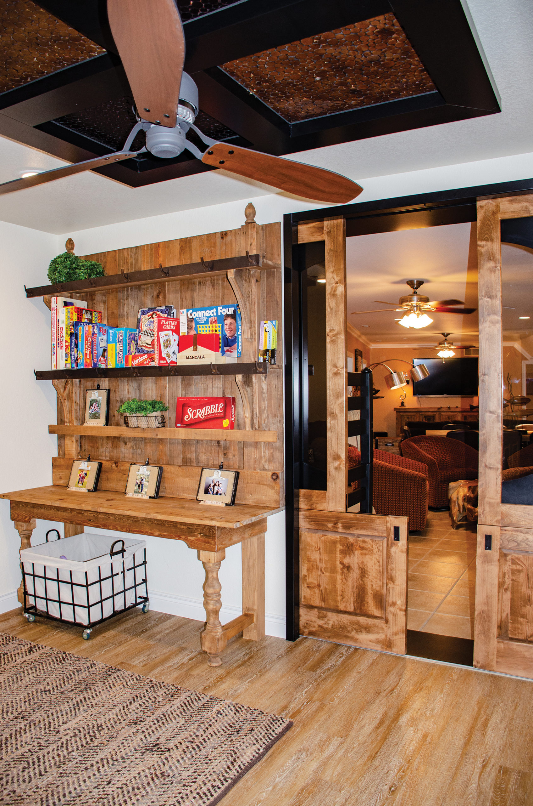
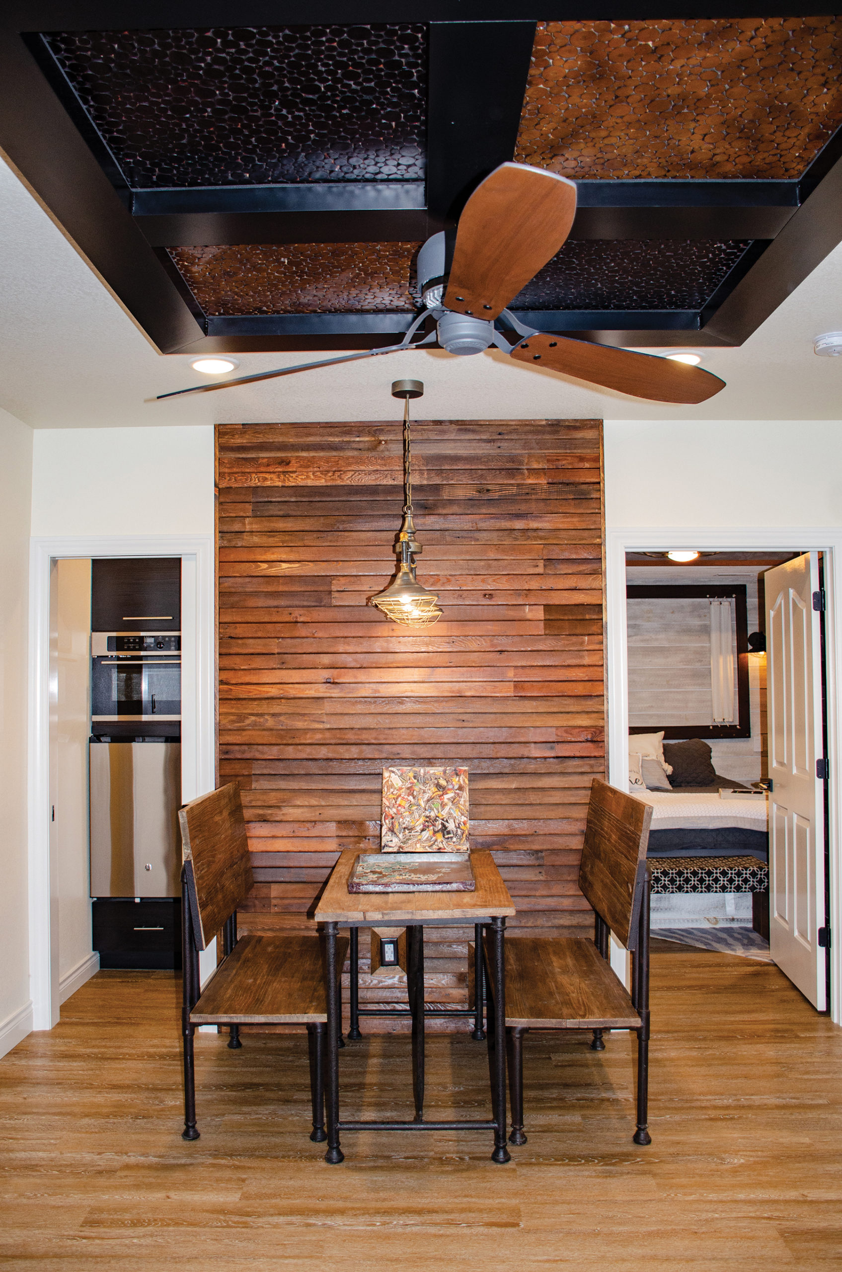
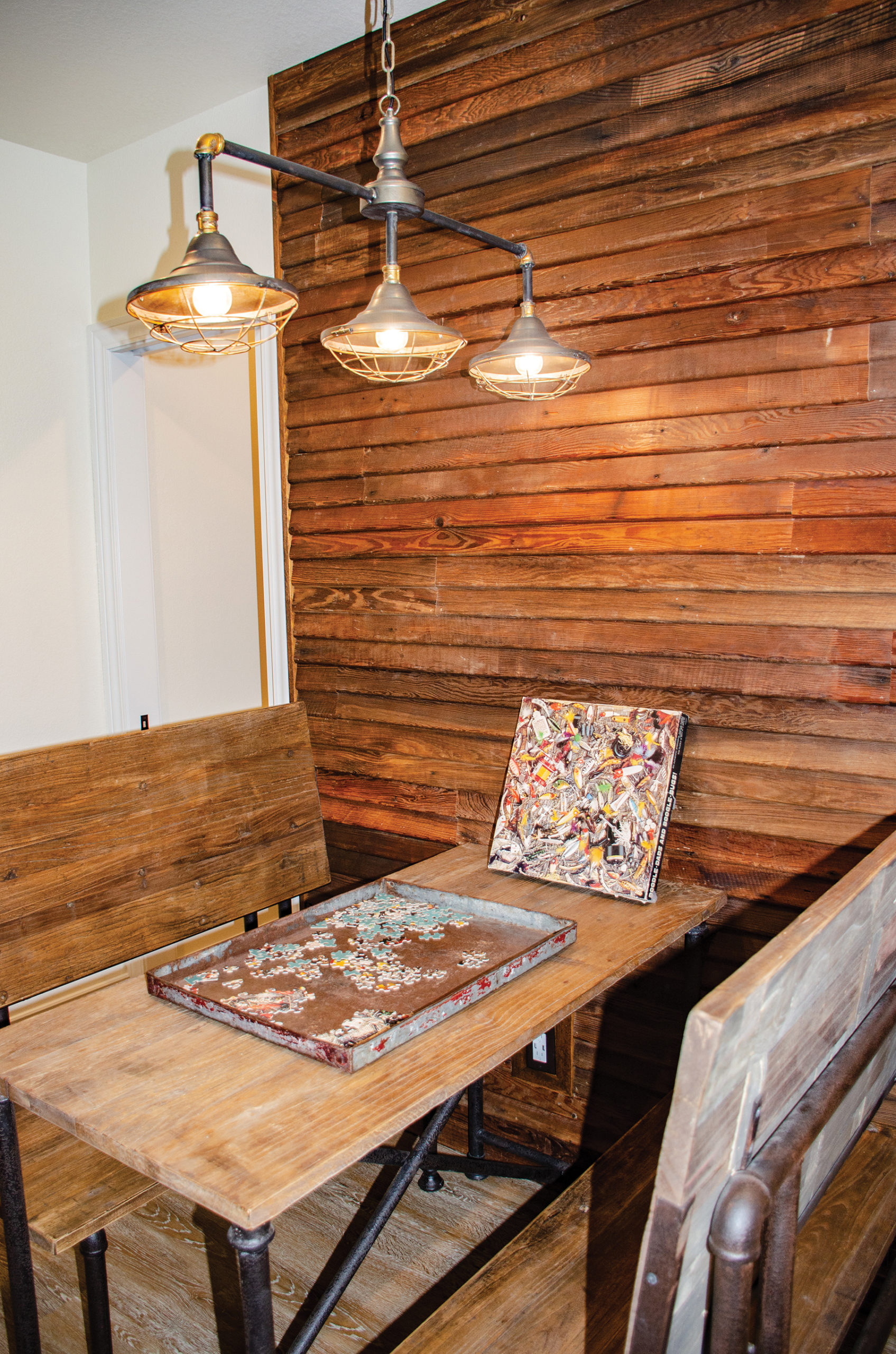
The kids and grandkids were clearly the focus in this area of the addition. They designed defined spaces where kids and adults alike can have the maximum amount of fun activities, and where a good time would be had by all.
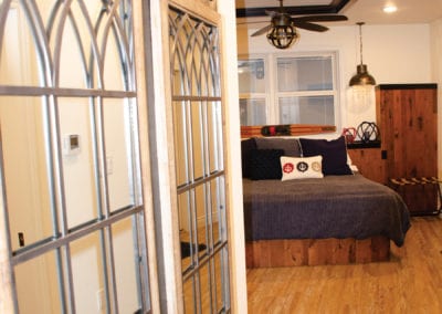
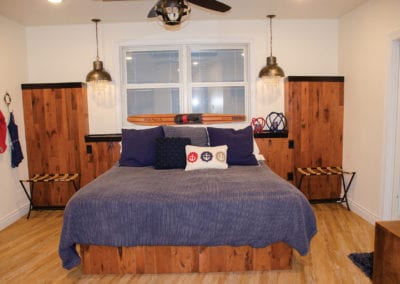
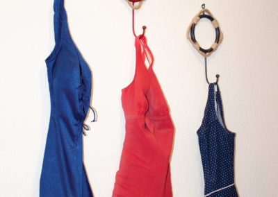
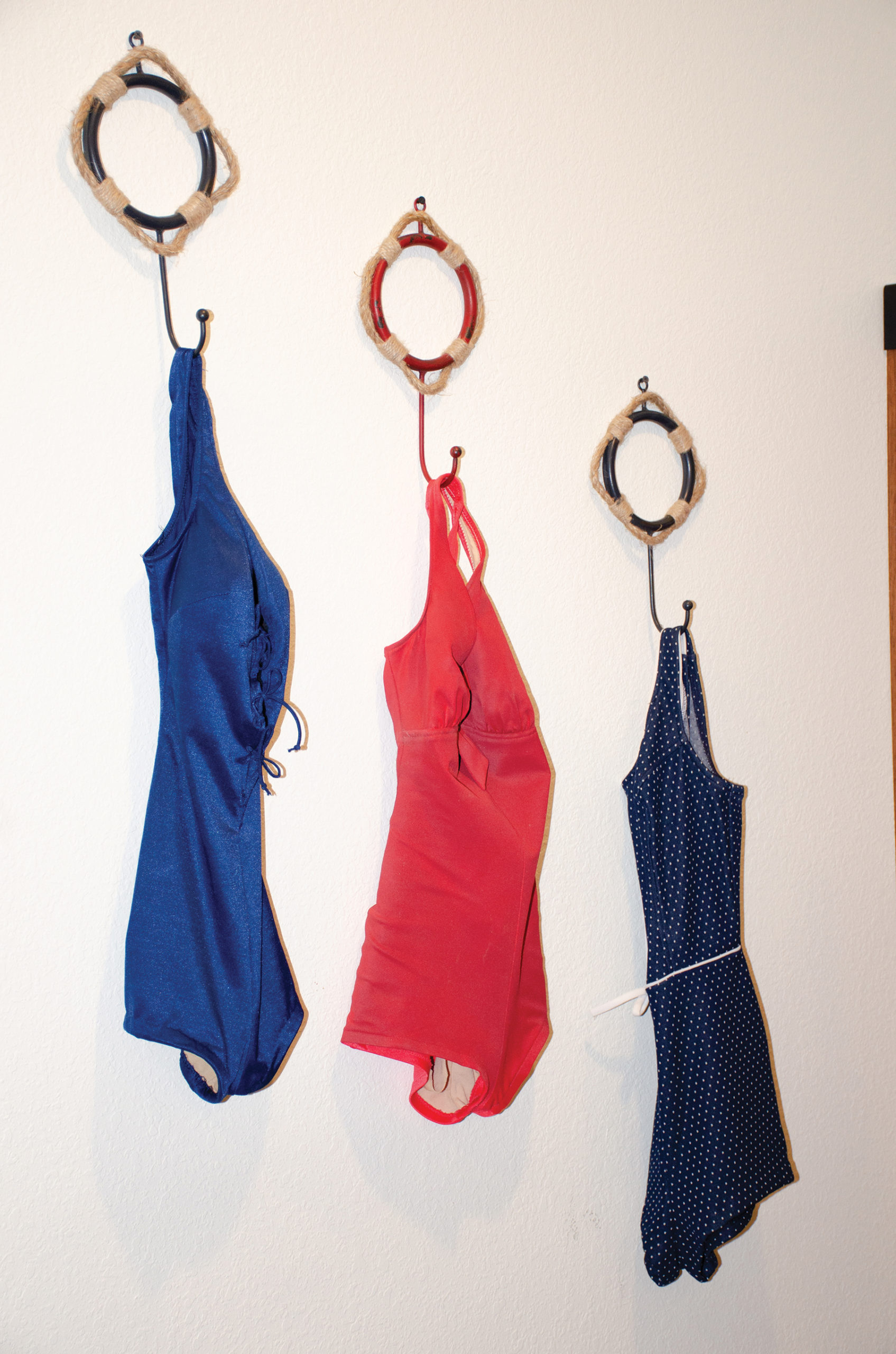
One of the bedrooms downstairs features a nautical theme with vintage swimsuits as décor on the wall. The rustic design was contrasted with ‘fancy’ lighting. Adding a little sparkle to the industrial lighting brings a touch of the unexpected into the space. The wood accent behind the bed features metal caps. That mix of materials brings a different texture into this room.
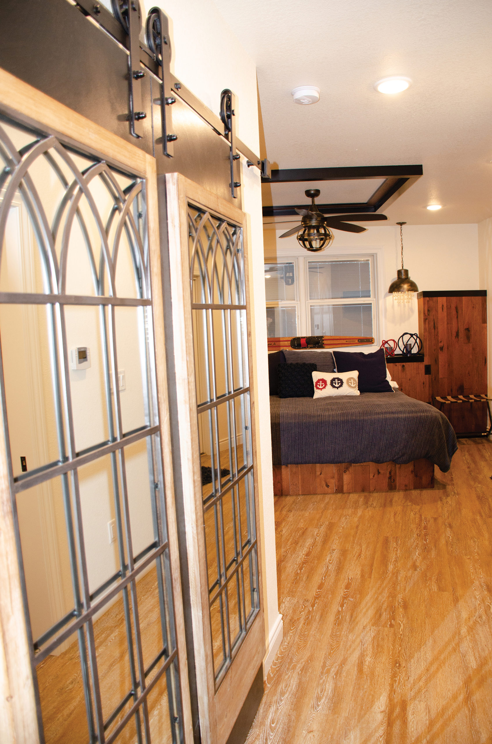

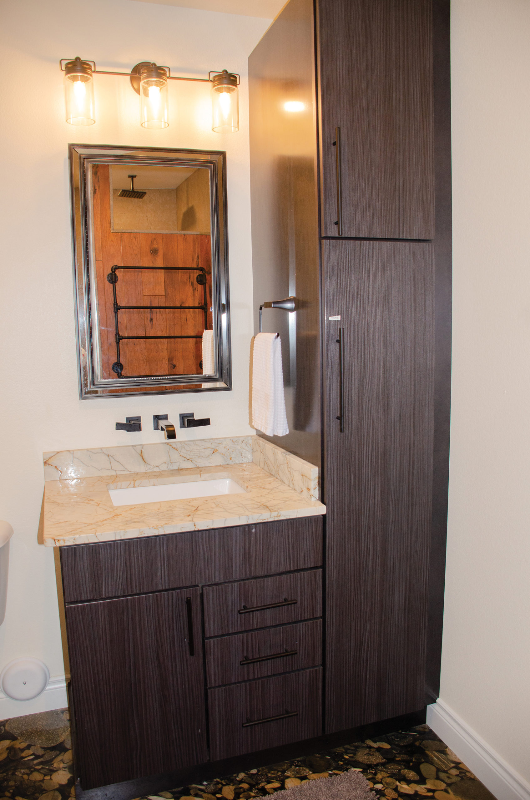
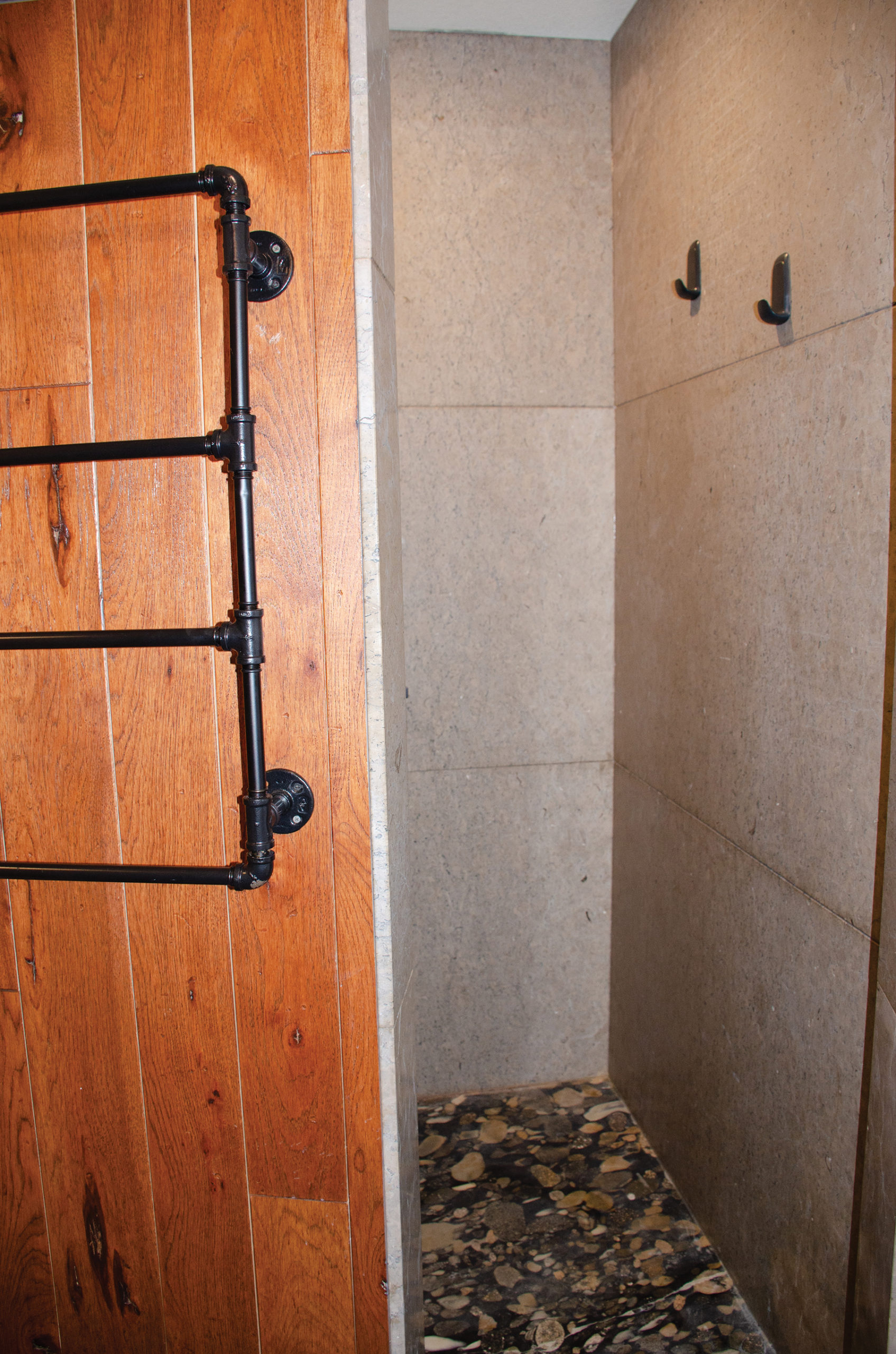
The adjoining bathroom features slices of granite on the floor mixed with granite slabs. The ‘slices’ are created and stacked to create the interesting effect.
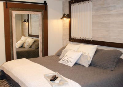
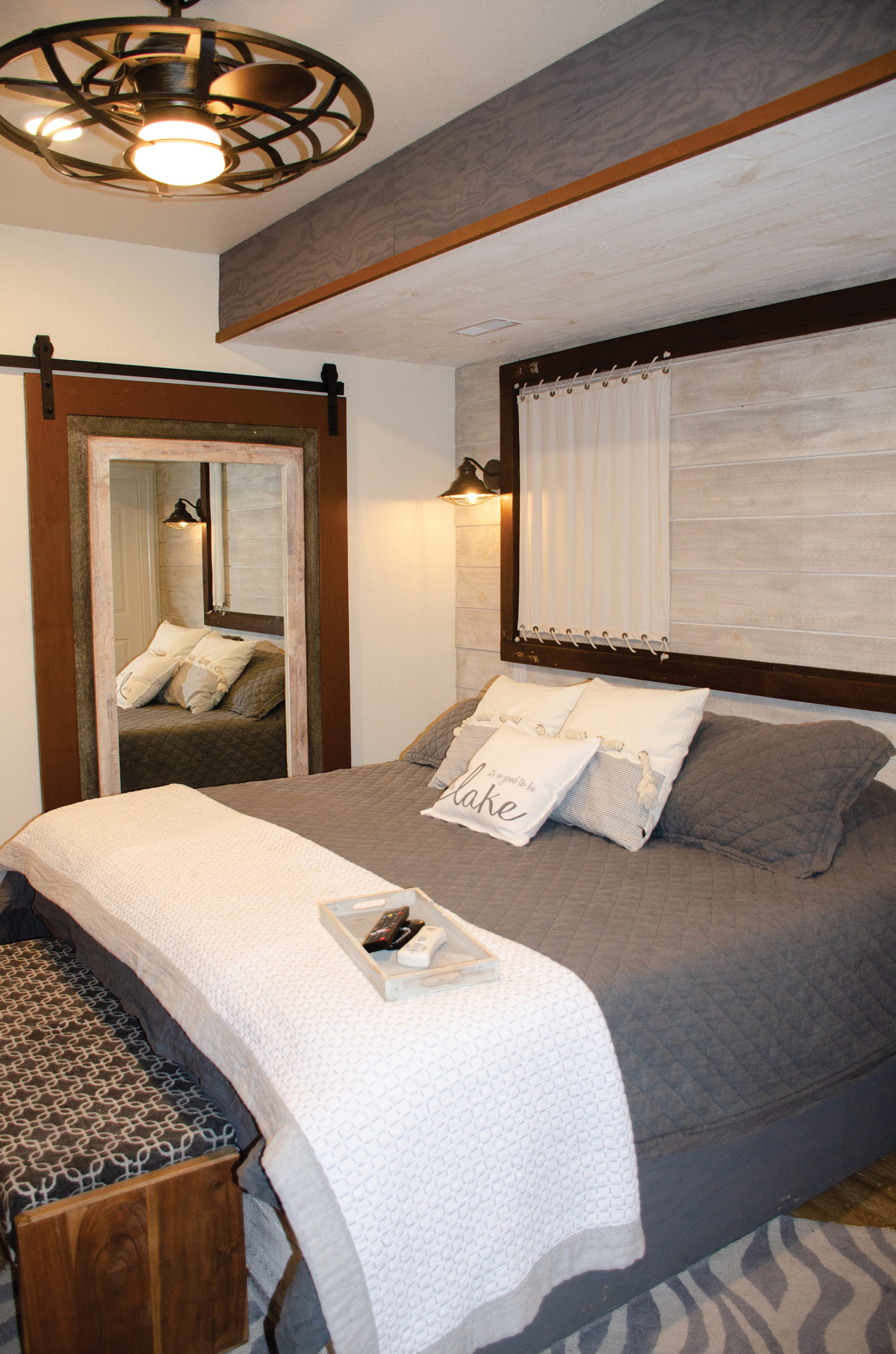
Another bedroom in the new addition continues playing with the nautical theme in a calming grey and white color theme. A whitewashed wood wall provides a clean backdrop for the sail-like headboard design.
The scheme continues into the lightly colored bathroom. Accents on the ceiling are made with metal frames to mix with the wood.

The Werners, along with the help of many talented craftspeople, designed a home that is sure to surprise as you go from one room to the other, all while flowing together seamlessly. They created not only a lake house but a home that their family is sure to return to for many years ahead, making tons of memories along the way.
SUPPLIER LIST
Up a Creek in Style: Ed & Kathy Mueller
Paulette Designs
Turks Construction
Carved in Stone
The Entertainer
Scruggs Lumber
S & K Roofing
Riback Supply
Randy Reinecki Painting
Raithel’s Plumbing
Pro Powder Coating
Pella Windows & Doors of Columbia
Pat Castrop Plastering Co.
Nathan VanLoo Electric
MidWest Welding
La Belle Cabinetry & Lighting
John Elliot Interiors
Howell’s Carpet Outlet
Excel Metal Roofing
Dennis Hilton
Coleman Appliance
Capital City Heating & Cooling
Boone County Millworks
Binkley & Sons
Best Fire, Inc.
Artistic Stucco
Accurate Flooring Inc.

