If you’ve driven around an older neighborhood, you’ve likely come across streets lined with iconic and unassuming ramblers, also known as ranch homes. The popular architectural style defined a generation and the growing communities of the time.
Today, the simple, single-story layout is often being updated to fit today’s desire for a more open concept. They are not without their challenges, and this particular home was no exception. There were small spaces, closed in by a central brick fireplace. Its massive structure went straight through the middle of the home, and the back wall housed the kitchen’s built-in oven, a common feature of mid-century homes. With such a massive structural element blocking this home’s potential, many homeowners would have run away at the thought of removing it. However, Doug and Nancy Bonnot not only dove head-first into the challenge, they took on much of the physical labor themselves.
Once the fireplace was removed, the space truly opened up, providing a blank slate for them to completely re-think the floor plan. The homeowners moved the living room from the back to the front and now it just feels right when you walk in the front door, through the entry and then into the great room. The beauty of an open floor plan is being welcomed into the entire space as soon as you walk in. Without any barriers to stop your eye, the large space seems even bigger.
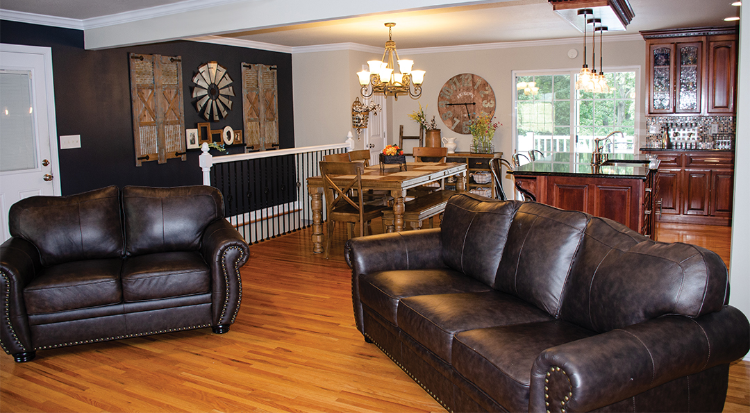
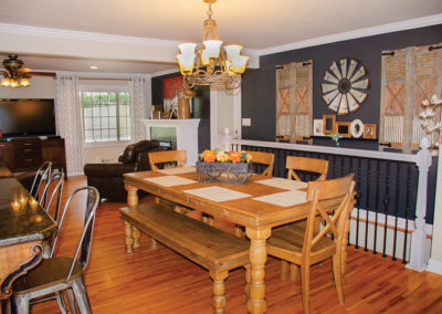
Simplicity in design is often difficult to achieve, and this is a study in how to do it right. These homeowners achieved it by repeating elements through the three-living areas. Flooring, paint color and wood tones in the cabinetry are repeated throughout. Consider the shades of paint… from a light grey on the walls to the dark charcoal accent color, an unobtrusive focal point was created. Some may have chosen a strong contrast color, but the effect created by using shades of grey results in a calm modern feeling.
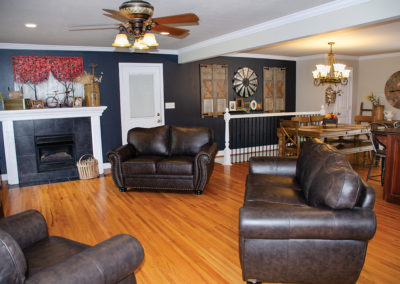
Generous leather seating is placed on the diagonal completing an interesting furniture grouping. The diagonal arrangement allows easy access to the kitchen and dining room and allows for everyone to be able to interact without anyone’s back to the adjacent space. A gas fireplace was added, and the black tile surround blends with the focal wall. The unobtrusive architectural feature complements rather than shouts for attention. Large scale artwork adds a pop of color and a few well-chosen accents complete the display on the mantel.
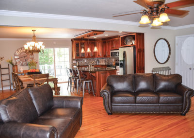
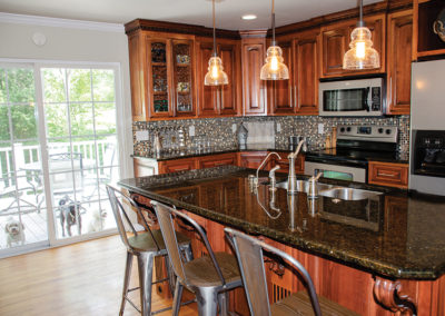
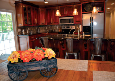
The new kitchen and dining spaces were relocated to the back of the home. Light streams in through the new patio doors that lead to their outside entertaining area. Now the space is awash in light and the visual sight lines encourage interaction and improves flow. Nancy and Doug love to have people over and the new design makes it easy to entertain and mingle with all their guests.
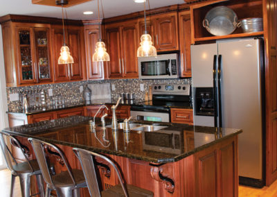
Dark wood cabinetry and a large island anchors the new, easy to work in kitchen. The design provides complete flexibility of use whether they’re cooking for two or twenty! Beautifully crafted custom cabinets include glass panels, a display niche and large crown accented by dentil molding which was stained a bit darker to make it stand out.
Brushed stainless steel appliances and a glass tiled backsplash reflect light. Three glass pendants hang from an accent feature over the island. Built to add interest to the ceiling, it defines the room and visually elevates the ceiling height.
The Bonnot’s redesigned the stairway wall by adding wrought iron spindles and newel posts and railings painted to match the rest of the trim in the home. Metal accents tie the areas together and gives the dining space a modern country charm.
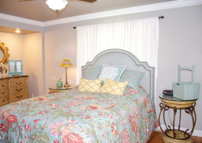
A true owner’s retreat, the master bedroom is soft and inviting. The pretty upholstered bed accented with nail head detailing and piled with pillows is a study in pattern and textures.
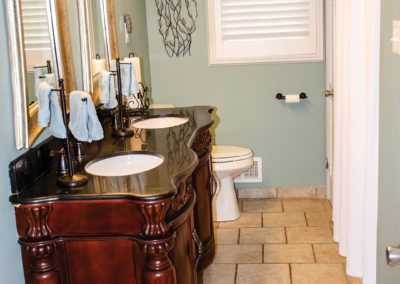
The traditional 1950’s bathroom was completely gutted and the homeowners redid and replaced everything from the tile floor to the tub shower. They chose a generously sized vanity with dual sinks and a black granite top. Again, by repeating colors throughout the different rooms, simple design choices add up to make a big impact.
This rambler remodel is truly a shining example of maximizing the potential of the footprint of an existing home. Don’t ever let walls or outdated conventions hold you back from enjoying your home in ways that are functional for you. This home’s wide circulation spaces maintain the desired open flow allowing everyone to gather in ways fitting of today’s modern family.
SUPPLIER LIST
JC Mattress and Furniture Showrooms
County Side Woodworks
Martellero Granite and Granite
Scruggs Lumber
Uniquely Rose
Justin Luebbert Hardwood Floors
Sommers Interiors
Howell’s Carpet
Lowe’s
Schaeffer House

