A Stunning Transformation
Designer Carole Hughes teamed up with homeowner Grady Martin to transform a grand home into a spectacular showplace that welcomes family and friends. The home features elements that create both a visually stimulating design and a modern masculine vibe.
As soon as we walked in, we knew we were in for a special treat!
As Grady would share his ideas with Carole, she would then use her skill as a designer to implement them. When he saw something he liked for his new home, they worked together to find just the right place for it. Unique furniture and accessories were chosen for their individual style and practical function creating a daring yet comfortable space when grouped or standing alone.
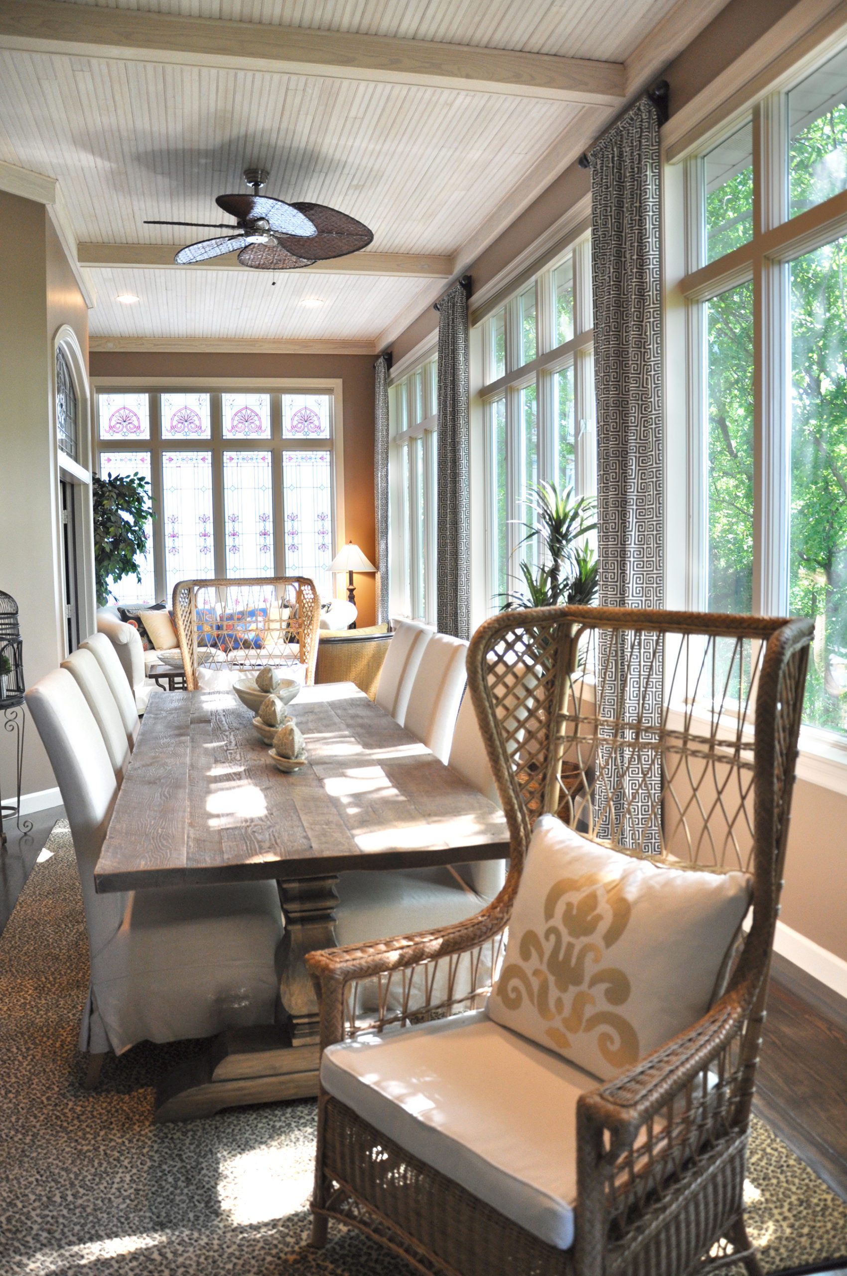
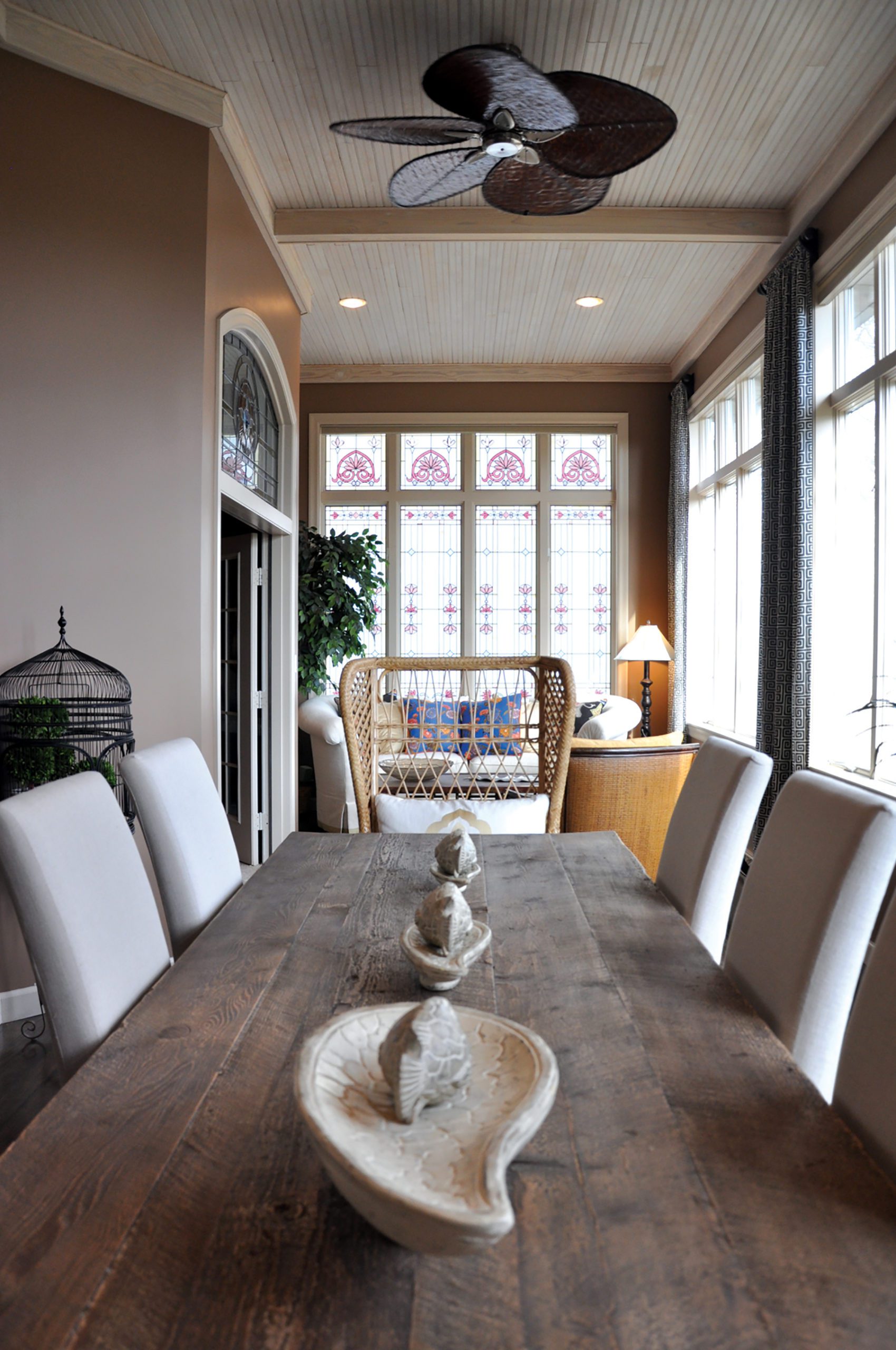
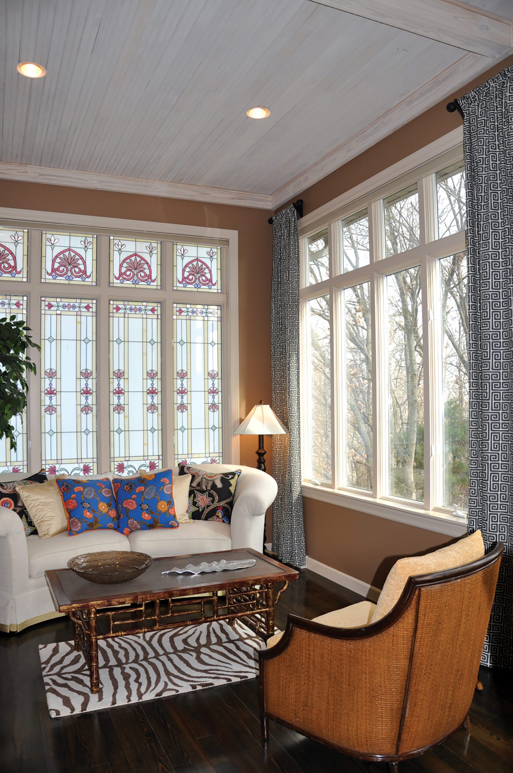
Who wouldn’t love to have a sunroom like this in their home? It absolutely radiates with comfort and charm.The one element that is most important in this space has to be the natural light. It brings warmth and life to the room as it moves across the walls during the course of the day. What a perfect place to enjoy a late evening dinner around the large farmhouse style table with friends, or enjoy morning coffee on the settee.
The transformation of this home is stunning. The collaboration between Grady, Carole and Sanning Construction took a great home and made it a true expression of the heart and soul of the homeowner.
Home Comes From The Heart
These homeowners wanted a place to connect and have purposeful conversations, so their children would have wonderful memories… a place where they could deepen their connections to family and friends and keep their lives on track. Their home is beautiful and relaxing, and at the same time lives efficiently.
To them, it’s not about taking care of the house, but the people in it.
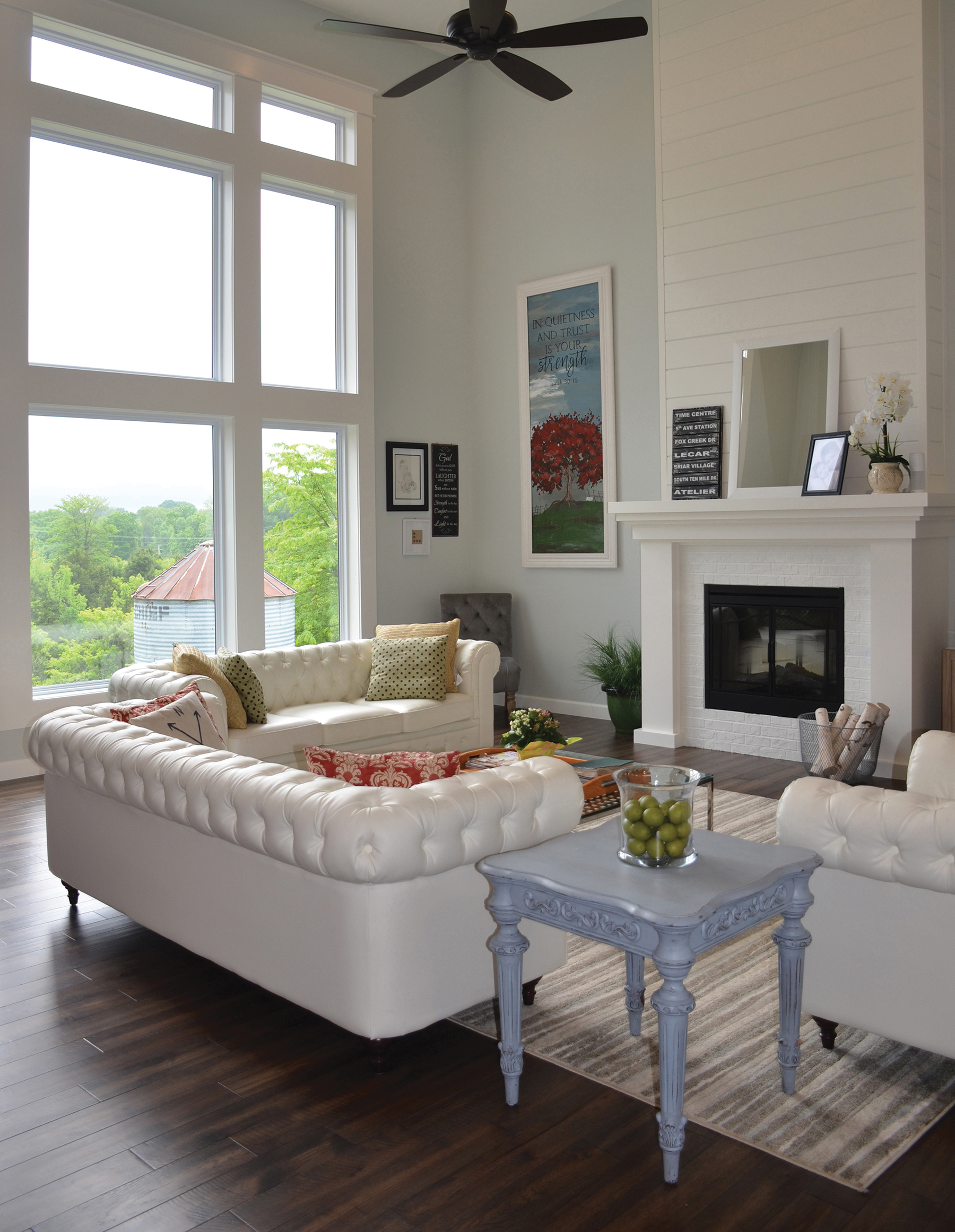
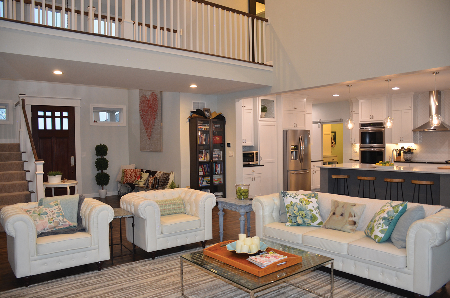
The spacious and welcoming living room remains uncluttered and bright with a feel of simplified elegance.
The color palette is light and subdued with just a whisper of blue-gray on the walls. Underfoot, hand-scraped hickory unifies the home with its warm tone. The huge bank of windows offers a beautiful view and fills the room with natural light. Tremendous consideration went into the artwork to give the home a personalized feel. The fireplace takes center stage. It is the perfect complement to the farmhouse style with the blend of painted brick, simple design and shiplap that soars to the ceiling.
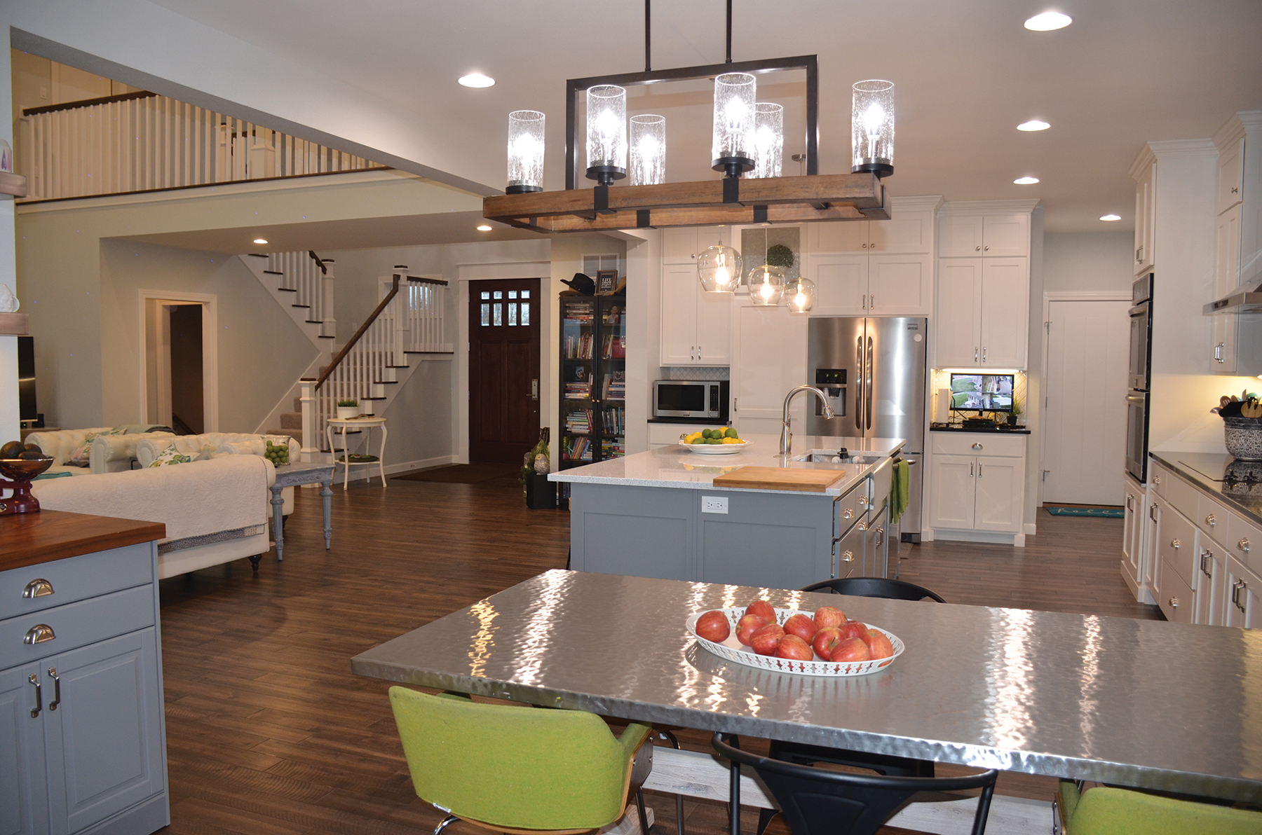
The kitchen was designed to be cook-friendly, family-friendly and entertainment-friendly. The all white perimeter cabinetry captures your attention with its understated simple lines. The white arabesque tile and black granite adds drama and complements the shaker style to deliver a dramatic result. They have a pantry hidden behind the door next to the refrigerator… there is a lot of space in a small footprint.
The extensive island is topped with quartz with sparkle accents. Touches of polished stainless steel add a chic element to the overall design. The space also includes a crossbuck dining table base with hammered stainless steel top. The casual blend of seating echoes her modern farmhouse style.
The home lives effortlessly well for their young family. The seamless joining of crisp modern overtones and traditional farmhouse elements has become the perfect stage for their lives to unfold. They wouldn’t change a thing.
Warm. Welcoming. Charming.
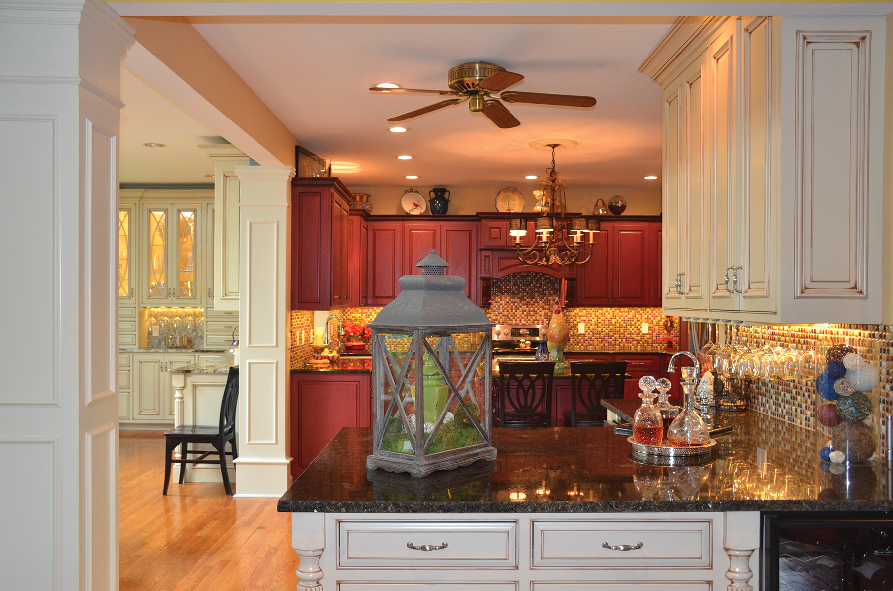
As this family grew, so did their need for a more open space. They turned to Jude Markway Construction and Tina Davis Designs for help with the much needed renovation.
Walls came down, and the open concept came to life. Interior rooms are now more accessible to one another than ever before.
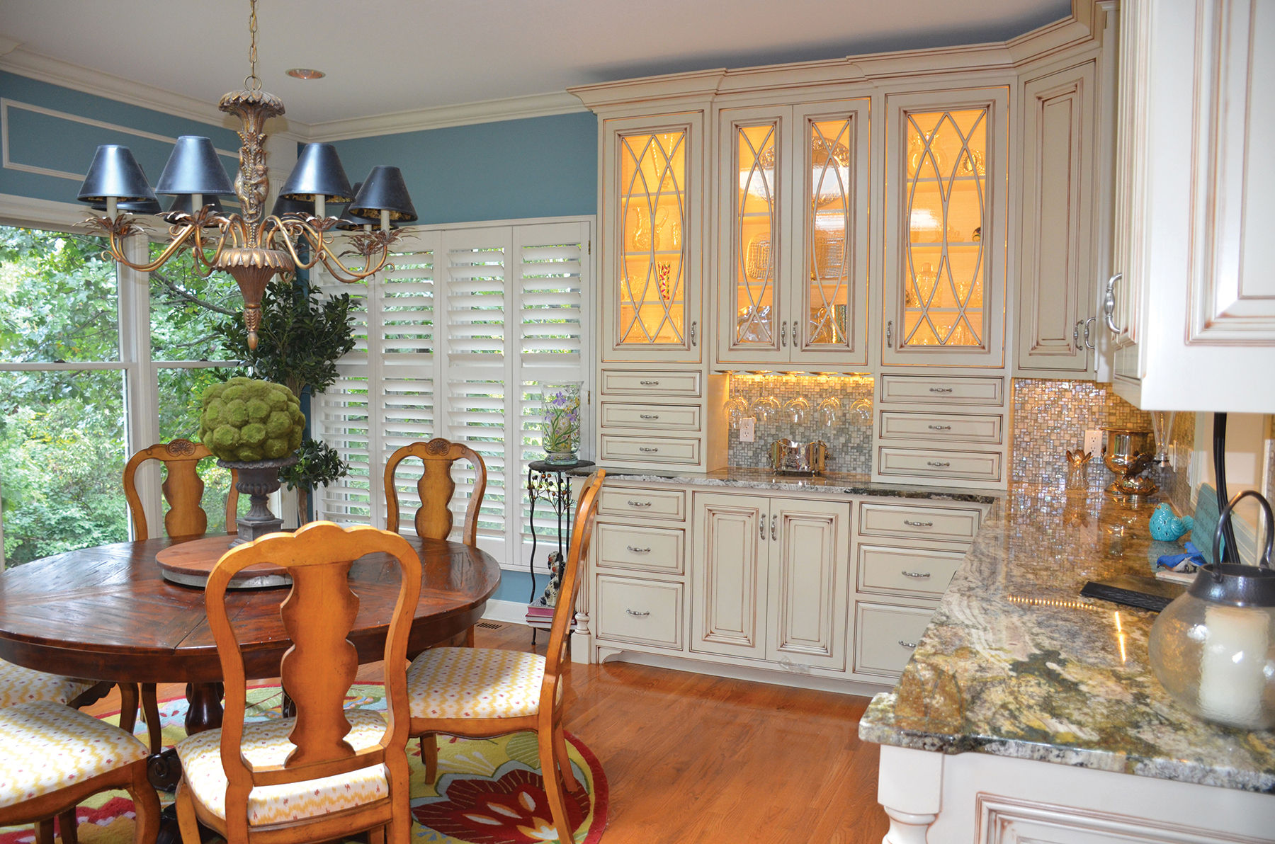
The existing red cabinets were freshened up with a complementary new tile backsplash. Then, new kitchen cabinets with custom glass doors set the tone for this vibrant gathering space. Because they were all constructed in the same size, there is a sense of symmetry and consistency through the space.
A new wet bar peninsula makes entertaining fun and brings everyone together.
The resulting design looks like it had evolved over time… that had personality and charm. It embraces their whimsical style without neglecting all the important touches that reflect their personality. With balance, harmony and keen attention to detail, this uniquely beautiful kitchen truly has it all.
Livable Design: A True Treasure
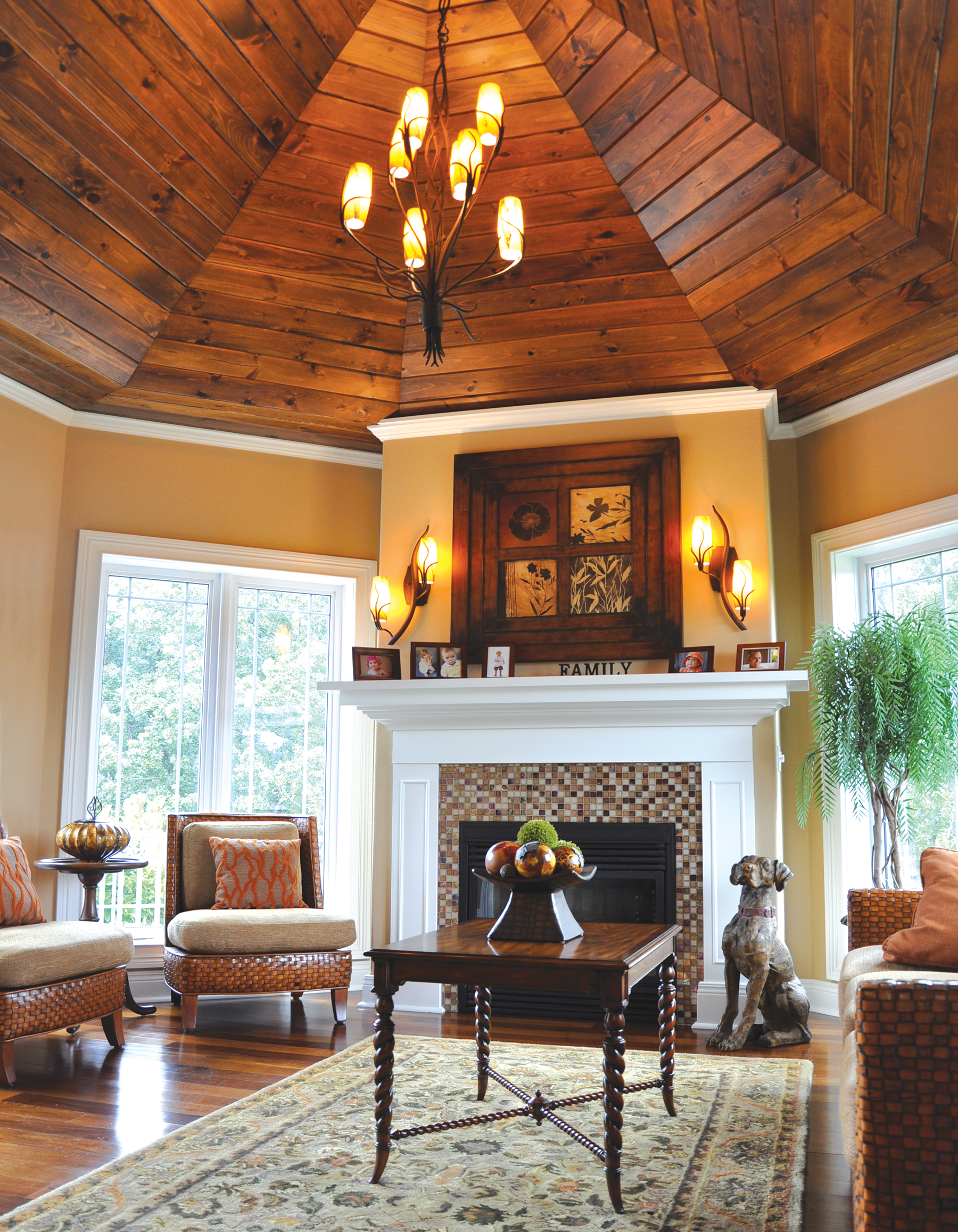
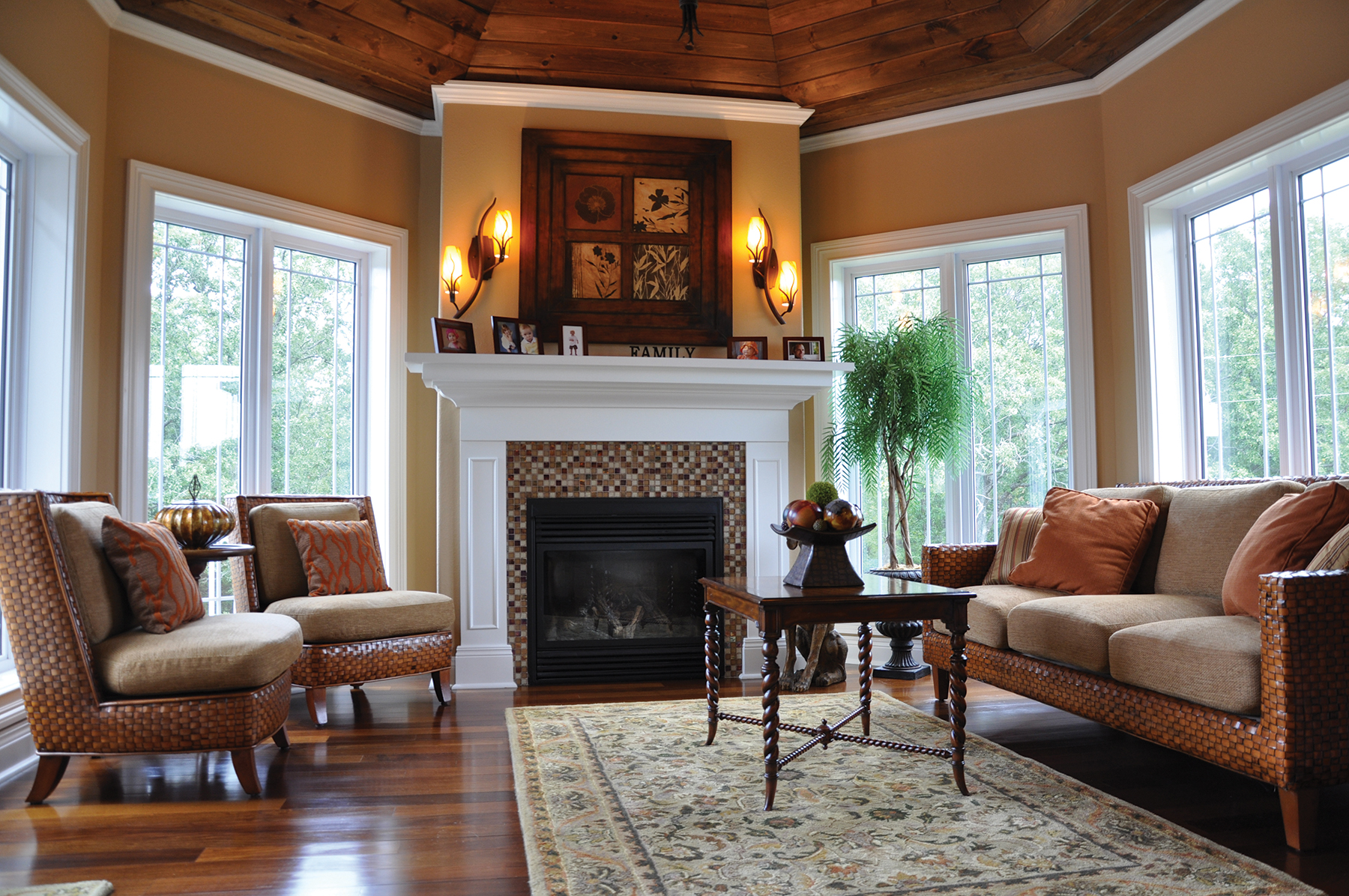
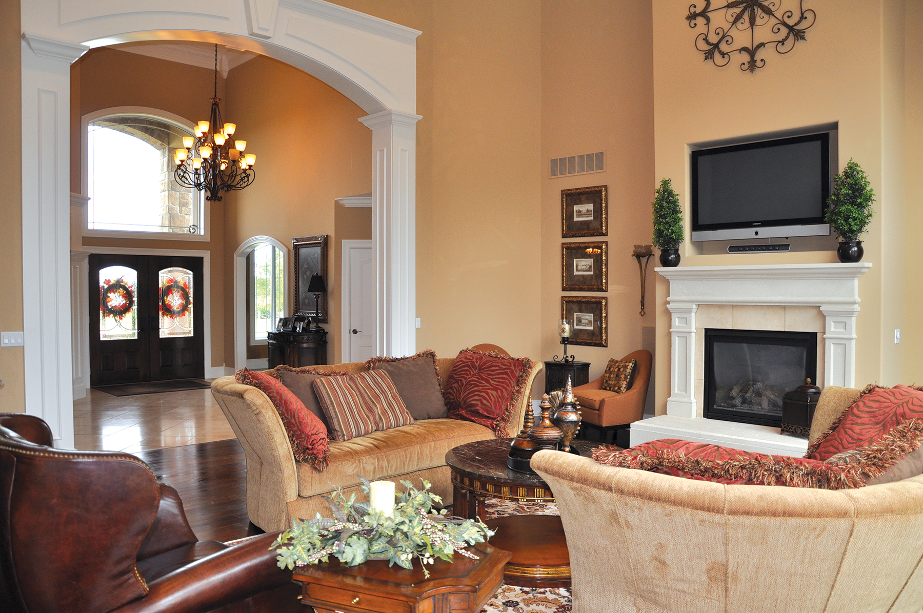
When Keith and Karen Beck finally broke ground on their home, they enlisted the help of Anna Luecke who worked to develop an entire palette of design elements that would define their gorgeous new home. The design embraced a welcoming open floor plan that works for large gatherings or intimate family occasions. Through the richness of fabrics, the silkiness of polished granite countertops and the warmth of custom-designed wood cabinets, the design embodies a sense of home and a level of comfort.
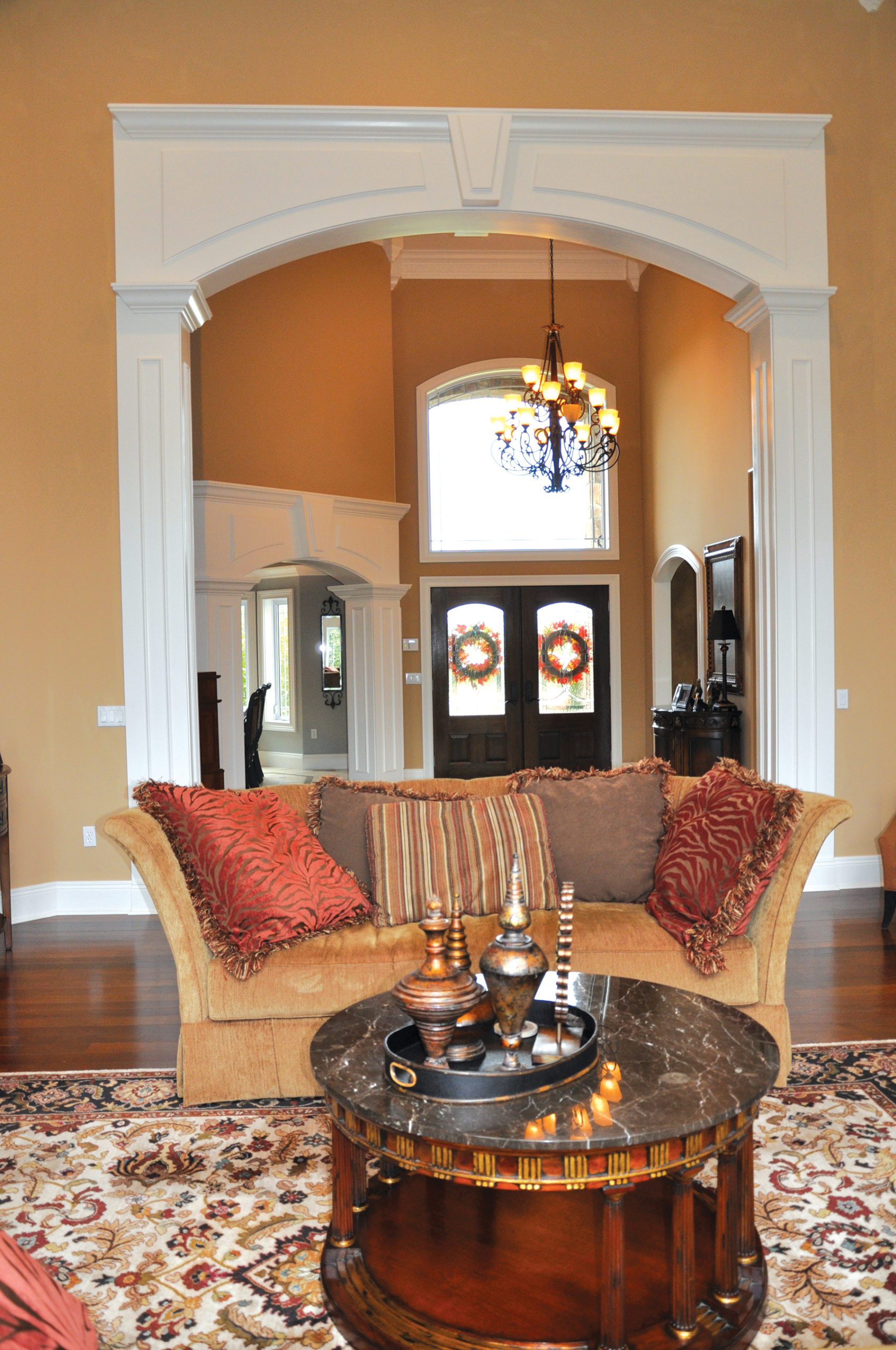
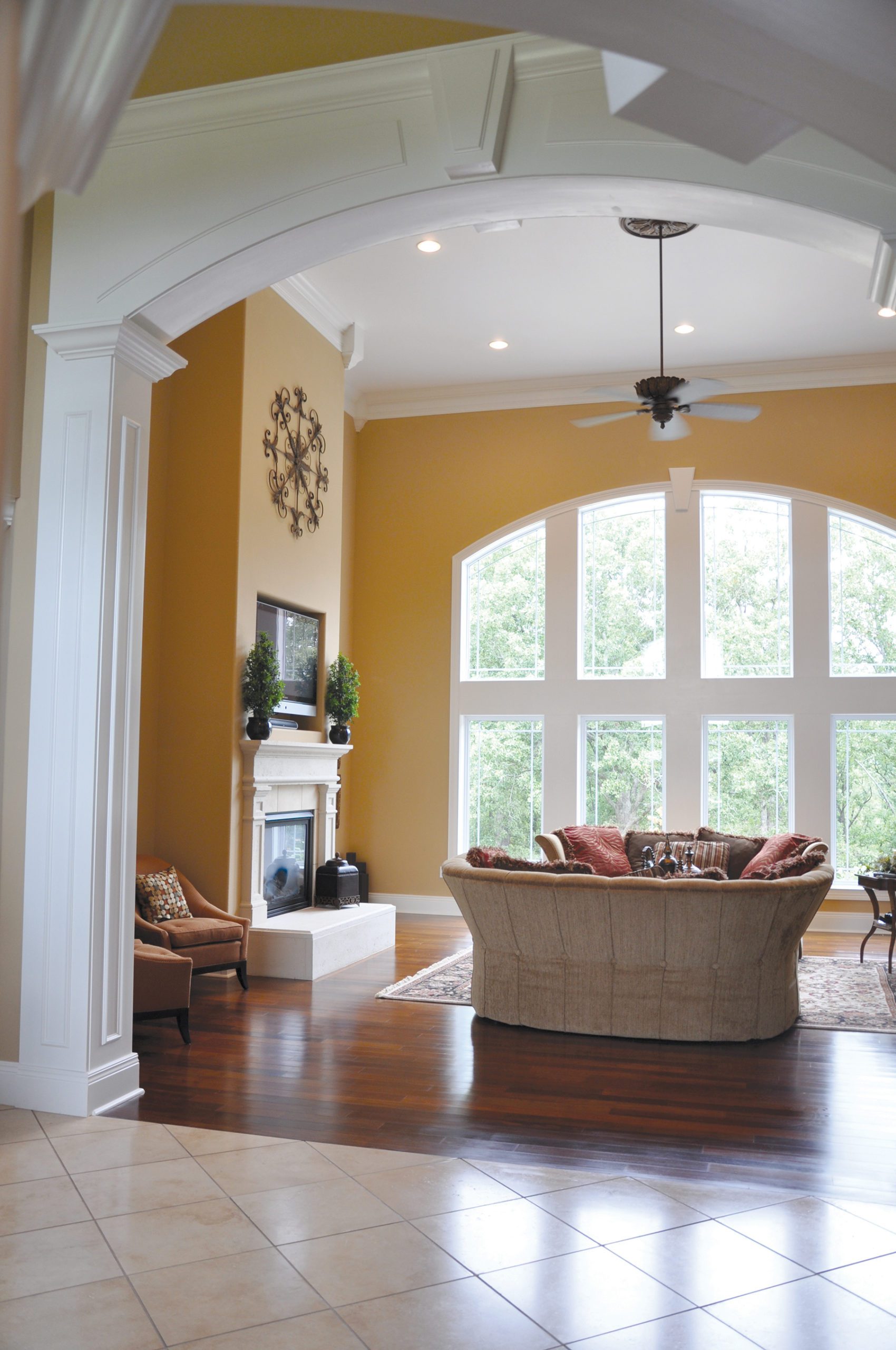
The home features an abundance of classic architectural curves. Archways between the rooms define each space. Visual warmth stems from a cohesive color palette, travertine tiles and gleaming Brazilian walnut wood flooring. Columns have their roots in classical architecture and generous moldings accent the depth of the columns, trim the doors, windows and ceilings, further enhancing the interior lines and allowing the design of each room to garner its deserved attention.
Grand design can be appreciated, chic design can be admired but livable design is a homeowner’s treasure. The Beck’s home is a true treasure – a flawless combination of inventive style combined with the practical needs of their family.
A Skillful Mix of Contrasts
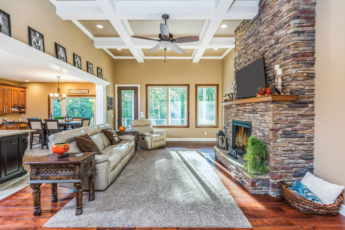
This homeowner’s design was guided by inspiration from the HBA Parade of Homes and brought to life with the help of Clinton Luebbering Construction.
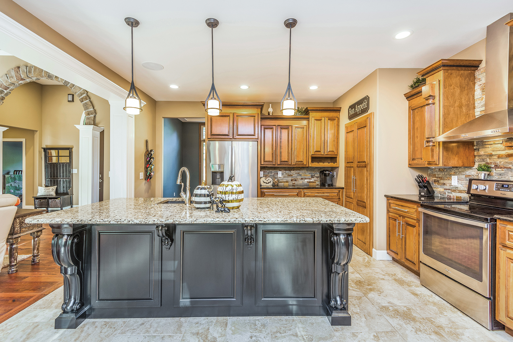
Upon entering, the house reveals the open concept living room. A tall stone fireplace leads your eye up to the tall 12-foot coffered ceilings. The homeowner skillfully chose a mix of contrasting materials which makes the cohesive design pop: white trim highlights the stained doors, a dark wood fan stands out against the white coffers, and the stone fireplace texture plays nicely against the warm tone of the hardwood flooring.
Opposite the fireplace wall, the room opens to the kitchen. The opening is framed with well-crafted millwork. They’ve cleverly designed this beam to create a photo ledge where the homeowner can display treasured memories of their family.
The homeowner took every opportunity to bring together function and style in her dream kitchen. A large, black painted island with light-colored granite anchors this space. Warm stained cabinetry lines the walls. Again, contrasting materials in the design, she chose black-toned granite countertops. The textured stone backsplash ties into the living room fireplace. Though the ceiling here is lower, it still feels airy as light streams in from the large picture windows.
While they had once considered having more closed spaces, this family couldn’t be happier with how this open layout works
for them.
Contemporary Casual
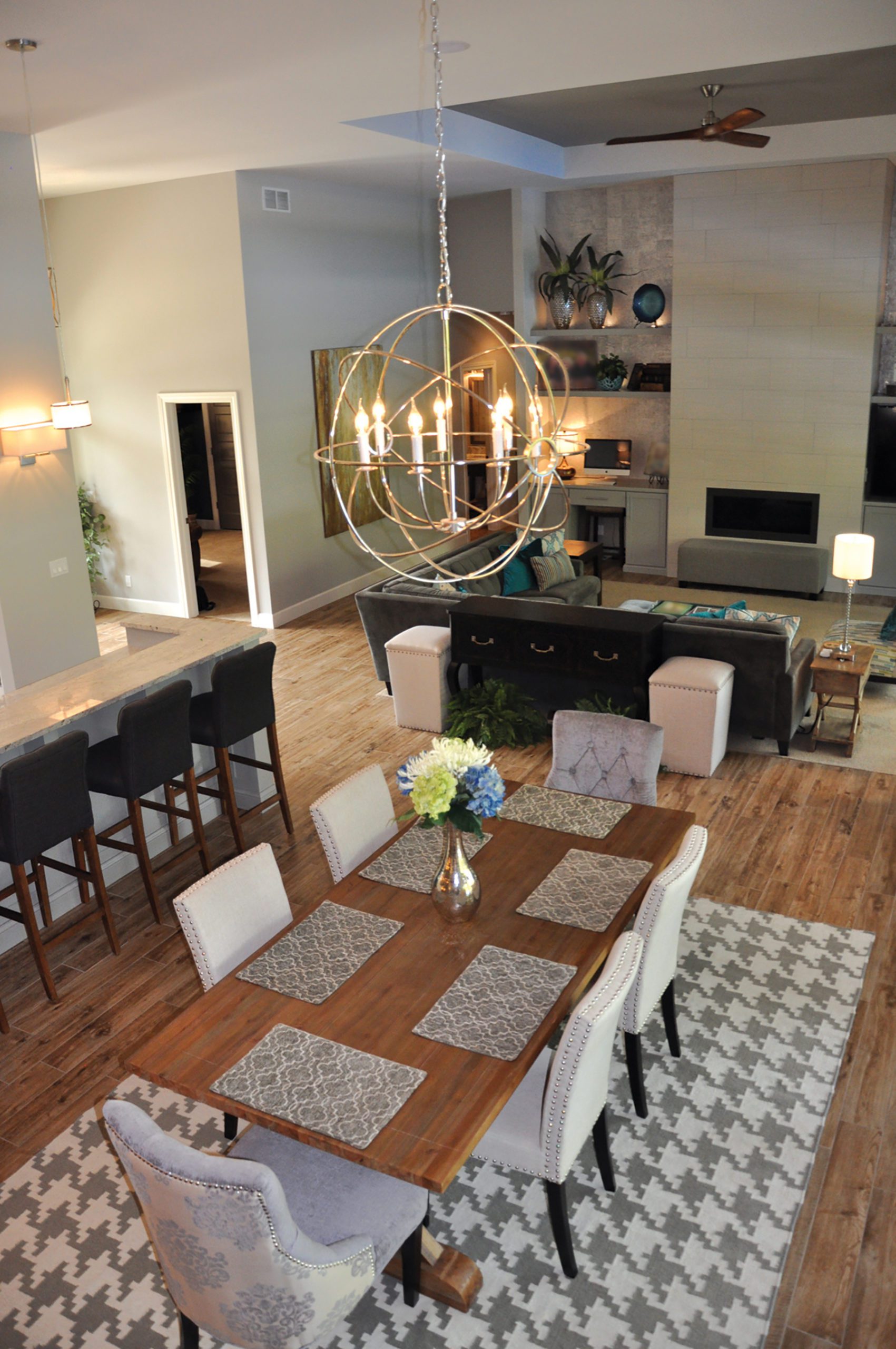
When building, these homeowners teamed with Brice Ready Construction and designer, Anna Luecke, to build their contemporary home. The resulting plan features large windows, open spaces and unique features designed around light and space.
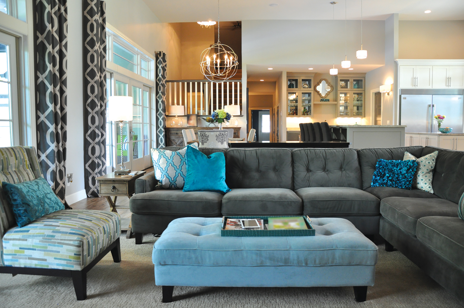
Uninhibited by traditional choices, they took an opportunity to create something special by editing moldings and ceiling treatments. They let the geometry of the space speak for itself, adding drama and substance. A large open space, the kitchen, great room and dining room all blend, allowing for an easy flow of traffic when entertaining or when it’s just the family.
The engaging and complementary design adds special touches without overdoing it. Starting with a fireplace covered floor to ceiling with 12 x 24 tiles, it soars to thirteen feet. The modern design continues on the bookcases which flank the fireplace. Shimmery cork wallpaper was chosen to add texture and create the perfect backdrop for carefully curated accessories. Pops of color are sprinkled into the design adding interest. A large sectional with contemporary lines is the perfect place to enjoy the fireplace while watching a movie, and the upholstered furnishings inject a bit of color and softens the modern edges.
The homeowners had a vision of the look they wanted and with the help of their team, it became a reality.
The Only One of its Kind
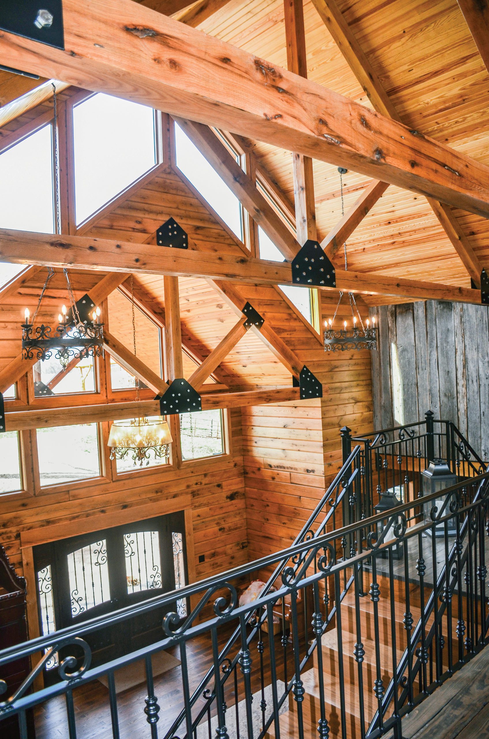
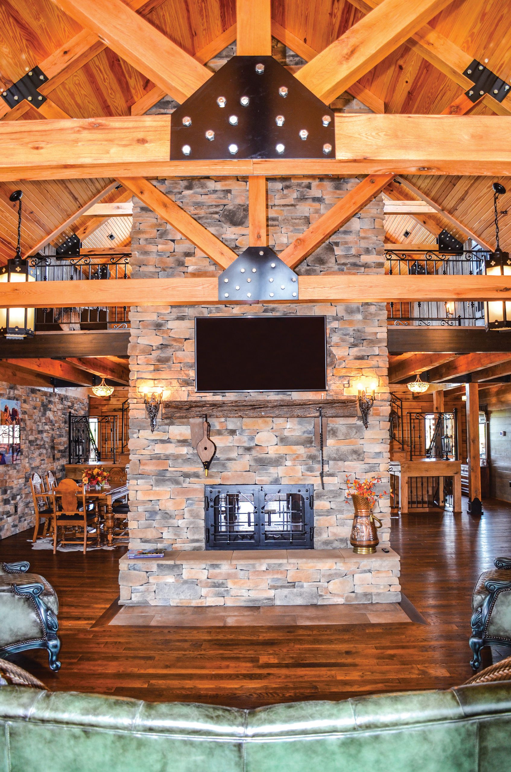
Joey and Anita Ridenhour knew they wanted a log home, so they went to Gastineau Log Homes to put their concept on paper. Hours of planning and revisions resulted in this beautiful structure.
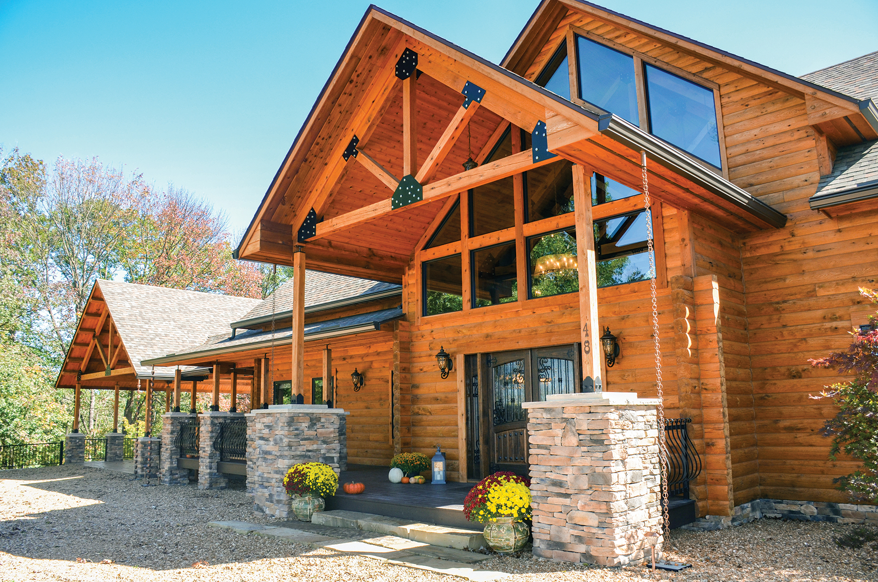
Their home has its own personal narrative to tell. It’s a story of how construction methods of the past and designs of the present merge to create an almost spiritual result. The dance between wood timbers, stone and steel is apparent as you approach the home. Only an amazing structure such as this can make a powerful connection to this beautiful piece of land in the rural farming community, they both are drawn to. They responded to that sense of community by sourcing local craftsmen whenever possible to create the one-of-a-kind features that are found throughout the home.
A series of pillars, posts, beams and soaring gables reach toward the sky, forming the perfect architectural composition. Remarkable structural features are a hallmark of log home construction. Impressive detailing used in the exterior design include geometric window groupings, cut stone steps, stamped concrete, stacked stone pillars and rain chains instead of downspouts.
A warm welcome awaits as you enter the home through the custom wood, glass and wrought iron doors. We weren’t sure where to look first. The massive structure is brimming with wonderful details and skilled craftsmanship.
Industrial Down on the Farm
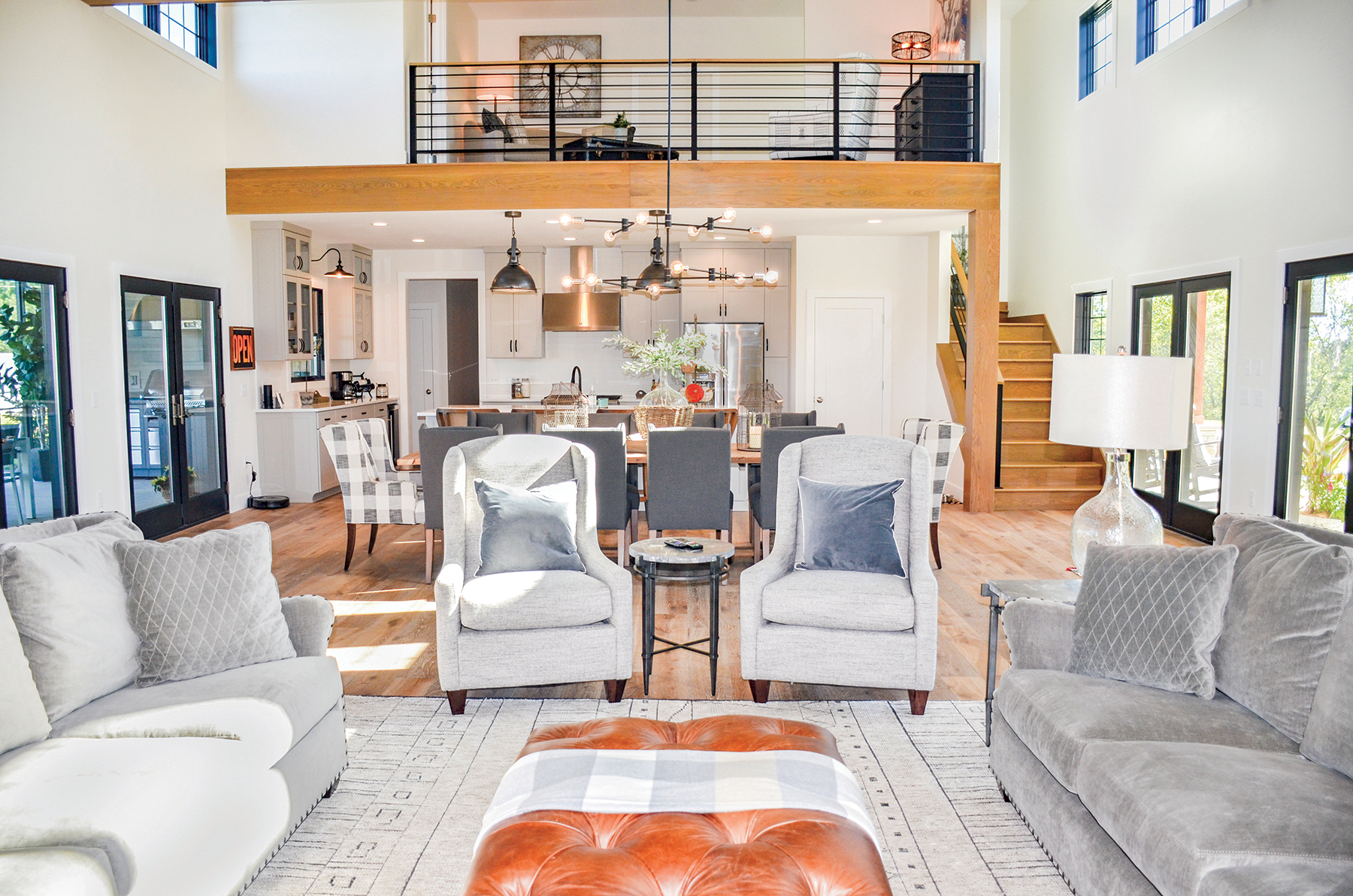
When their original plans for a remodel fell through, these new homeowners worked to determine exactly what they wanted from this property. With a blank slate, they created a home that would play host to many family gatherings. The couple, in collaboration with Paulette Kreter of Paulette Designs, drew up the plans for their new home, and Mike Luebbering took on the task of making it a reality.
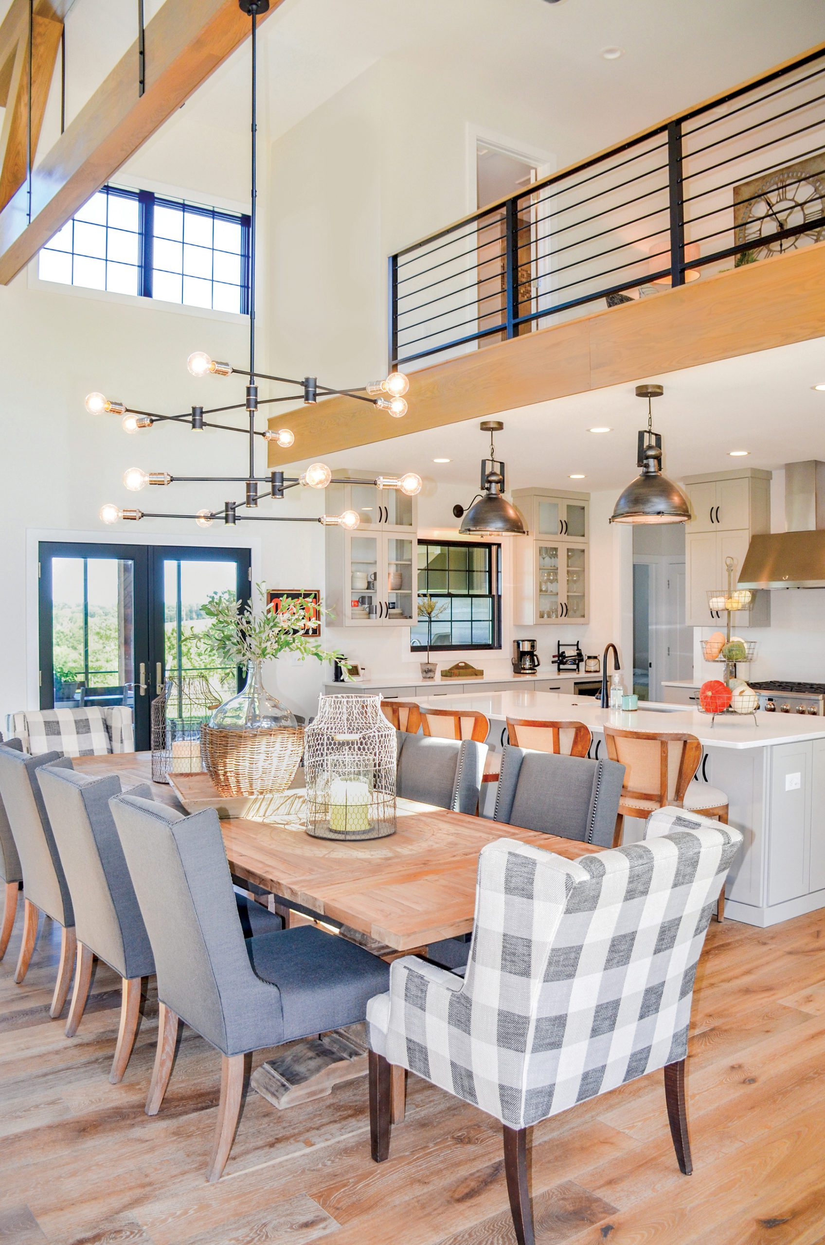
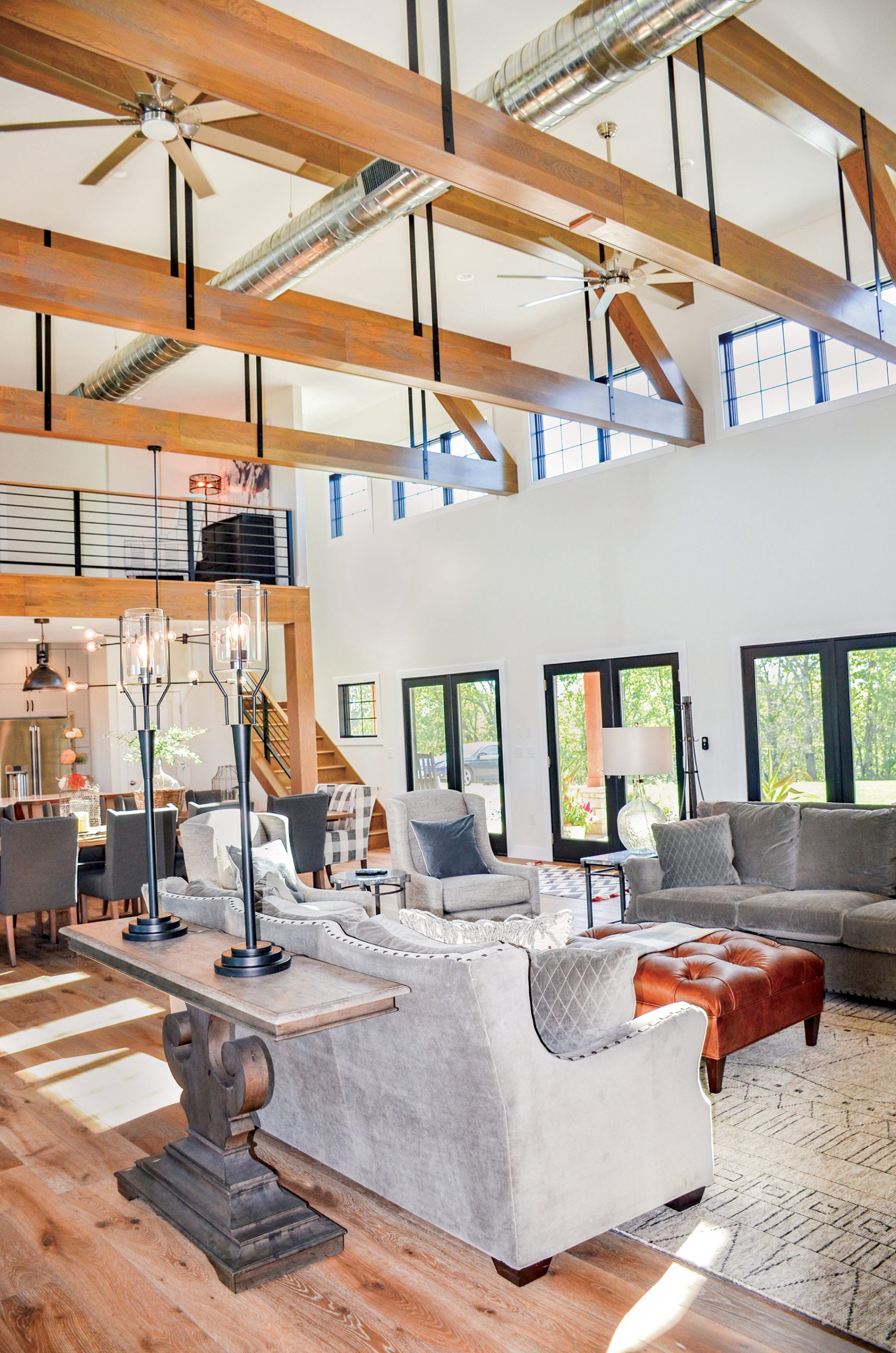
Once you walk into the space, you realize that the entire second story above much of the open concept living area has been left exposed. The openness is accented by Anderson windows and white oak support beams, drawing your eye upwards to the ceiling, across the space, and furthering that light and expansive feeling.
They created a truly rustic, industrial retreat. Old meets new. Traditional meets modern. Natural meets man-made. Metal accents contrast against the light woods and cream-colored walls. All the windows and doors have been framed with black trim, echoing the metal strapping on the beams. An exposed duct running across the ceiling even further enhances the industrial style.
With the homeowners’ strong vision for their space, Rachel and Tina of JC Mattress and Furniture Showrooms helped them finish off the design and find the perfect furnishings, lighting and area rugs.
Evolution of the Family Home
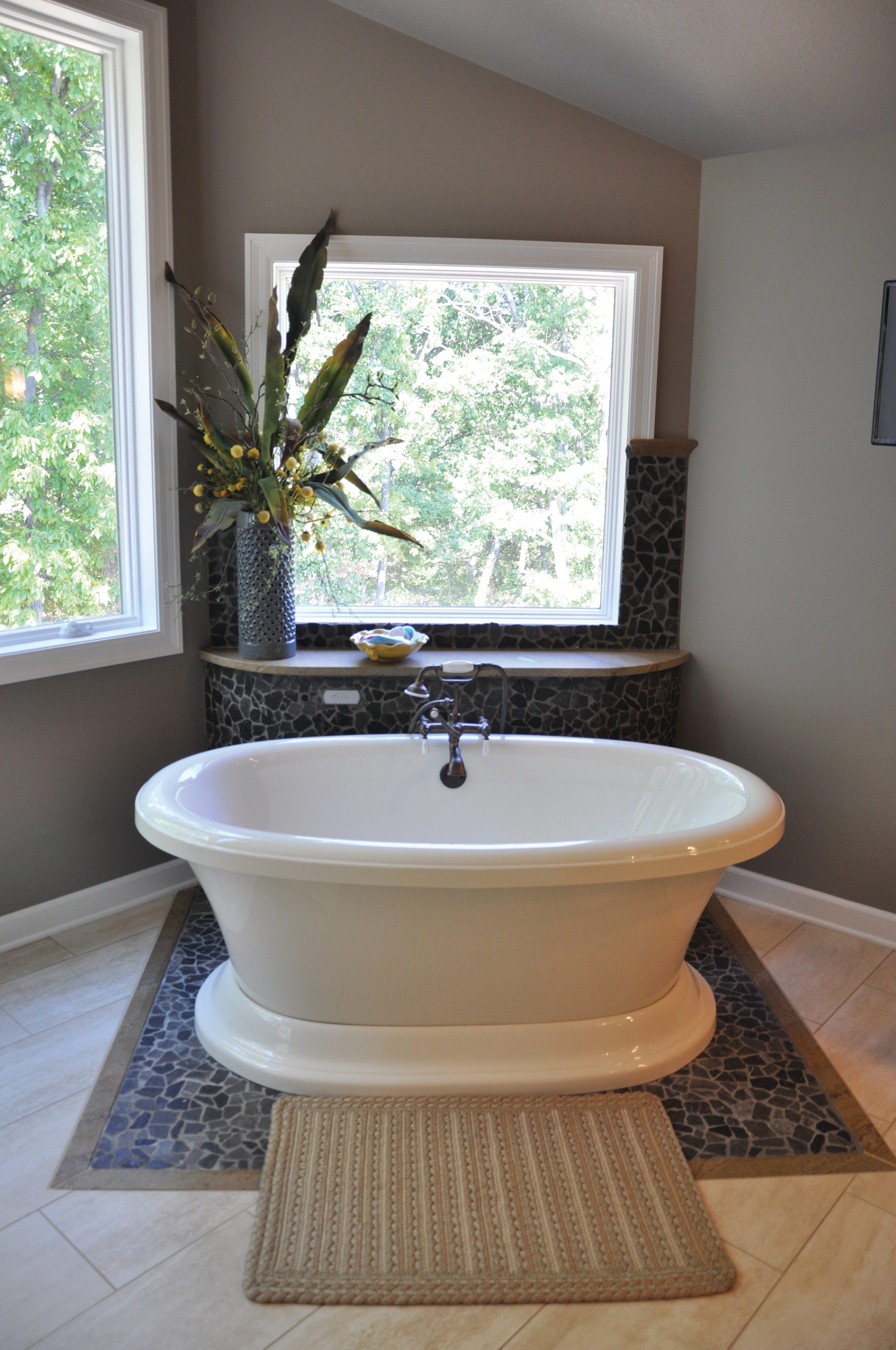
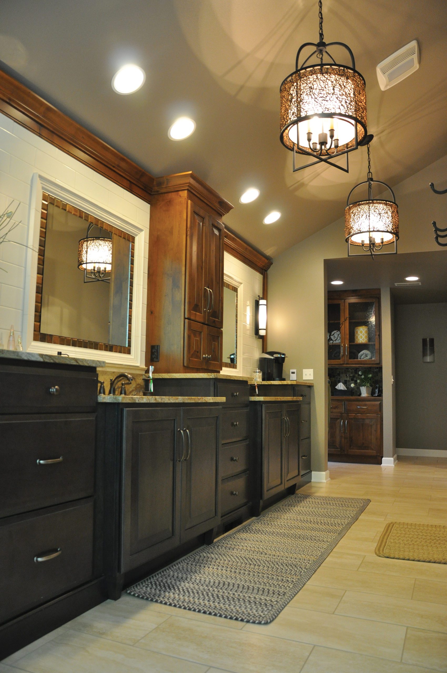
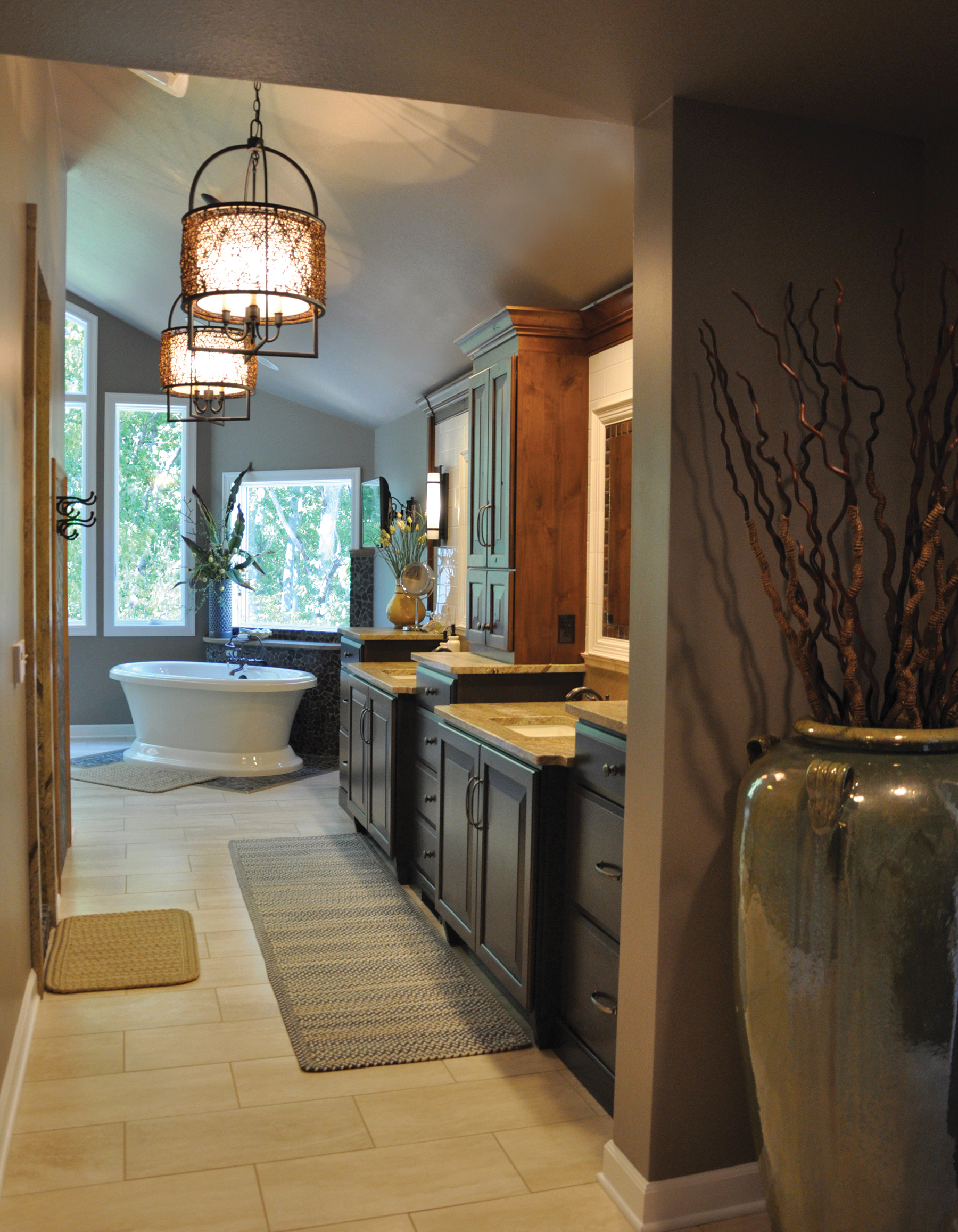
When these homeowners became empty-nesters, they turned to their original homebuilder, Kent Bentlage, and Theresa Heckman to expand and transform their master bathroom and closet.
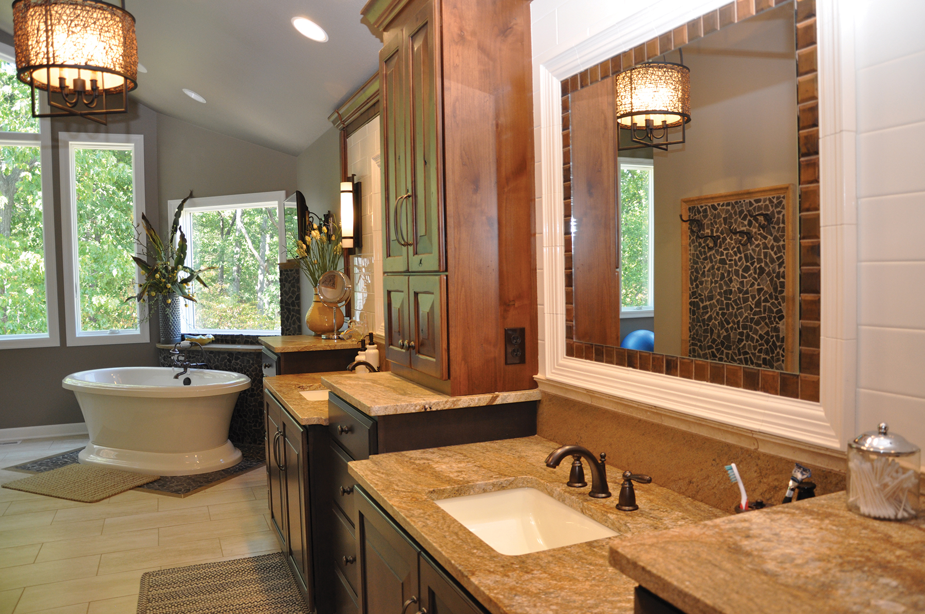
What is immediately striking about their master bath is the distinct style that is functional and incredibly creative. The expanse of cabinetry takes on a certain fluidity as different levels are used to define the couples individual spaces. The artful combination of a variety of tile and granite creates an intriguing effect in this sophisticated space. Different tiles are combined to frame the mirrors, punctuate the free standing tub and towel hooks and create a one of a kind shower. It is a study in form, function, scale and texture.
The result is a spa like retreat that takes your breath away. Where you can fill the tub and take a long relaxing soak or step into the huge steaming shower and allow the stress to evaporate. The huge windows let the outdoors become a part of the experience. Just imagine enjoying the beautiful view while soaking in the tub.
Humble Beginnings
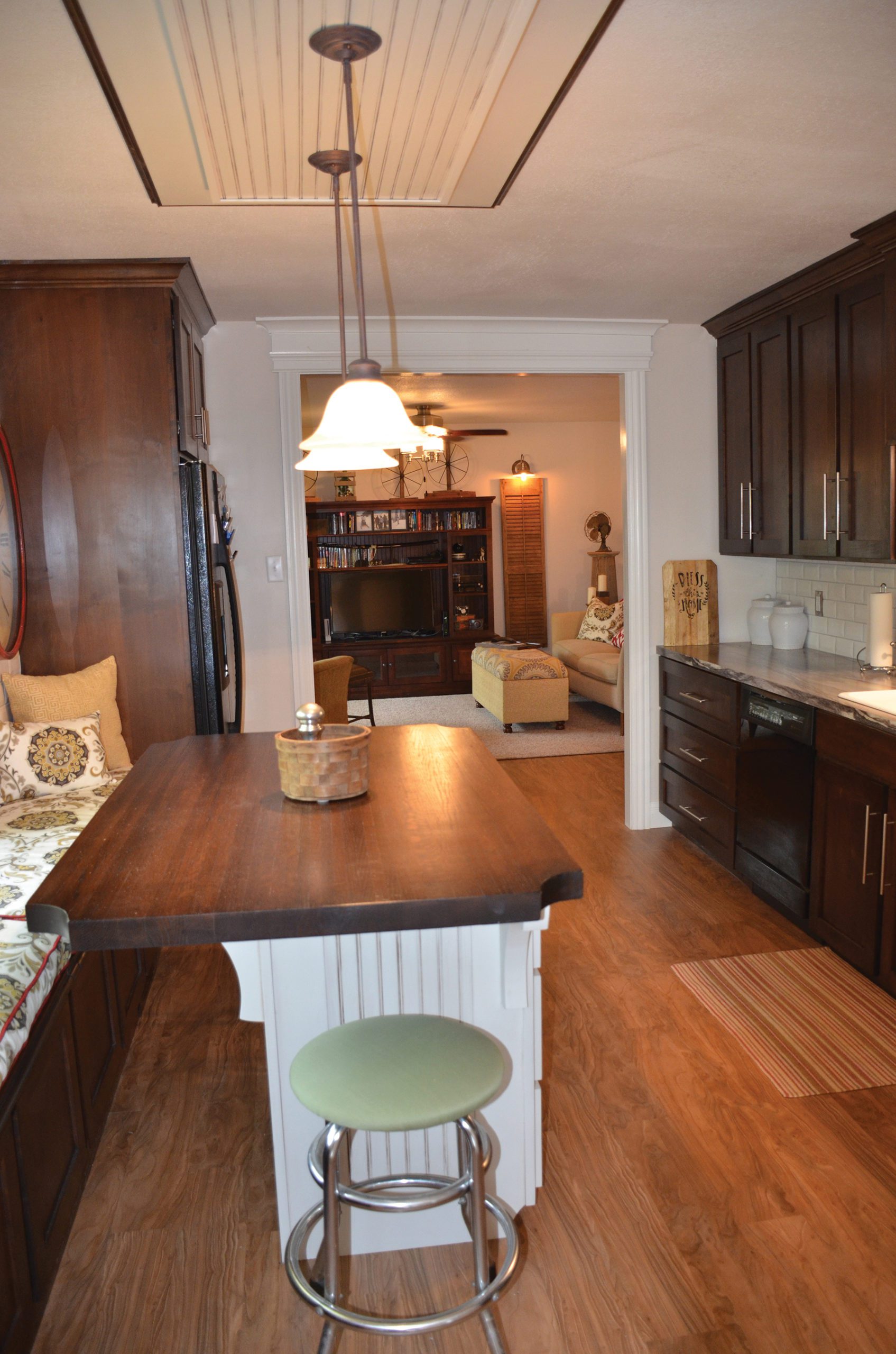
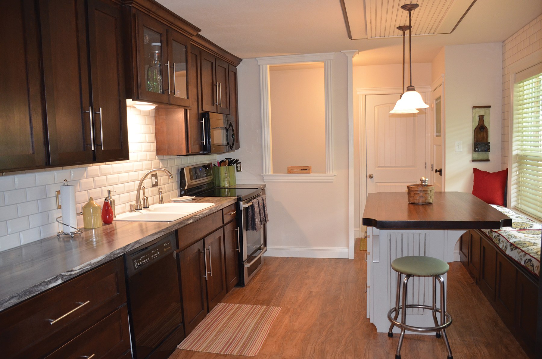
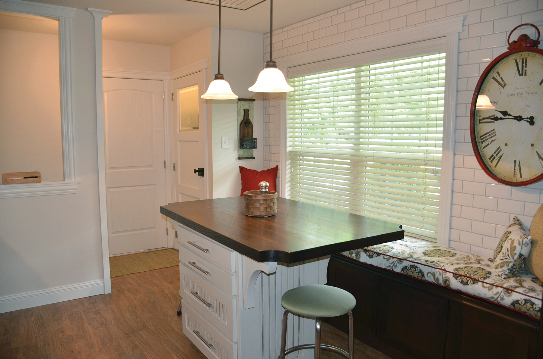
This badly neglected fixer-upper house became an excellent starter home. Starting with the plan, a budget and a cottage design style in mind, the home was transformed.
In the kitchen, they reconfigured the layout to make the most of this small area while maximizing the function of storage, prep and dining space. Then the opening between the living room and kitchen was enlarged as much as possible. Both of those changes made a huge difference!
The large window is the perfect place for bench seating. A tongue and groove wood island with butcherblock wood top serves two purposes: additional counter space and the dining table. New alder cabinets, granite-look laminate counters and beveled white subway tile complete the cottage look.
The journey included hard work, a few surprises, tough decisions and a great learning experience… all an exciting first step for this first-time homeowner.
Carefully Chosen Details
While no stranger to building, this would be the first home that Jan would build without her late husband. She met Dean Holtmeyer, and right away she knew he was the builder for her.
He implemented all of her requests and offered creative options to make her home everything she imagined.
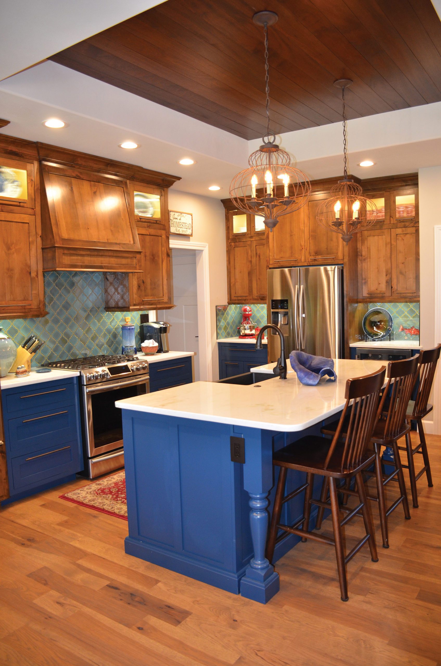
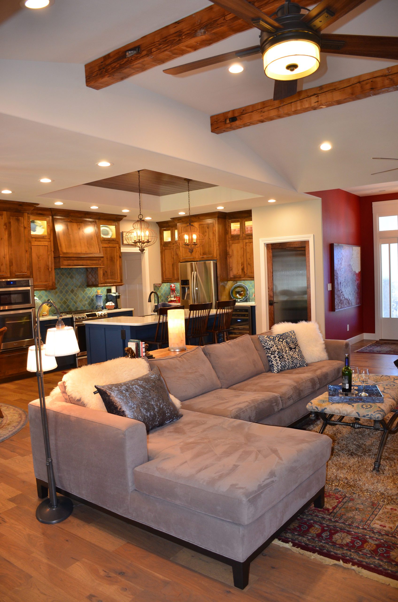
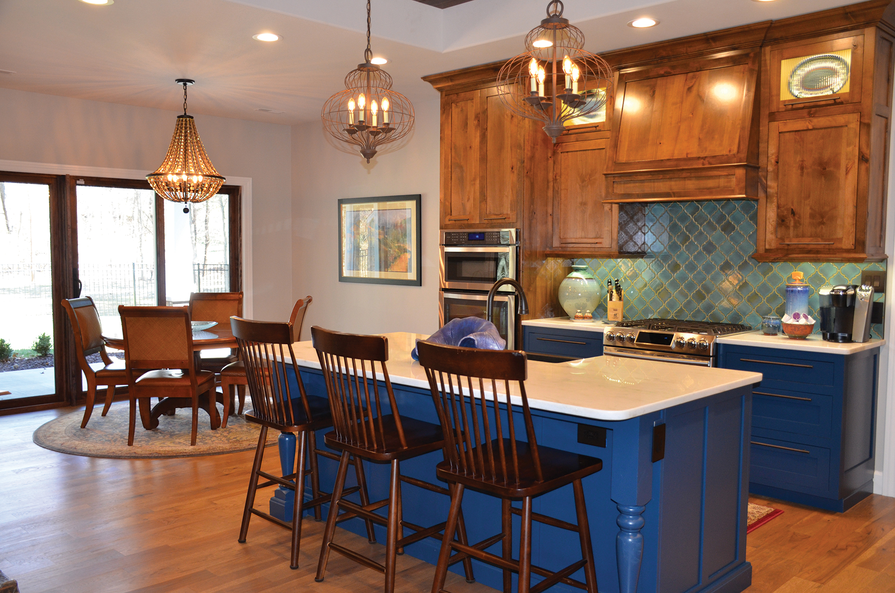
Kitchens are always the heart of any home. Jan knew she wanted blue cabinets but did not want to pair them with white uppers. When she wasn’t able to find inspiration photos of blue cabinets combined with wood, she forged ahead to a beautiful result. Precise craftsmanship and planning can be seen in the quality of the floor to ceiling cabinetry.
Every detail was carefully chosen, from the faucets to the finishes on the appliances and even the placement of the handles.
Ample quartzite granite counters, stainless steel appliances and abundant storage make it her dream kitchen. An arabesque tile backsplash adds a touch of old-world charm.
Overhead mahogany inlaid tray ceiling is a stunning detail that adds character, dimension and texture. A pair of wire light fixtures echoes the shape of the backsplash tiles. Their airy design is just the right touch to illuminate the space.
In the adjacent dining area, she paired her round table with the gorgeous dining chandelier, that has both glamorous and classic elements. The intimate space goes along with the theme of livability and warmth in this home. The room is filled with natural light to add to the open breathable feel.
The home is truly the embodiment of the craftsman aesthetic… Simple living and high thinking. Where simple pleasures are appreciated and embraced.
Room for Two
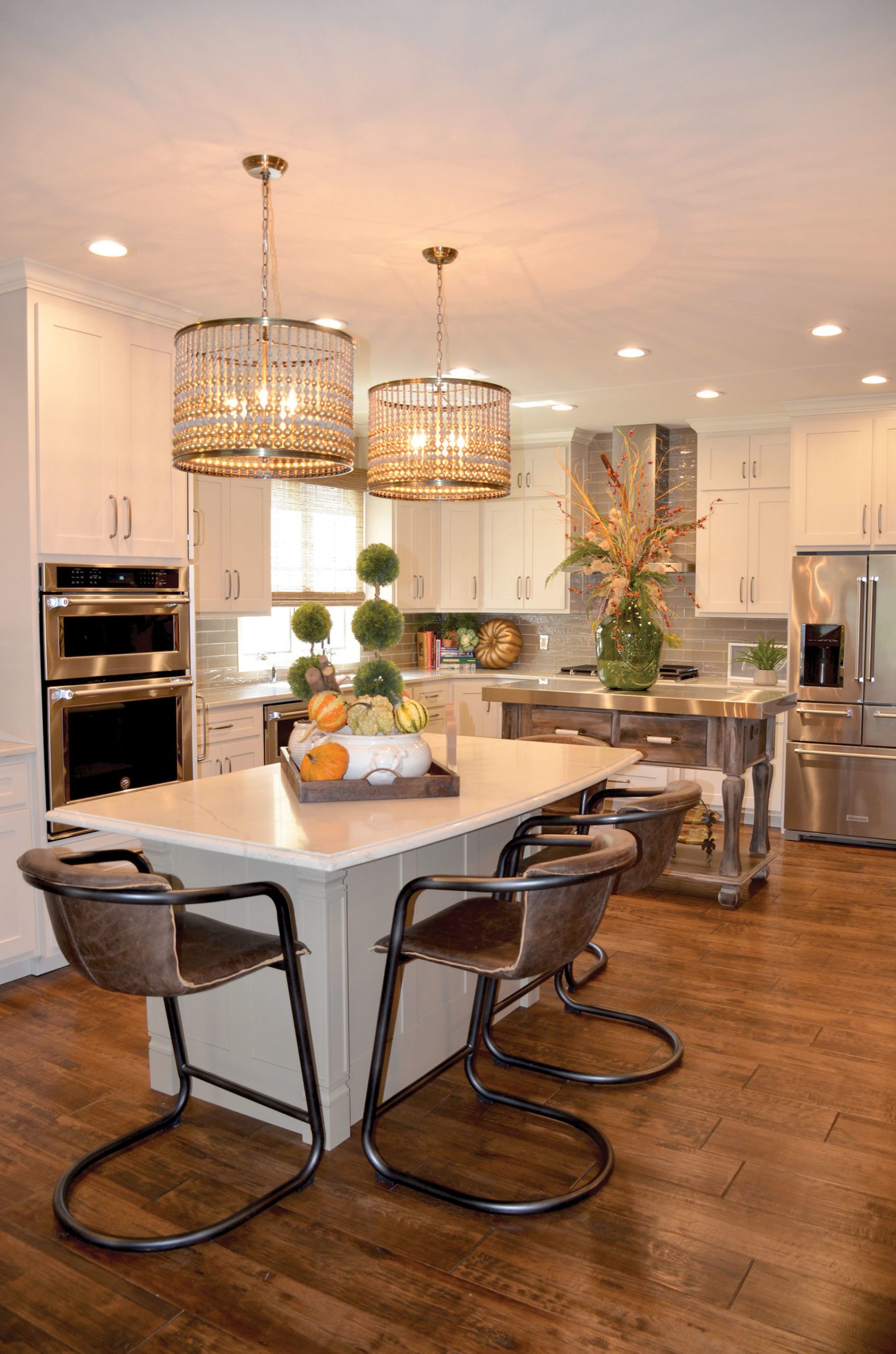
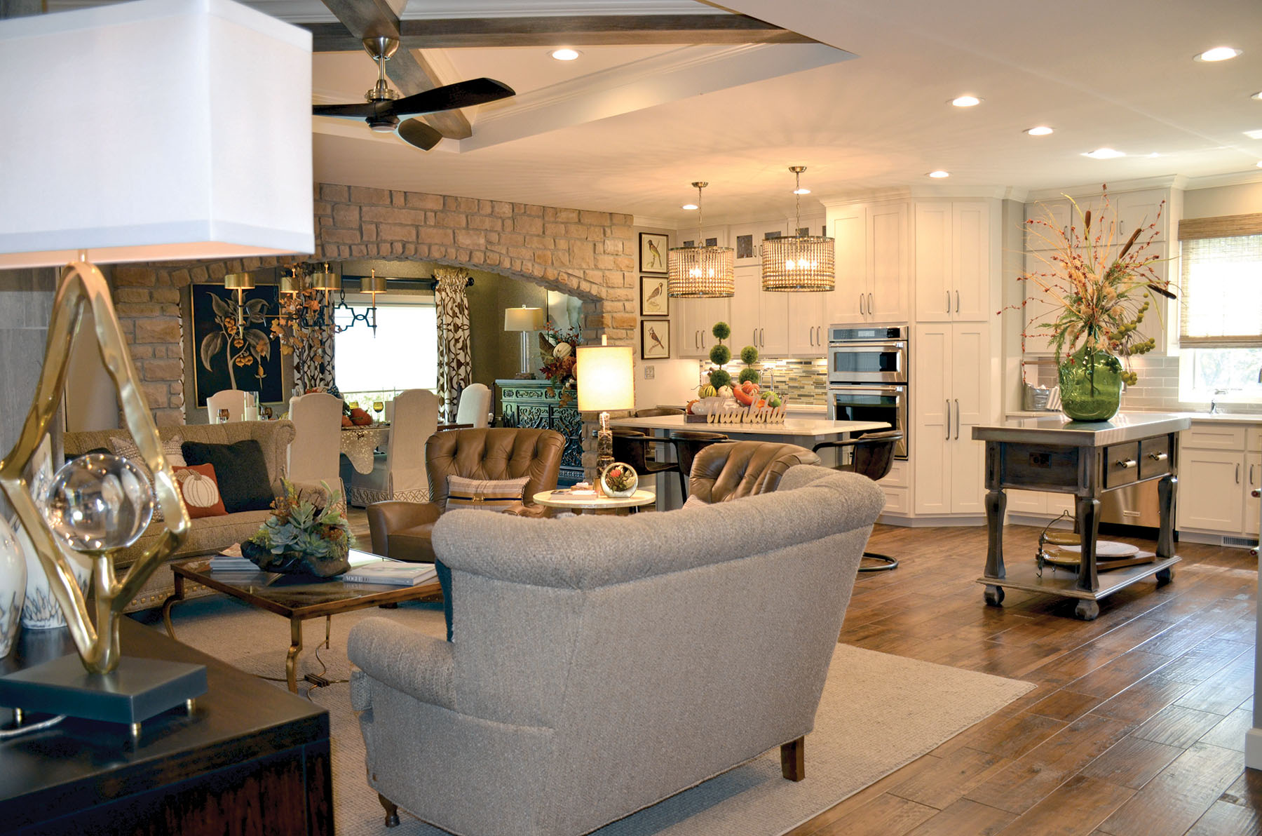
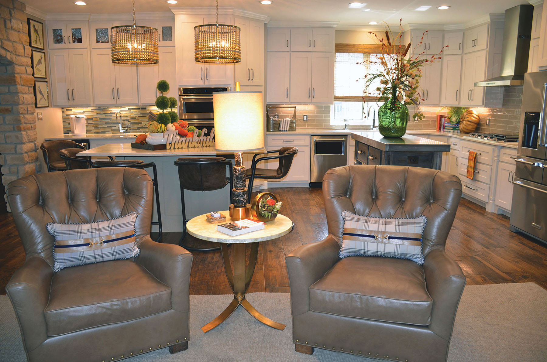
Dave Burks was already amid construction when Tom and Patsy Hoeferlin fell in love with this house and decided to make it theirs. At the heart of this open-concept home is the kitchen, which gets a great deal of use as Patsy loves to cook. The central island is multi-functional with wooden bead, dual drum shaped light fixtures overhead, creating a modern, yet glamorous appeal.
Patsy’s love of baking necessitated a second island. The stunning design and custom finish on this unique baker’s table perfectly suites the impeccable design.
The beautiful cabinetry utilizes simple lines to create a powerful impact on the open plan. Mixing colors, finishes, materials and textures always make a big design impact. These details may seem subtle, but when combined they are what makes the design come to life.
In their living room, there is plenty to catch the eye. The neutral palette enhances this relaxing space.
A large wool rug anchors the space and seating was chosen that is both comfy and beautiful. Their use of materials in the living room delivers a sense of urban elegance. Carefully chosen accessories appropriately scaled for the space create an intriguing display in this room.
Looking back, Tom and Patsy’s personal touches have transformed a house into their home and makes them smile every time they walk through the front door.
Approachable Elegance
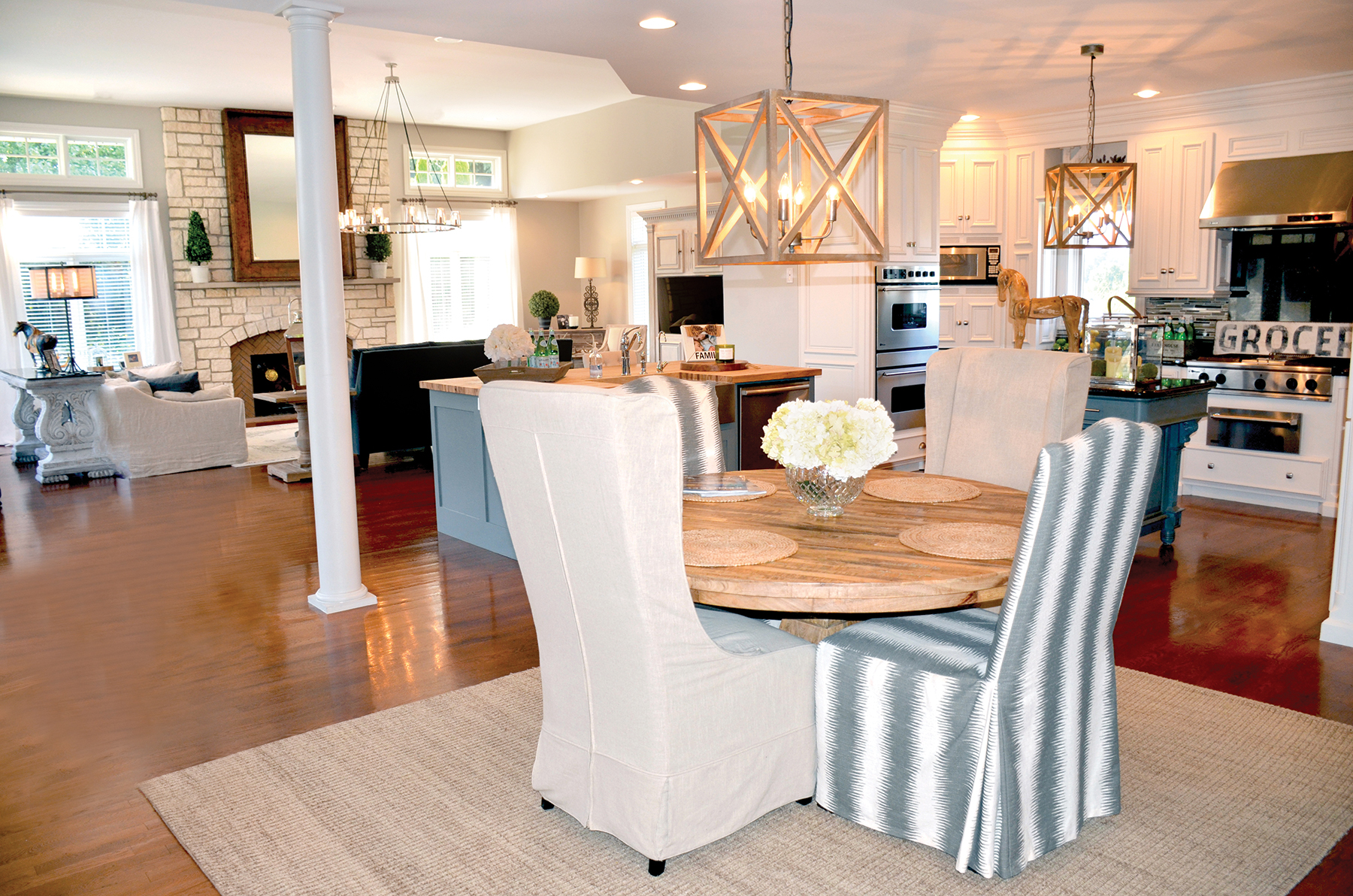
Tom and Brenda Kolb wanted to modify and update their home as their lives and tastes changed. The team at Dick Otke Construction Company, who originally built the home, was happy to help with their remodels. When you walk in, each space flows beautifully to the other, and you are immediately at ease.
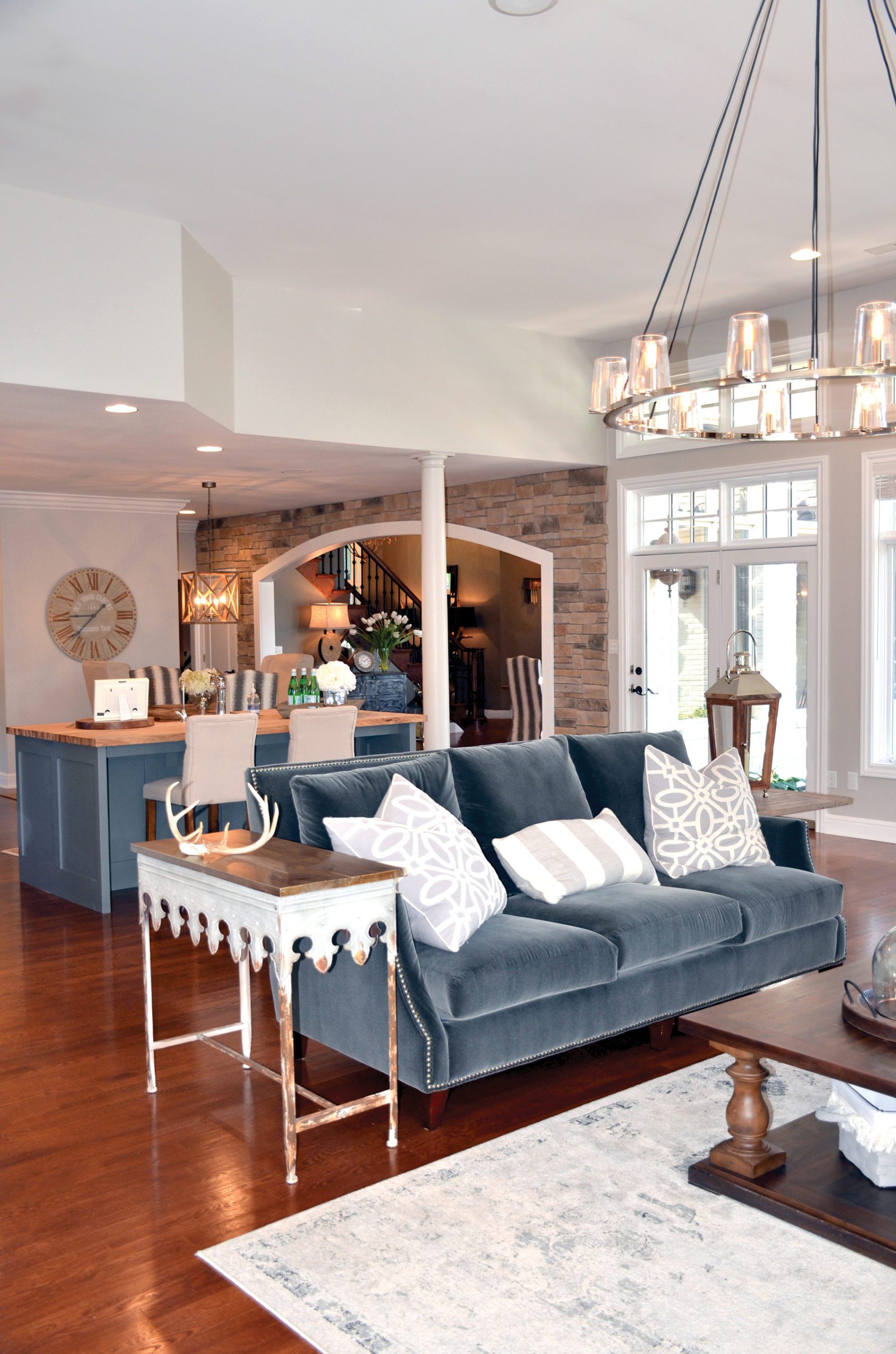
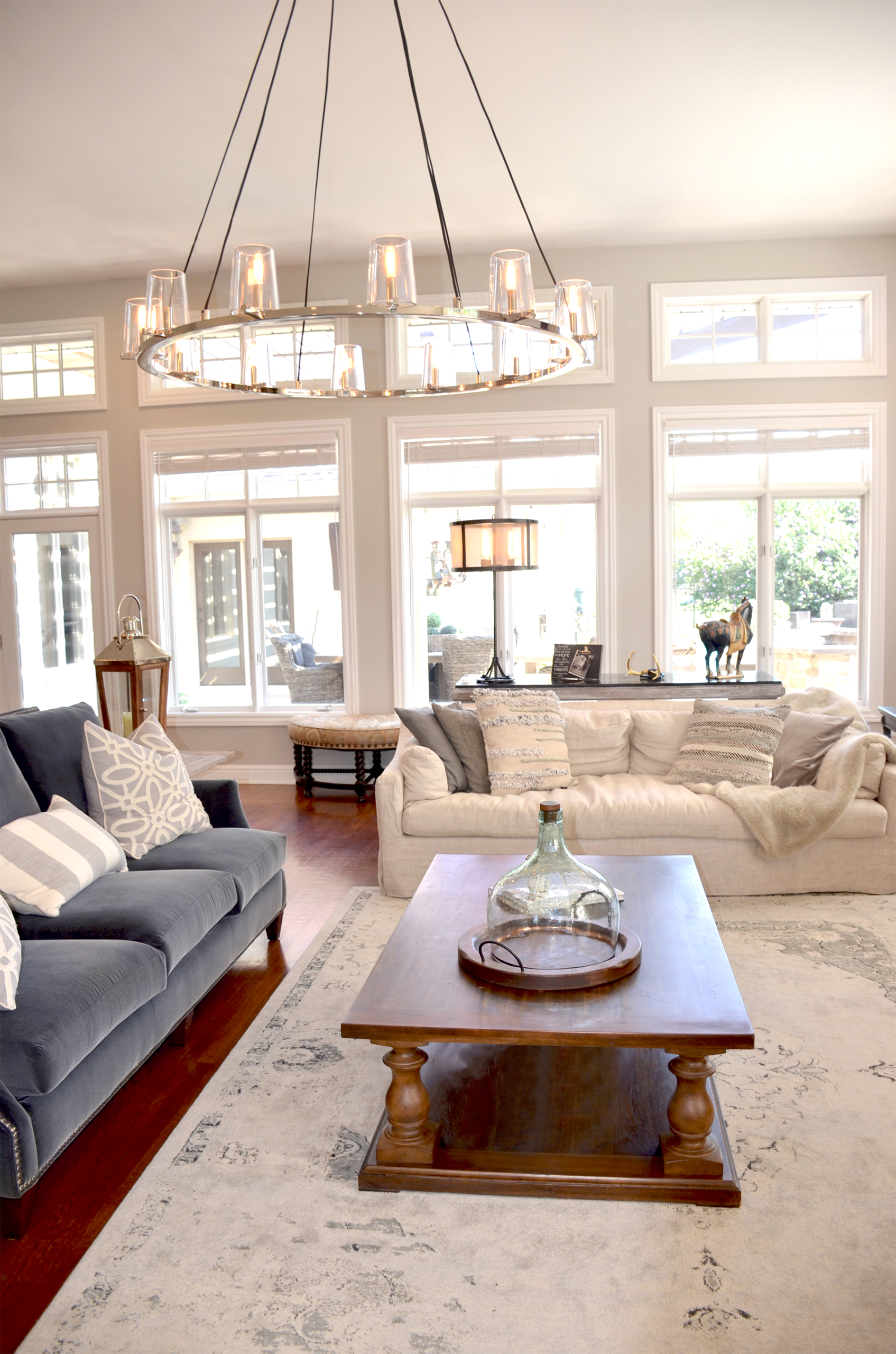
Through the dining room, you get the first glimpse of the great room. You are immersed in a soft, light and bright open space where finish details abound.
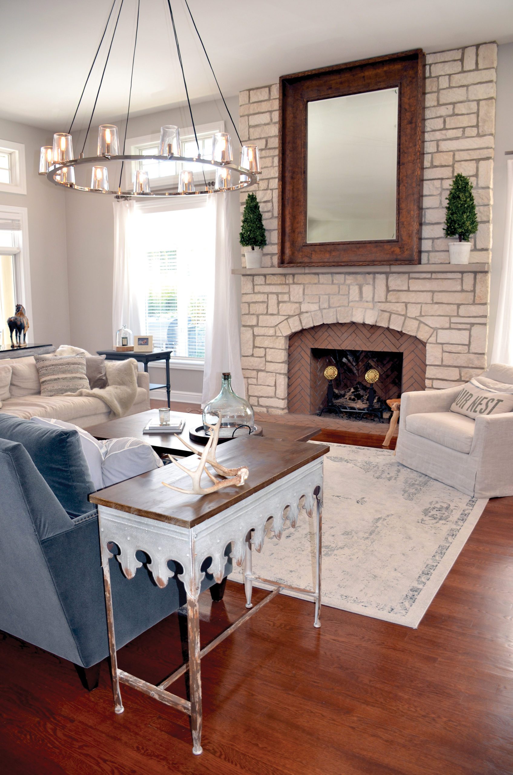
This new addition and living space makes entertaining guests much more enjoyable. Central to the room is a beautiful stone fireplace which makes a commanding focal point. The furnishings are the perfect complement – a dark blue-grey sofa is paired with a natural covered sofa, and a low-profile coffee table leaves the emphasis on the room’s visual space, while a large mirror over the hearth and modern chrome chandelier add a subtle hint of sparkle.
The view of the outdoor entertaining space is stunning. A room with a view promotes an air of tranquility and pulls you outside, and this multi-functional living space does just that!
